
WisePal
Smarter savings, wrapped in a brand worth trusting.
Product UX/UI Design|Branding Concept|Website Design|Pitch Deck Designs & Templates|Marketing Assets|Motion & Animation|Illustrations & Graphics
Visit website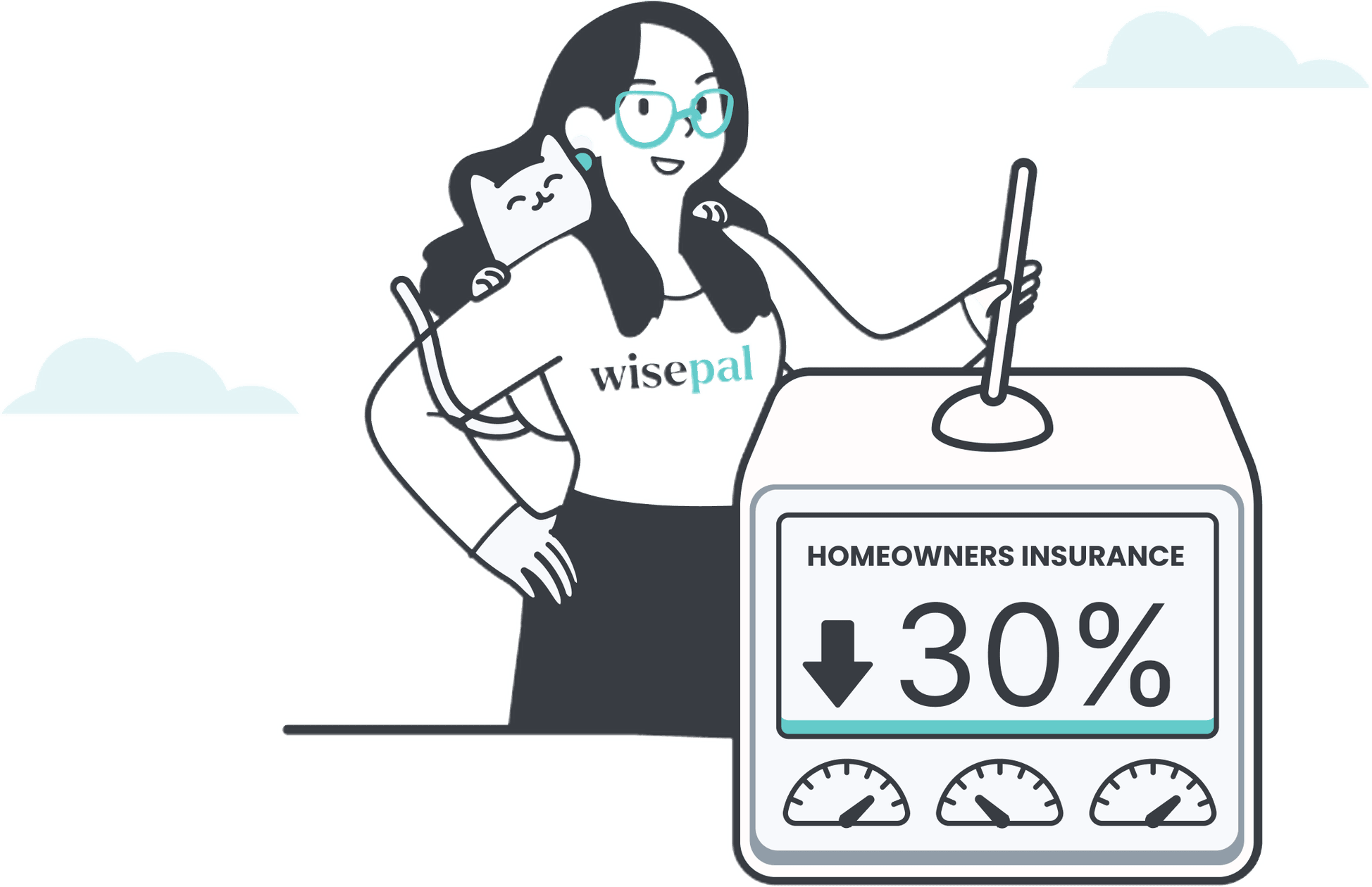

WisePal is a FinTech startup on a mission to help people stop overpaying for the things they already have. By scanning bills and surfacing lower-cost alternatives across insurance, utilities, mobile, and banking (all for free!) they've built a product that genuinely works in the user's favor. They're not a marketplace pushing sales; they're a financial ally built on transparency.
Overview
The challenge
WisePal came to us with a powerful product and a clear mission, but no brand to match it. In a space crowded with finance apps that feel cold, transactional, or opaque, they needed an identity that felt warm, credible, and approachable, one that could earn someone's trust before they ever handed over a bill. Every touchpoint, from the logo to the social ad, had to communicate "we're on your side."
“”"We built something people genuinely need, but the brand has to make them feel safe enough to try it. It needs to feel trustworthy, modern, and honestly… a little bit fun."
How we brought it to life
We built WisePal's brand from the ground up, starting with a mark and identity system that balances friendliness with financial credibility. From there, we extended the system across every surface: a clean, conversion-focused website, a pitch deck for investor conversations, one-pagers for partner outreach, motion content that brings the product to life, a custom illustration world that keeps things human, and social campaigns ready to perform. WisePal walked away with a complete brand ecosystem built to grow.
Deliverables:
- Branding Concept & Logo Design
- Brand Guide & Visual Identity
- Website Design UX & UI
- Pitch Deck Designs & Templates
- Marketing Assets
- Motion & Animation
- Illustrations & Graphics
Check out the stunning assets we've created!
WisePal websiteBranding concept & logo designTrust designed from scratch
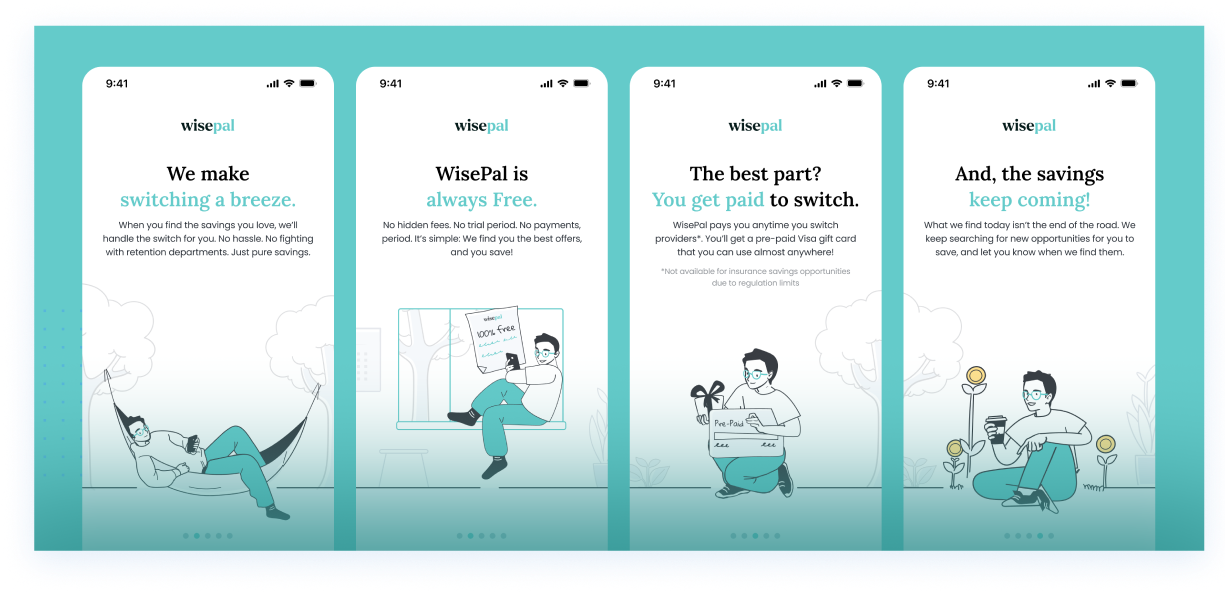
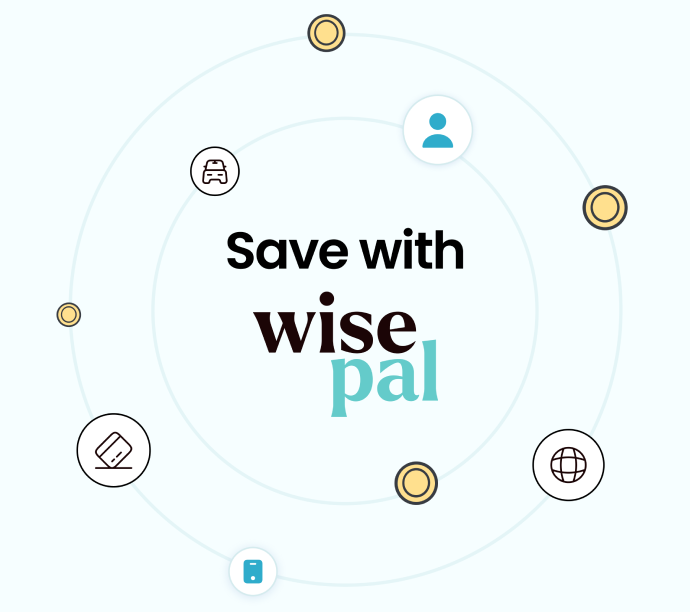
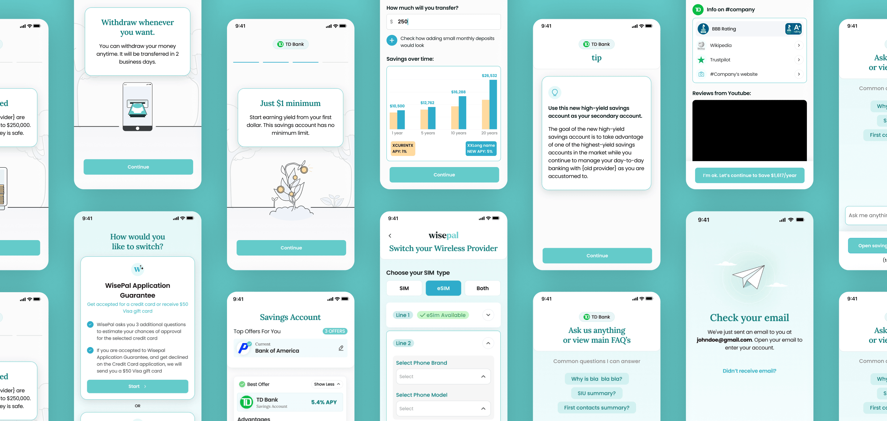
We built WisePal's mark around the intersection of intelligence and approachability - a symbol that feels sharp and considered without veering into corporate stiffness. The teal-forward palette signals clarity and calm, giving users a visual reason to relax in a space that usually makes people anxious.





Brand guide & visual identityOne voice, every bill category
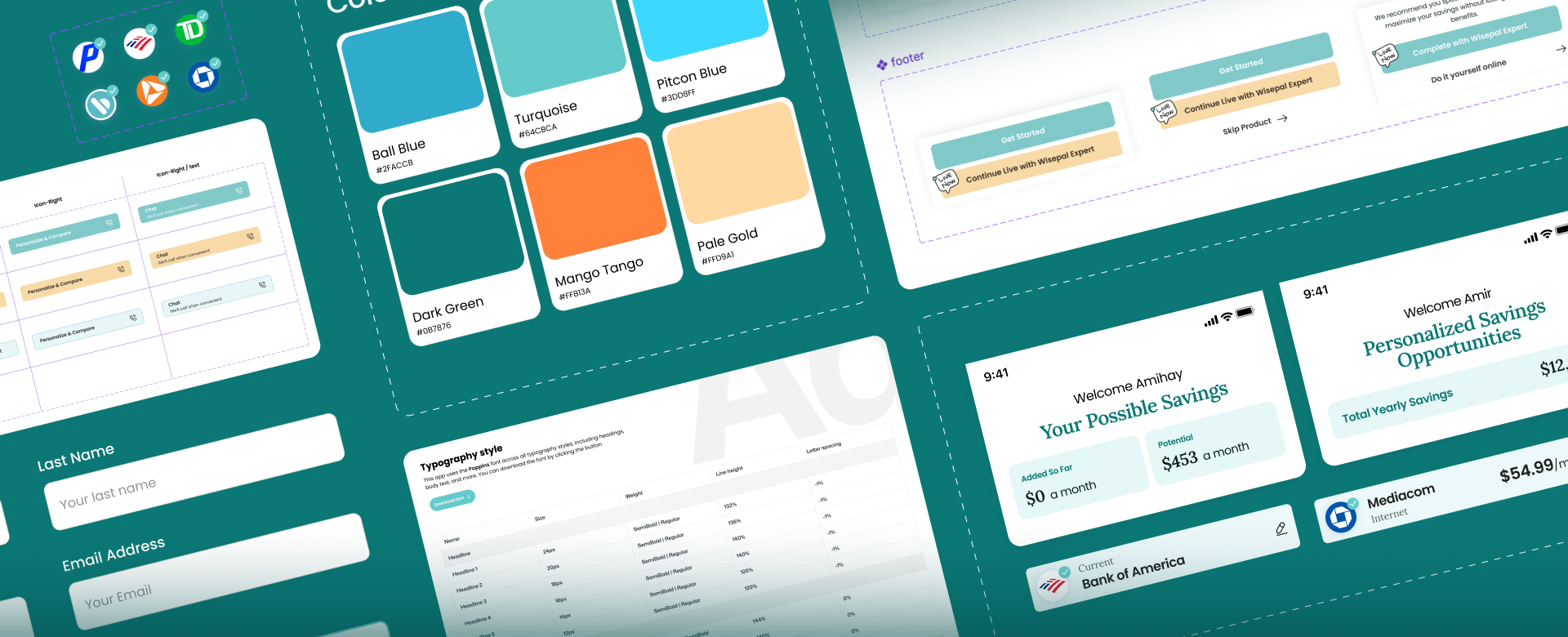
WisePal's identity needed to flex across insurance, utilities, banking, and mobile without losing coherence. The brand guide locks in a visual language that stays warm and consistent whether it's a social ad or a product onboarding screen, rules that make scaling feel effortless.
Website designFree product, zero confusion
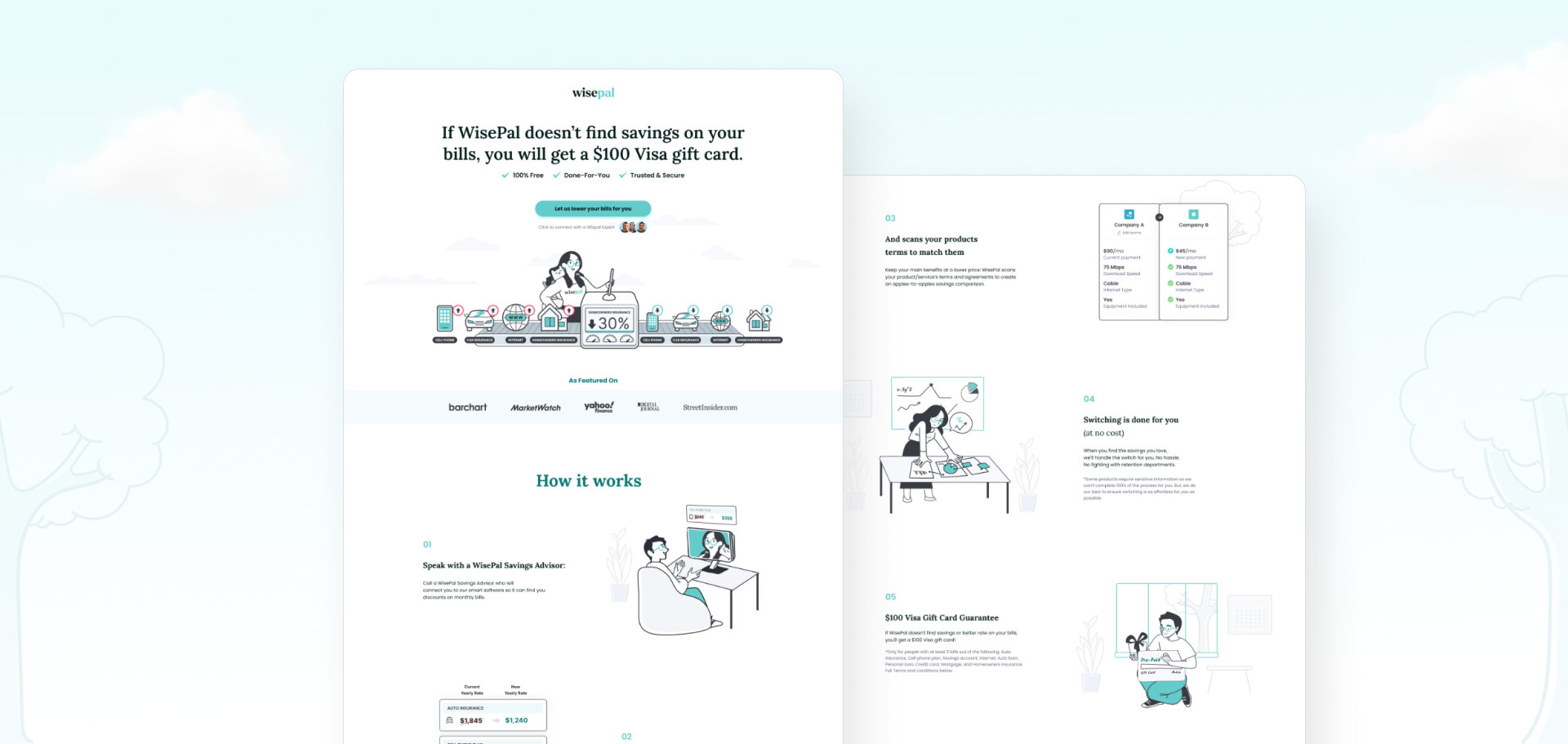
The biggest UX challenge was making a multi-step, data-sensitive product feel light and inviting. We designed a site that leads with trust signals and plain-language benefit statements, walks users through how it works without overwhelming them, and converts without ever feeling pushy.
Pitch deck designs & templatesThe story investors need to hear
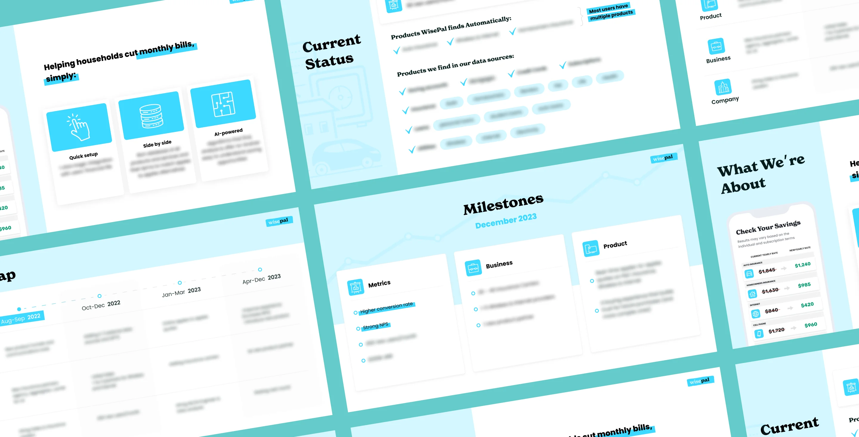
WisePal's pitch needed to explain a nuanced business model (commission-based, user-first, multi-category) in a format that lands in the first few slides. We built a deck that frames the problem with clarity, leads the market opportunity with confidence, and makes the "100% Free" model feel like the obvious future of personal finance.
Marketing assetsFrom one-pager to feed, built to convert
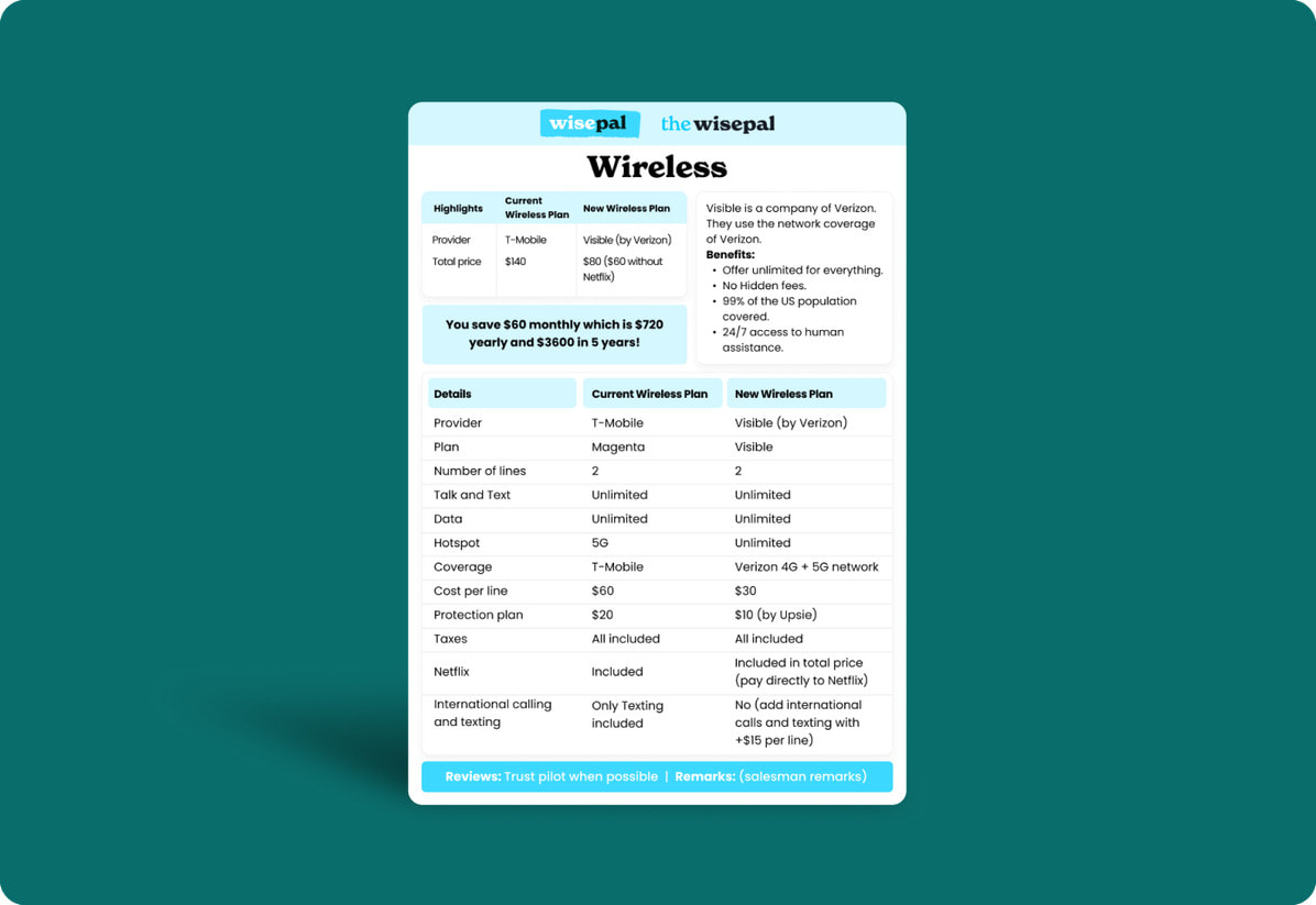
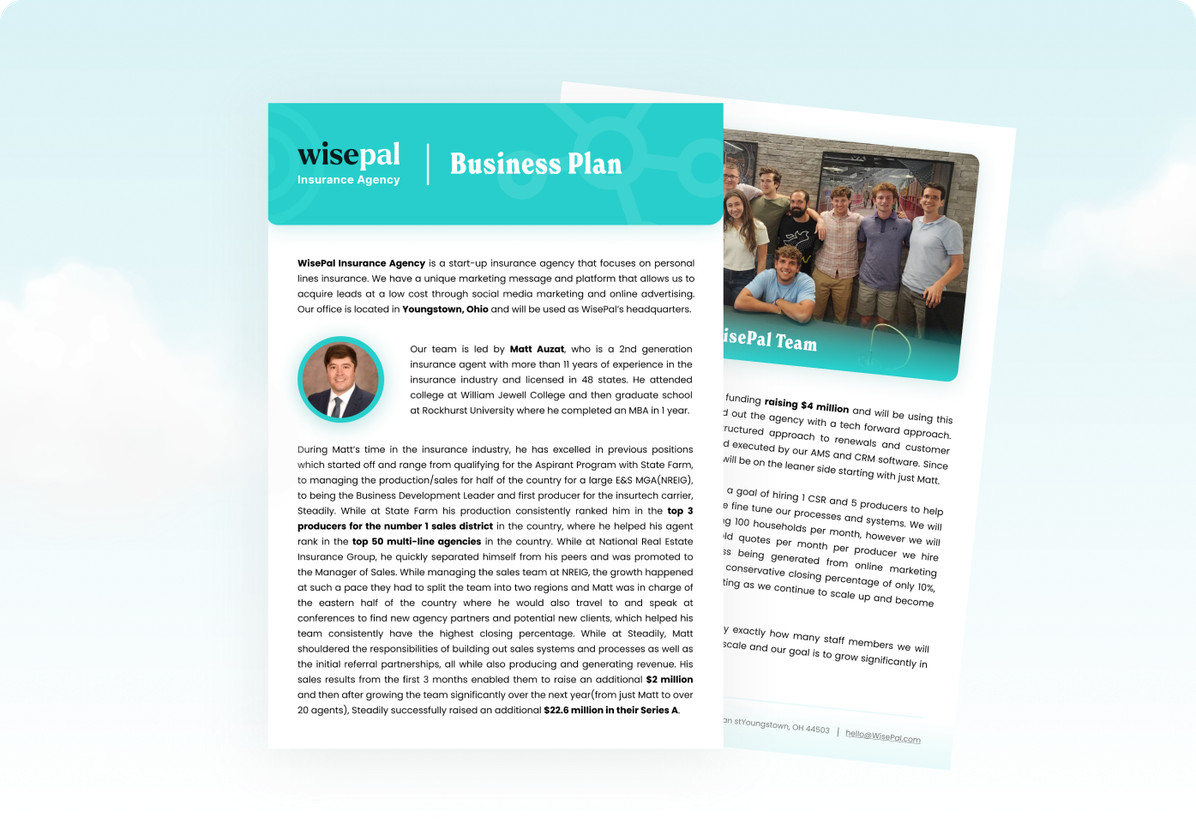
We designed one-pagers and partner papers that communicate WisePal's value in a single glance, alongside a social ad campaign system built for performance across formats. Every asset speaks the same brand language: clean, direct, and engineered to earn a second look.
Motion & animationThe savings, set in motion
Static design can only do so much when your product's magic is in the doing. We brought WisePal's story to life through motion: animated explainers and video assets that show how the platform works, why it's free, and why users can trust it. The result is brand content that educates and converts simultaneously.

Illustrations & graphicsA friendly world for a complicated problem
Personal finance is stressful. WisePal's illustration system was built to counteract that: a custom visual world of approachable characters and clean iconography that makes saving money feel like a relief, not a chore. The style is warm, modern, and instantly ownable.









Social media ad campaignsOne question, every overpayer
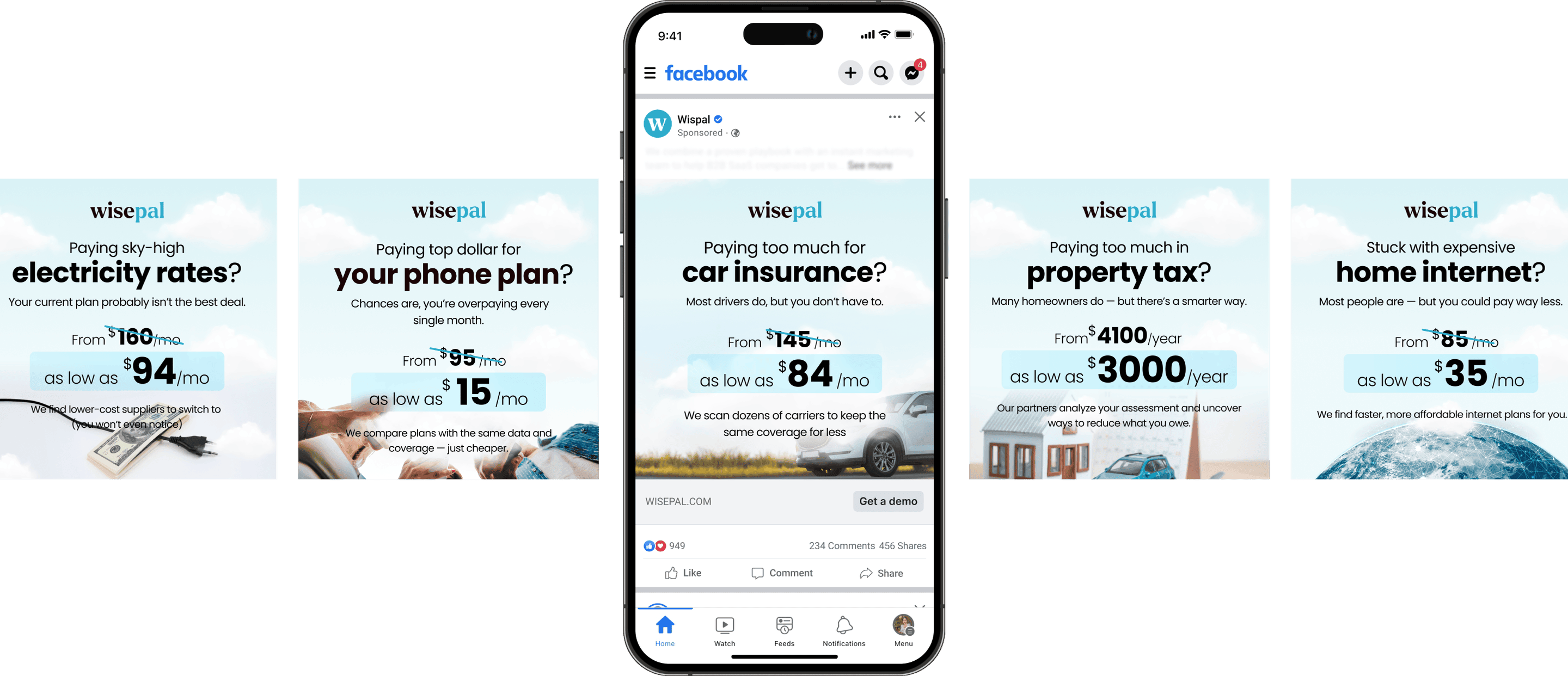
WisePal's value proposition is instantly relatable, but only if the ad stops the scroll long enough to land it. We designed a performance ad system built around a single creative tension: the moment someone realizes they've been overpaying. The campaign spans every bill category WisePal covers (car insurance, electricity, phone plans, home internet, property tax), with a modular visual format that's consistent across channels but tailored per audience. Each ad is engineered to convert: a sharp hook, a concrete savings number, and a clear next step that doesn't feel like a sales pitch.
We nailed this project
Don't just take our word for it!

Mondeo has been with me through most of my companies, and it's a 10 for me. It's a combination: design that looks good and practical, people who execute fast and are responsive, and talent Einat knows how to find, which would be hard for me. I don't need to hire in-house, because when we need them, we just tag them on Figma, we know each other, and it's like part of the team. Even when we hire someone full time, we'll keep working with Mondeo, because it just works well.

Some clients send a thank-you note. Amihay wrote Ditsa a song. Have a listen.
Why it worked
WisePal's brand works because it solves the hardest problem: making something complex feel easy, and something data-driven feel human. By designing every touchpoint as one cohesive system, we gave users a consistent reason to trust WisePal before they ever clicked "get started."
Building a product that needs to earn trust at first glance?