


Waterfall Security Solutions protects the world's most critical infrastructure from cyber attacks. Power grids, industrial facilities, and the cyber-physical systems where a breach isn't just a data problem, it's a real-world one. Its security is hardware-enforced, not software-alone, giving critical infrastructure operators protection they can trust.
Overview
The challenge
Waterfall's technology operates at the highest possible stakes, but their product interface hadn't been built to reflect that. Managing OT security across complex industrial environments requires a platform that surfaces the right information, at the right level of detail, without introducing friction for operators already working in high-pressure conditions. They needed an extensive product design overhaul: a design system and product experience built for mission-critical clarity.
“”"The people using our platform are protecting infrastructure that entire regions depend on. The interface needs to be as reliable and precise as the hardware underneath it: nothing confusing, nothing missing."
How we brought it to life
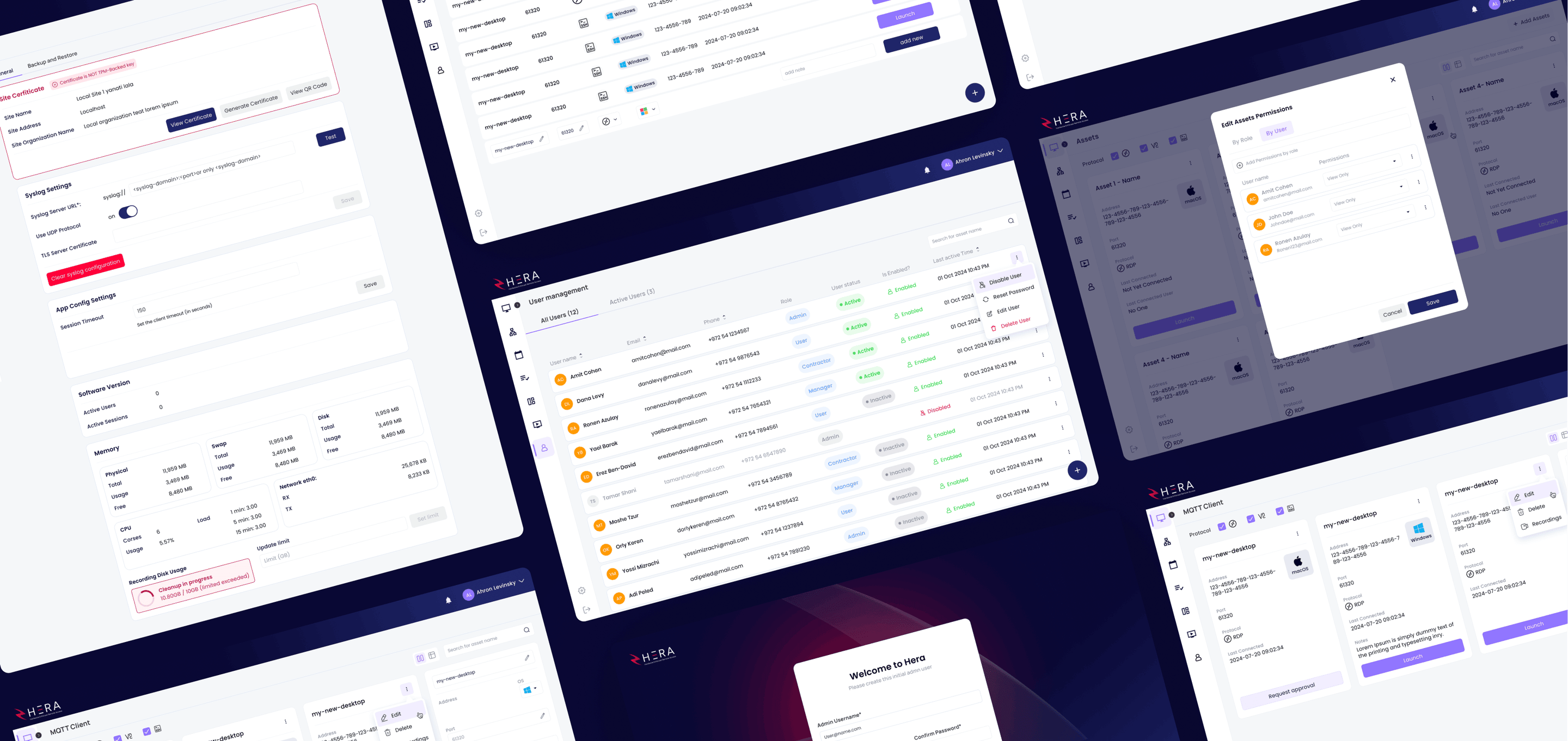
We designed Waterfall Security's product experience from the system up, building a comprehensive UI kit and design system that gave the entire platform a consistent, scalable visual language. From component library to fully realized product screens, every design decision was made in service of speed, clarity, and confidence under pressure. The result is a product interface that matches the seriousness of the technology, and the stakes of the environments it protects.
Deliverables:
- Brand Guide & Visual Identity
- Product Design
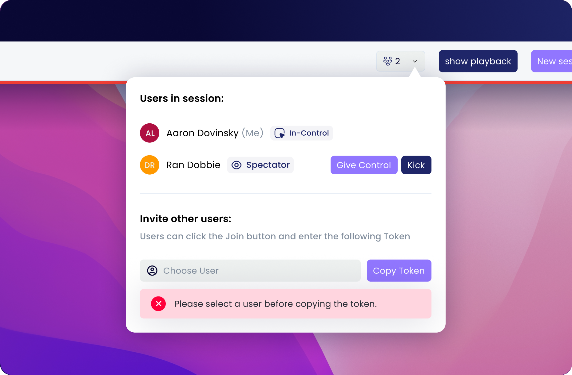
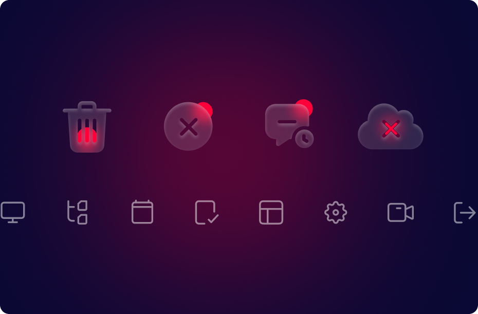
UI kitThe logic of looking reliable
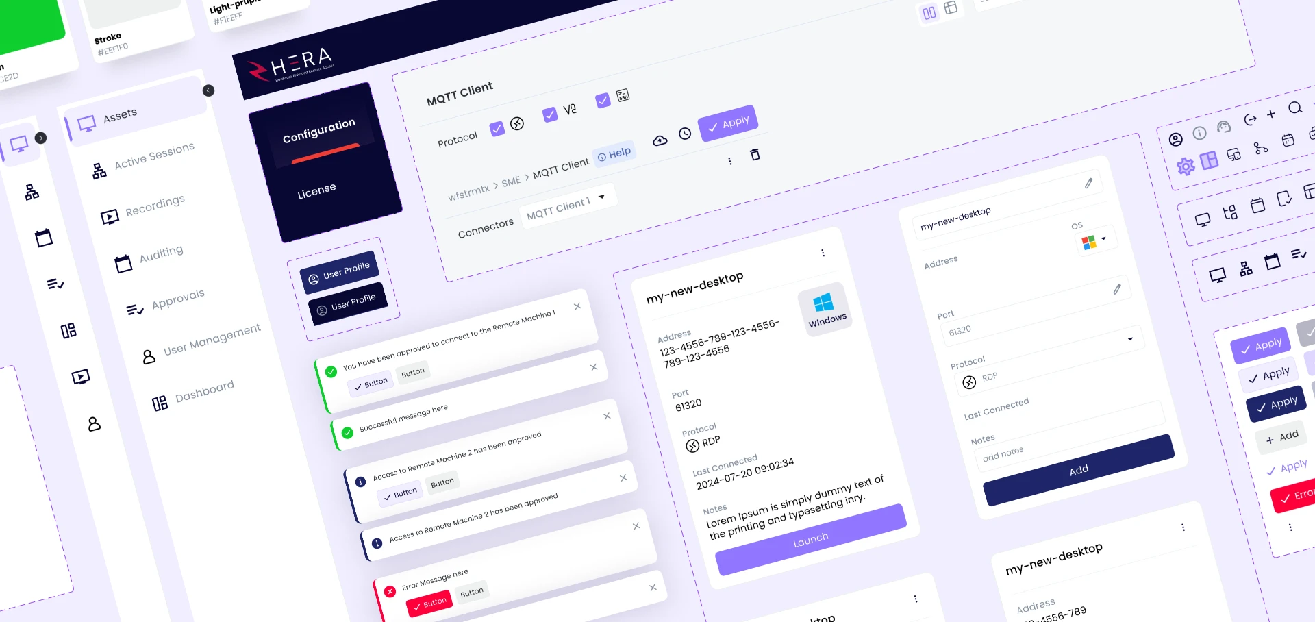
We built Waterfall's design system as the structural backbone of the entire product: a deep, organized component library covering UI patterns, states, typography, and color across every screen and scenario. The deep violet palette signals precision and authority, creating an interface that feels engineered rather than assembled. Every component was built to scale across a complex, multi-surface industrial security platform without breaking consistency.
Product designMission-critical data, instantly readable
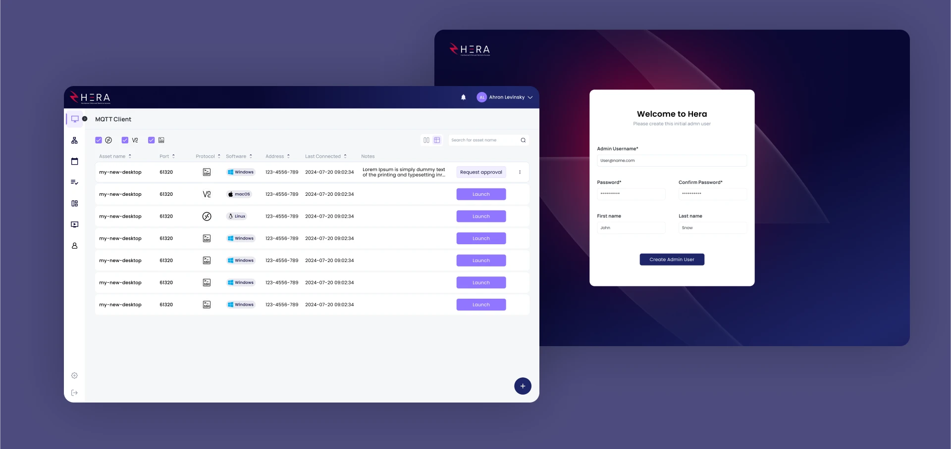
We translated Waterfall's OT security capabilities into a product interface designed for operators who can't afford to hesitate. Complex network data, system states, and threat signals are organized into clear visual hierarchies that reward fast scanning and support decisive action. The interface is dense where the work demands it, and unambiguous everywhere else.
Why it worked
OT security is a domain where interface failure has real consequences, so clarity wasn't a nice-to-have, it was the entire design mandate. By grounding every decision in the design system first, we ensured that every screen that followed was coherent, predictable, and built for operators working under pressure. Waterfall's platform now looks and feels like the category-defining product it is.
Protecting critical infrastructure and need a product that reflects it?