
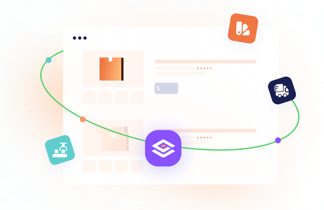

LinkedPort is a Tel Aviv-based end-to-end merchandise and fulfillment company that handles everything from supplier sourcing to shipping, under one roof. They serve e-commerce businesses, Amazon sellers, and global enterprises looking to bring branded products to life without juggling a dozen vendor relationships. Their client roster includes Google, Meta, Microsoft, HP, and eBay.
Overview
The challenge
LinkedPort's offering was genuinely impressive (full-service, transparent, globally coordinated), but their brand and website weren't telling that story. For a company operating at enterprise scale, they needed a visual identity and digital presence that matched the ambition of the clients they were already serving. The brand was functional; it just wasn't memorable.
“”"We work with some of the biggest companies in the world, but when they land on our site, they can't feel that. We need a brand and website that makes it obvious we're the real deal."
How we brought it to life
We built LinkedPort's identity from the ground up, crafting a mark and brand system that balances warmth and reliability, then carried it through a full website redesign and a rich illustration library. The site structures a complex, multi-service offering into one fluid, easy-to-navigate experience. The illustrations give the brand personality and help users understand a layered logistics process without reading a word of copy.
Deliverables:
- Branding Concept & Logo Design
- Brand Guide & Visual Identity
- Website Design UX & UI
- Illustrations & Graphics
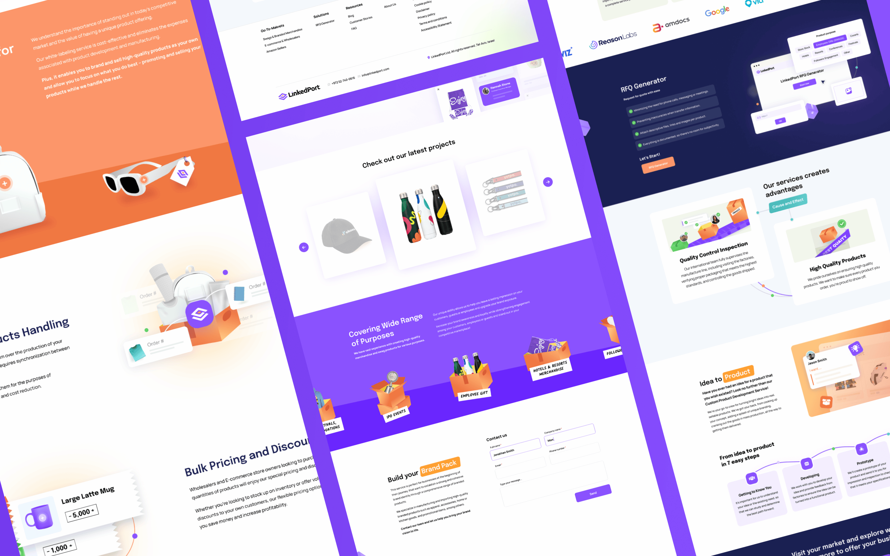
Check out the stunning assets we've created!
LinkedPort websiteBranding concept & logo designBranding trust chains
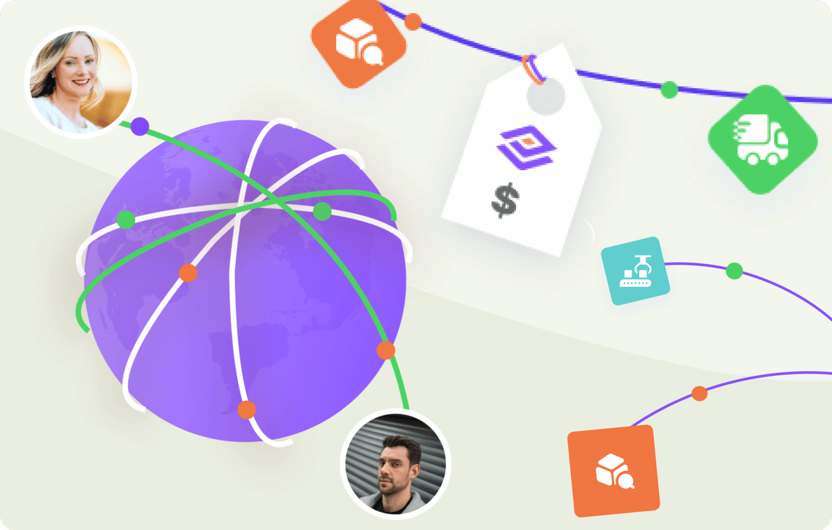
LinkedPort connects suppliers, manufacturers, and clients across the globe, the brand needed to feel like a bridge, not a warehouse. We designed a mark built around connection and flow, grounded in a purple and peach palette that feels modern, approachable, and distinctly different from the industrial visual language typical in logistics. A brand that enterprise buyers can actually trust on first impression.
Brand guide & visual identityA system, not just a style
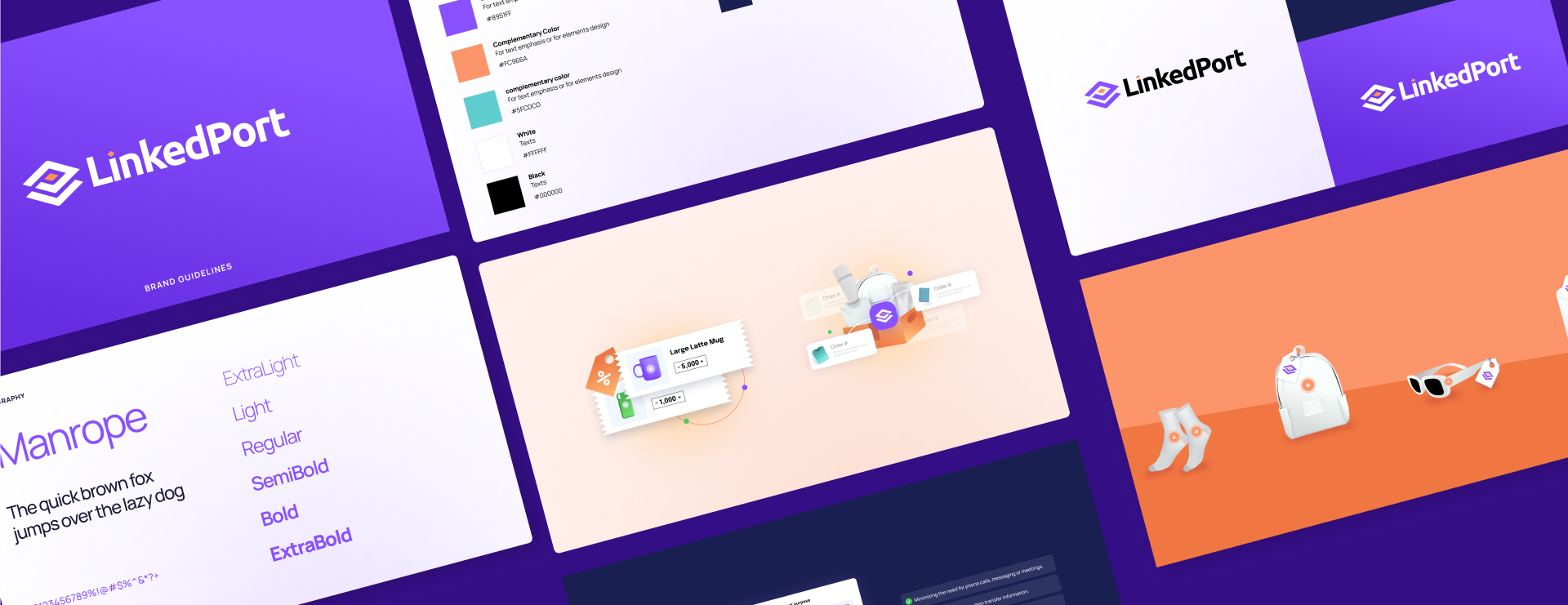
We developed a visual identity system flexible enough to live on a shipping label, a pitch email, and a homepage hero without losing its shape. Color rules, logo lockups, typography pairings, and illustration style guidelines give LinkedPort's team a consistent language to build from, whether they're onboarding a new client or launching a campaign.
Website designA site that feels human
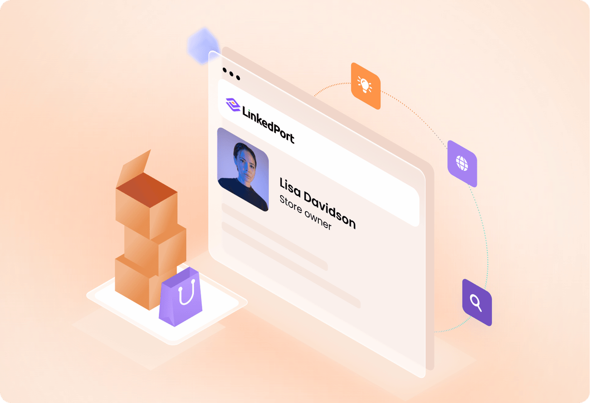
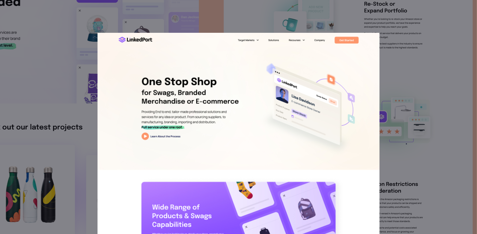
LinkedPort's service model (sourcing, branding, fulfillment, delivery) is comprehensive but complex. We designed a site that makes it simple. Clear navigation, a logical flow from problem to solution, and a visual rhythm that guides buyers through every service tier without overwhelming them. The result is a one-stop shop that actually feels like one.
Illustrations & graphicsBuilt to move product
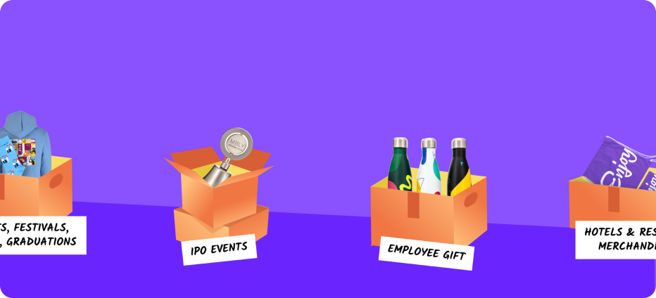
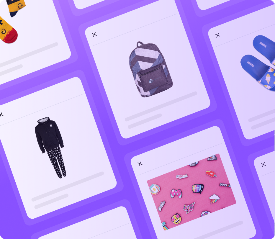
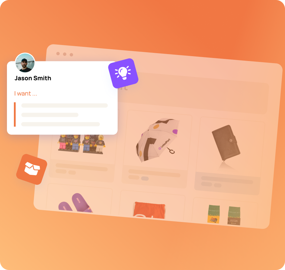
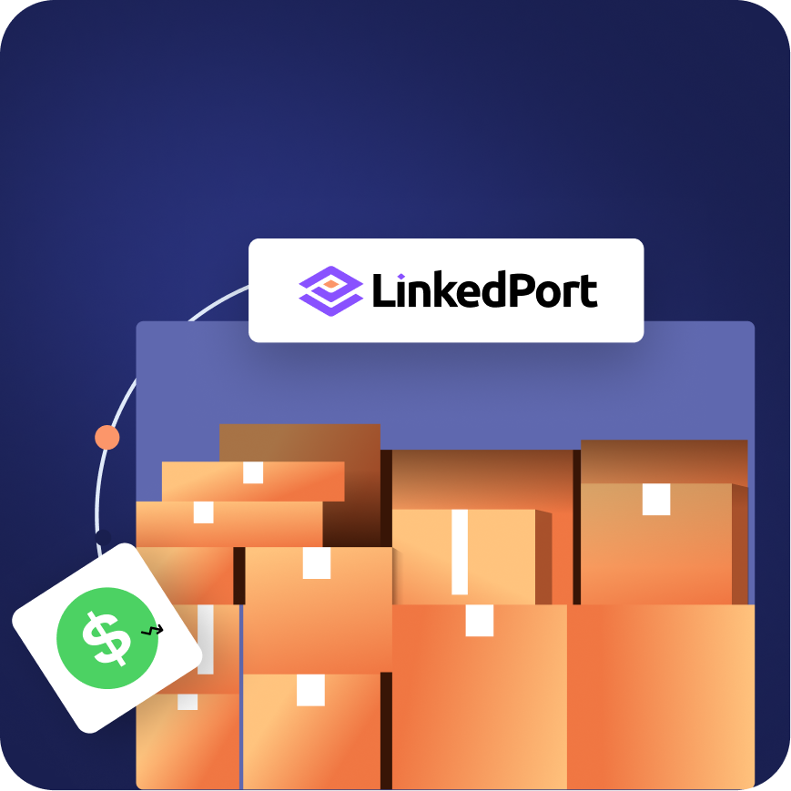
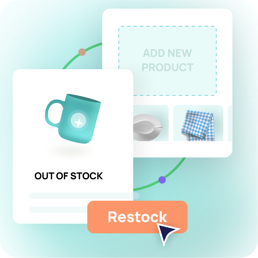
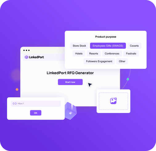
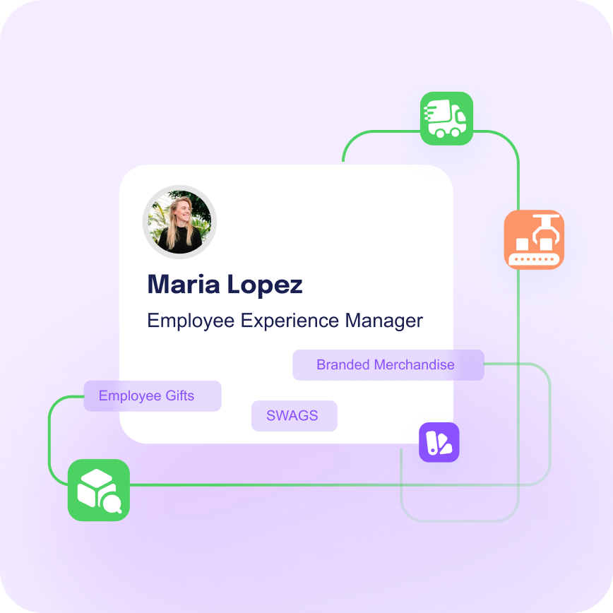
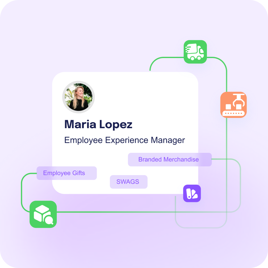
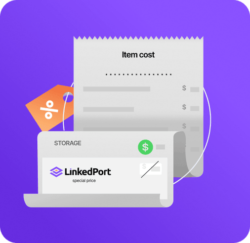
We built a custom illustration library that gives LinkedPort a visual personality beyond the logo: playful, vibrant, and rooted in the physical world of products, packaging, and delivery. Each illustration translates a step in the fulfillment journey into something engaging and easy to understand, making a behind-the-scenes operation feel tangible and trustworthy.






Why it worked
LinkedPort's secret weapon was always the breadth of what they offer. The challenge was making that breadth feel like simplicity, not complexity. By connecting a bold identity, an intuitive website, and a custom illustration system, we gave them a brand that finally communicates what their best clients already know: one call, one partner, done.
Running a business that does everything?