
Branding sprint for InfrOS.
Visit website

InfrOS (formerly Cloudculate) helps engineering teams stop guessing where their data should live. They design crystal-clear cloud architectures that match real-world workloads (performance, maintenance, and scaling included) and implement them in days, not months.
But their biggest challenge? Explaining a deeply technical service without sounding like every other cloud consultant on earth.
They needed a brand that had to be memorable.
Overview
The challenge
“Hey Mondeo? We want to be the opposite of boring cloud consultancies. We want a brand that shows what we actually do: bring clarity to complexity. And… we kinda want a superhero.”
We said YES.
The result: a visual universe built around a character who illuminates the cloud. A branding system that feels as technical as the work they do… but far more fun.
“InfrOS old brand felt more dense manual than effortless platform. They needed a redesign that matched the product’s superpower: turning complexity into clarity.”
How we saved the day
We anchored the entire brand around one idea:
Cloud architecture is very confusing, InfrOS sheds light on the complexity.
The lighthouse logo became the symbol of guidance, precision, and visibility.
And the female superhero silhouette became the character who “reveals” the right architecture through beams of light. The superhero whose power is shedding light on complexity. Literally. This character became the anchor of the entire brand story.
We created a brand rooted in the idea that the right storage choice becomes obvious when someone shows you where the light is.
The brand became:
- bright, sharp, and confident
- full of motion and clarity
It transformed InfrOS’s story from “cloud architecture services” into:
“The superhero that sheds light”
“The superhero that sheds light”
Color palette: bold lights emerging from deep shadows
Shapes: crisp beams, structured layers
The superhero served as a living metaphor for Cloudculate’s value: clarity, precision, speed.
Check out the stunning assets we've created!
Learn moreWe’re proud of this oneA branding sprint that turned complexity into something iconic.
- Light-beam motifs to represent uncovering the right storage path
- Layered structures symbolizing multi-tier architecture decisions
- A hero silhouette that feels modern and powerful
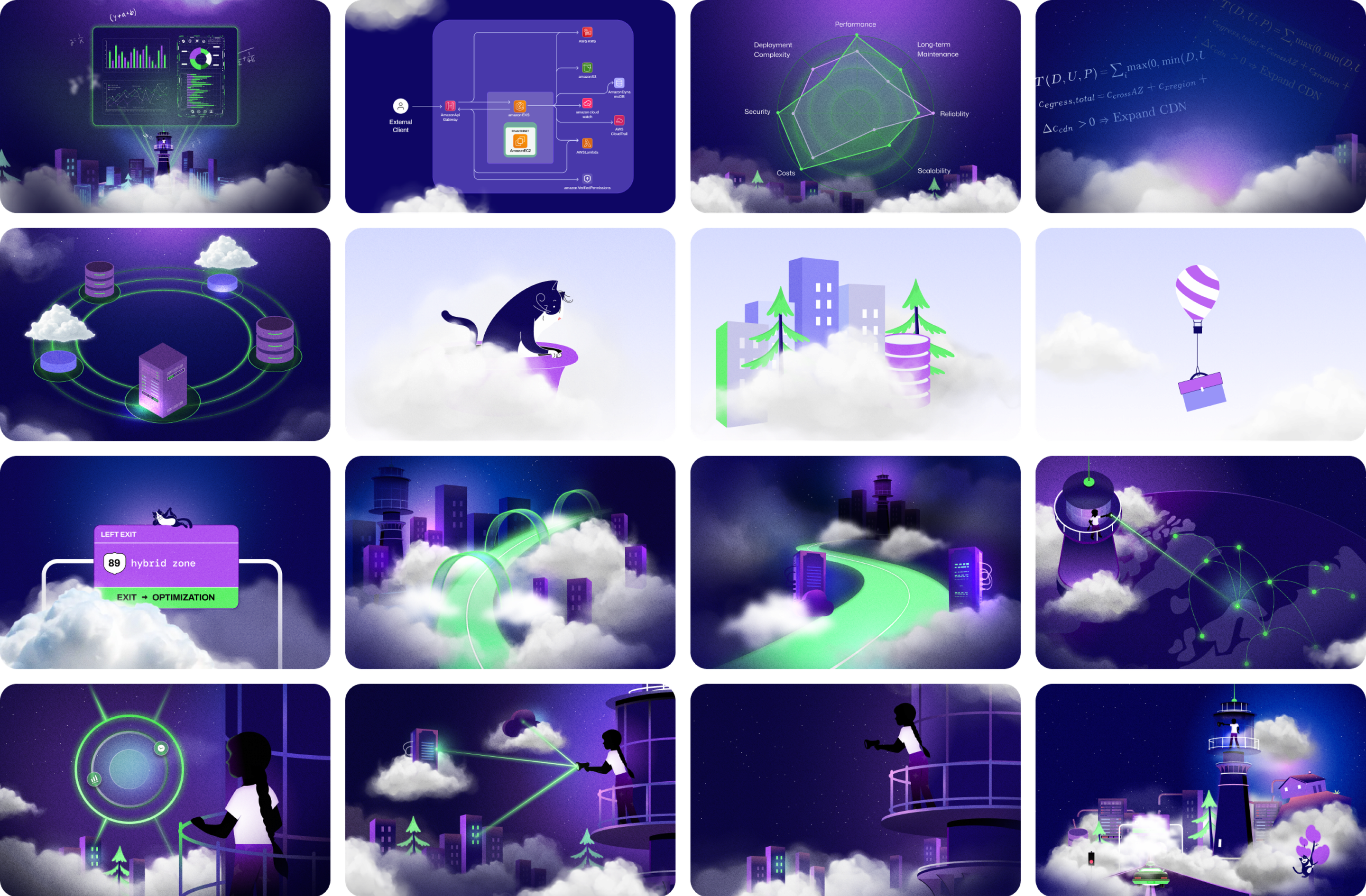
- Illustrations that instantly communicate “InfrOS sheds light on complexity” value proposition




Website design Deep tech, designed to land
Deep tech, designed to land
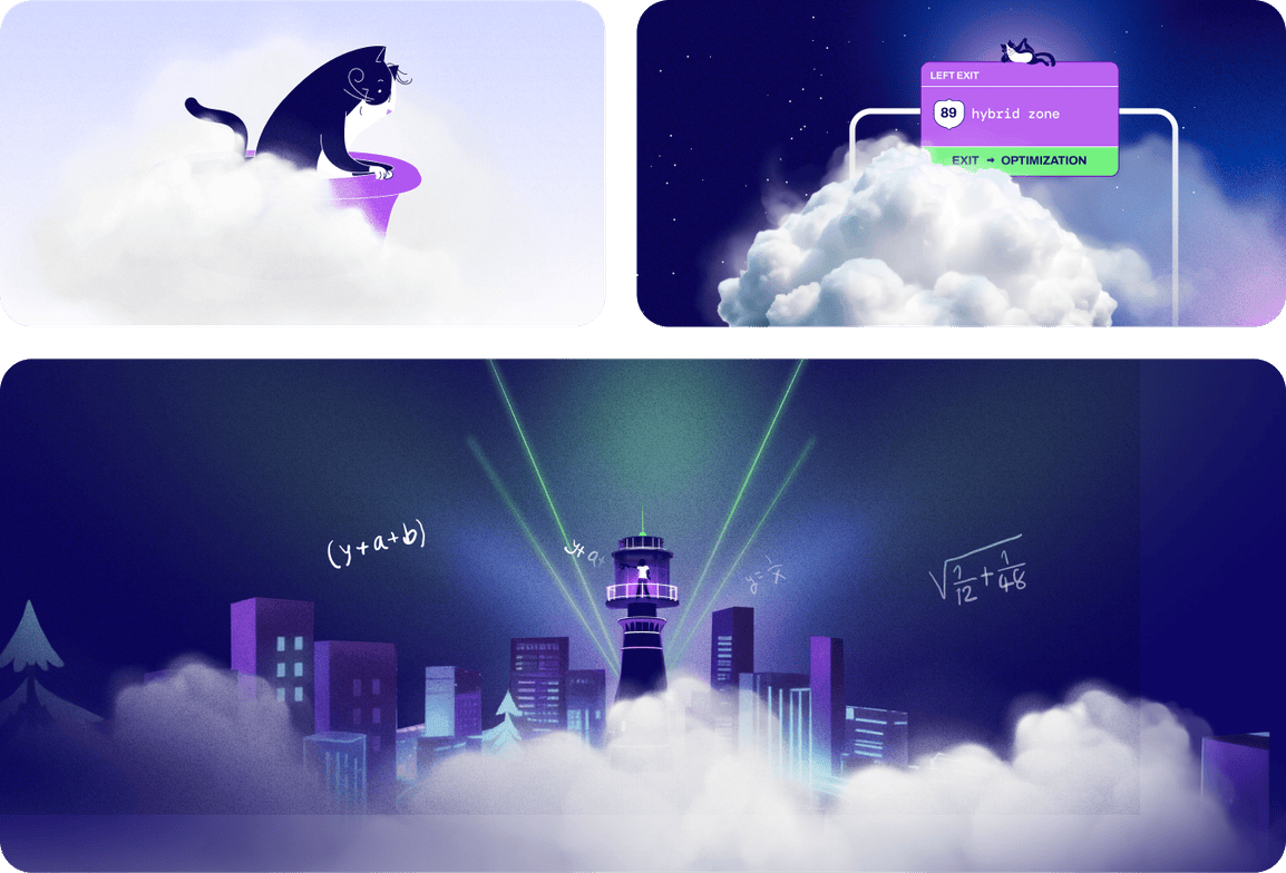
InfrOS's product is genuinely complex: multi-cloud, AI-driven, Terraform-native. The website had to earn the trust of technical buyers while staying clear enough for decision-makers who aren't reading code. We structured the site to move visitors from curiosity to conviction: leading with the proof, following with the depth, and never making users work to understand the value.
Illustrations & graphicsComplexity made beautiful
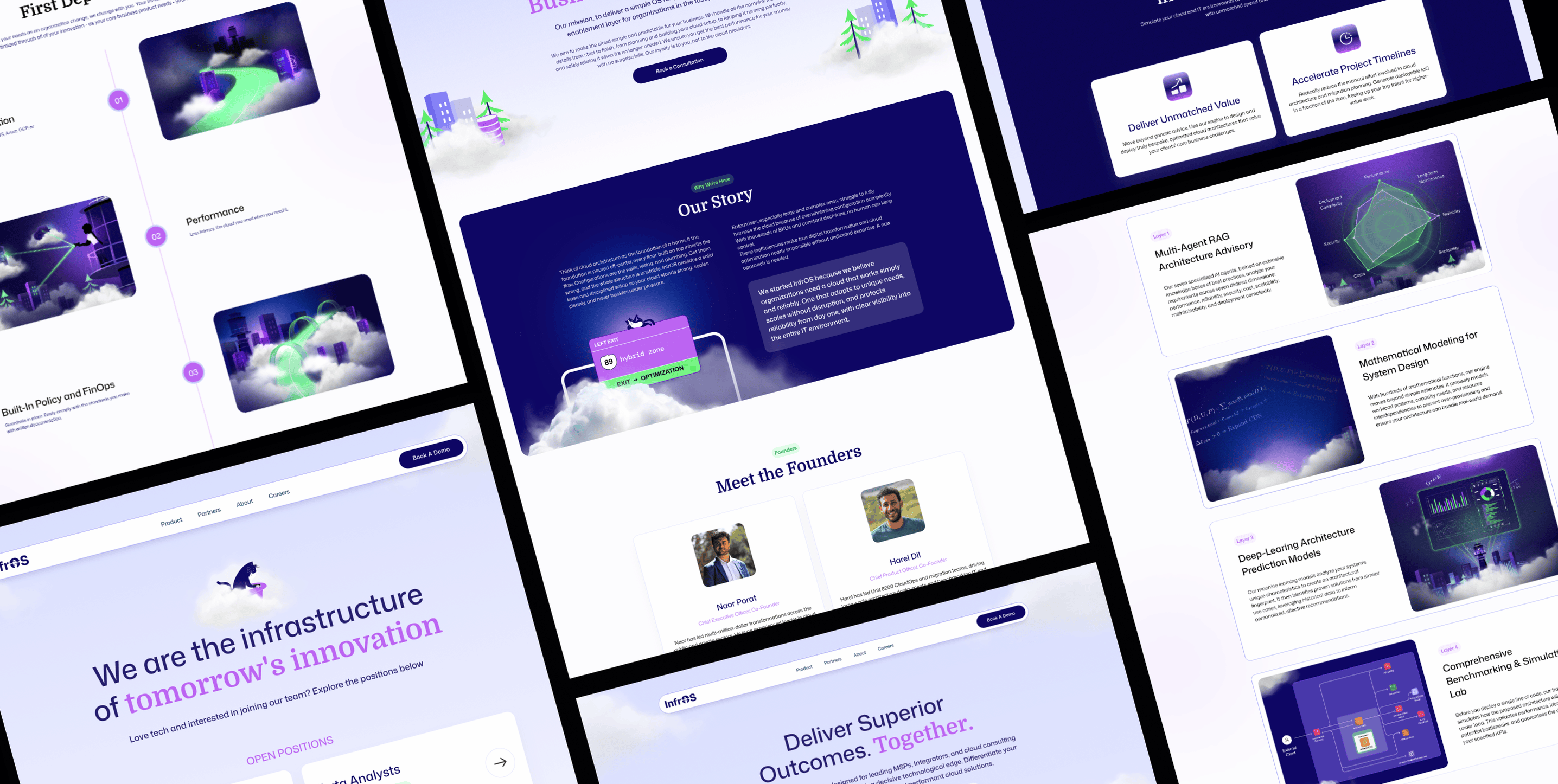
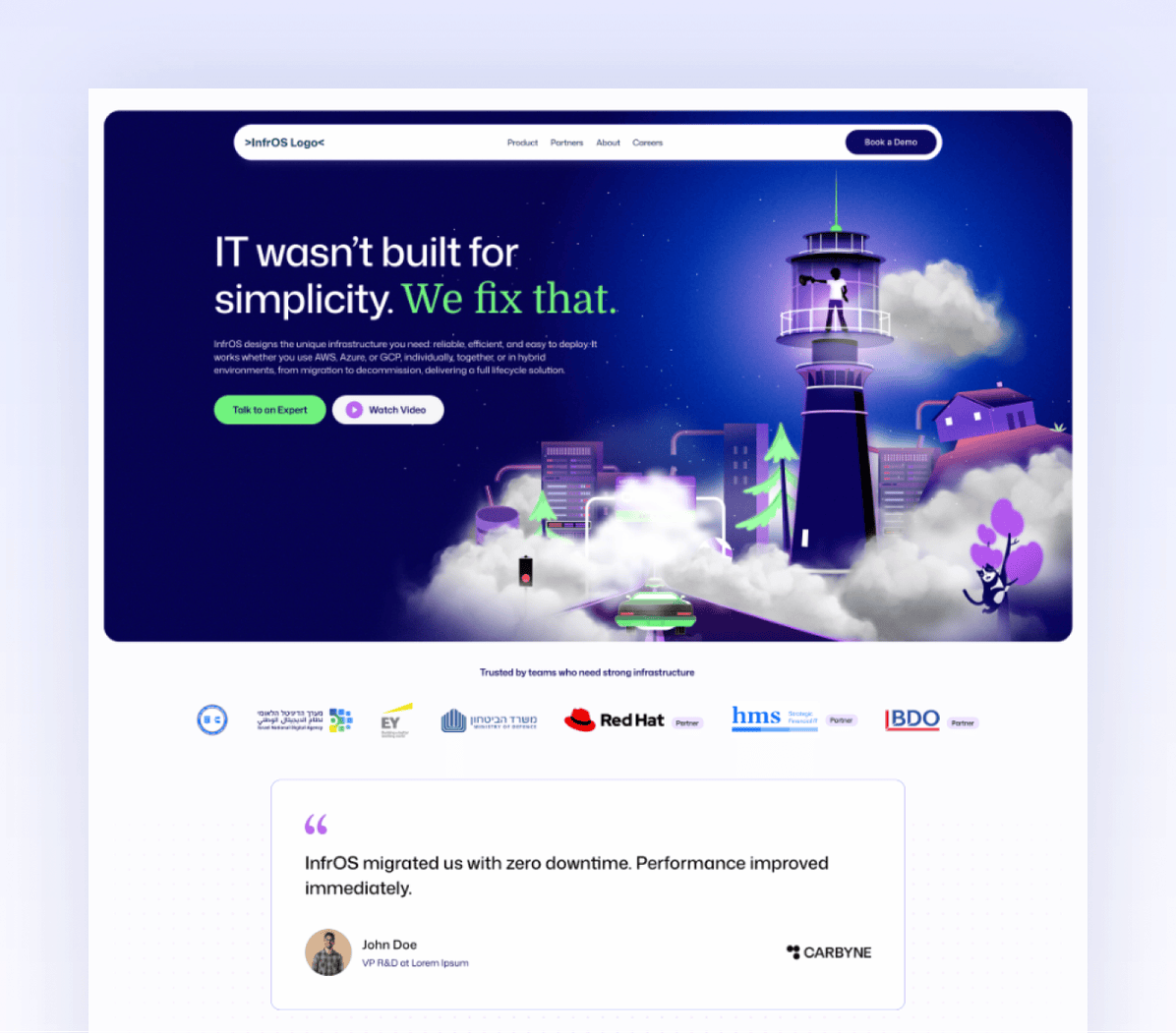
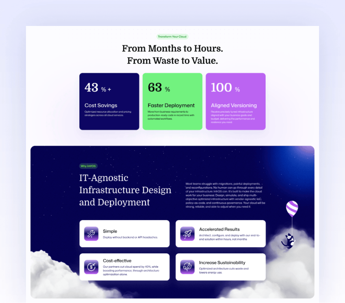
Cloud infrastructure is notoriously hard to visualize, so we built InfrOS a custom illustration world that makes it intuitive. The library spans technical diagrams, architectural metaphors, and character-driven scenes: radar charts mapping performance tradeoffs, orbital database clusters, glowing city skylines rising through clouds, and a recurring black cat mascot that gives the brand unexpected personality. Each illustration bridges the gap between what the platform does and what it feels like to use it, precise enough for technical audiences, vivid enough to stop a scroll.
Motion & animationWhen infrastructure starts moving
Static design couldn't capture what InfrOS actually does, so we put the brand in motion. We created animations that bring the platform's intelligence to life: visualizing data flows, architecture formation, and deployment cycles in a way that feels fluid and inevitable. The result is a brand that doesn't just tell its story. It demonstrates it.
Social media Built for attention in a crowded feed
Cloud infrastructure isn't the easiest sell on social, but InfrOS had real numbers and a real story. We designed a social media system built around sharp messaging, bold visuals, and a consistent brand voice that cuts through the noise. Every asset is built to stop the scroll and drive the next step, whether that's a demo request or a deeper read.

Why it worked
InfrOS came in with a product that was already winning. They just needed a brand that could prove it on sight. By building every element from the same visual foundation (identity, web, motion, and social), we created a presence that matches the intelligence of the platform itself. The brand doesn't explain what InfrOS does; it demonstrates it.
Building something that changes how infrastructure works?