
Imperagen
Small enzymes.
Big brand energy.

Overview
The challenge
How we brought it to life
Deliverables
- Brand research
- Logo and wordmark
- Visual identity: colour, typography, graphics and texture
- Website design (UX/UI)
- Website development in Lovable
- Launch assets: favicon, social image and LinkedIn banners
Understanding the people
and the placeResearch came first, and it shaped everything after it
Before anyone drew a molecule, we wanted to understand how Imperagen want to come across, which turned out to be serious about the science, practical about innovation and allergic to hype. Then came Manchester, a city built on grit rather than gloss, home to the industrial revolution, the cotton mills, inventors and a music scene their CEO loves.
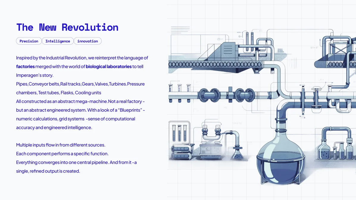
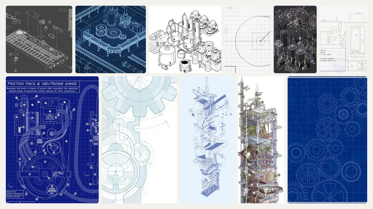
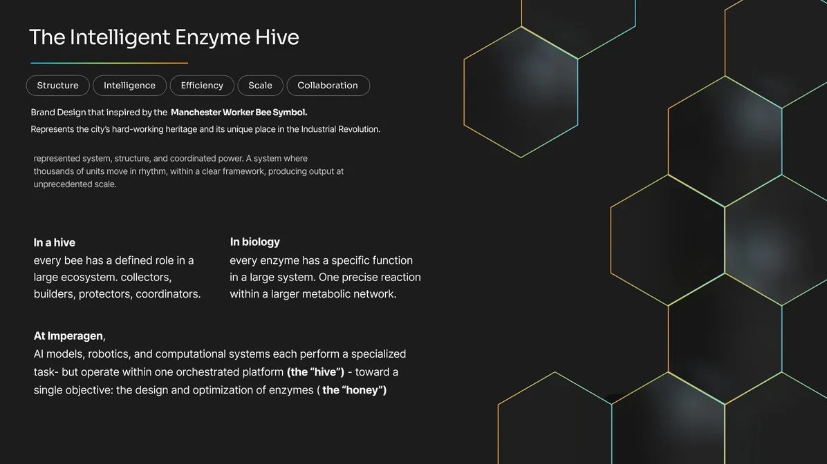
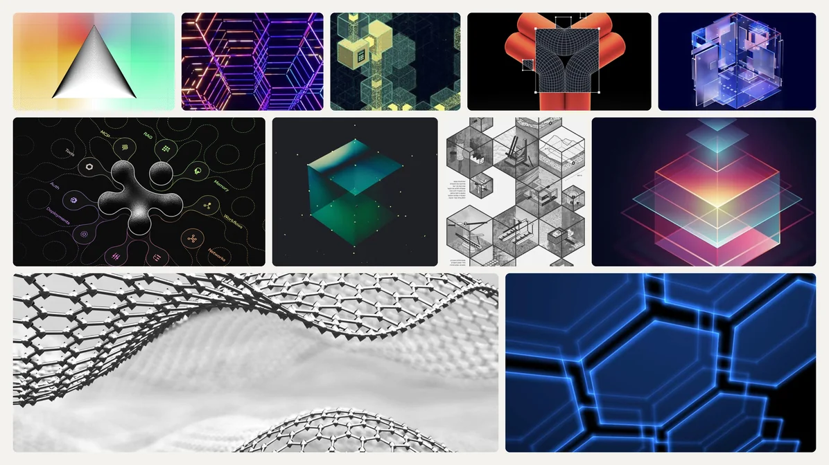
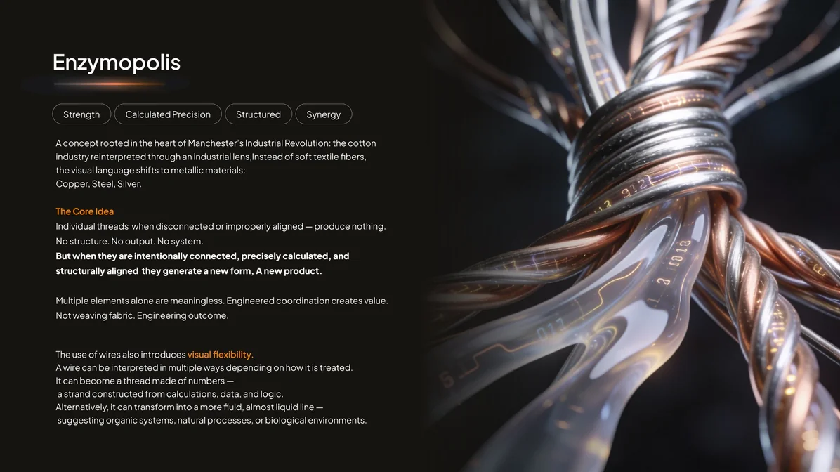
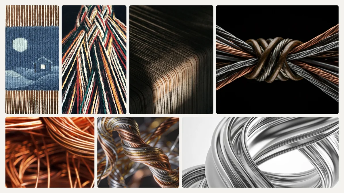
We came back with three directions, all rooted in that revolution. The New Revolution merged factories with biological labs into a mega-machine of pipes, valves, flasks and test tubes, drawn like engineering blueprints. The Intelligent Enzyme Hive took the Manchester worker bee, with AI, robotics and computation as the hive and the optimised enzyme as the honey. Enzymopolis rewove Cottonopolis in threads of copper, steel and silver that make nothing alone and something new once precisely connected.
From the mills to the moleculeFour rounds, each one a little closer to the enzyme
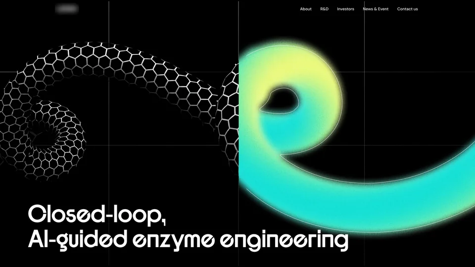
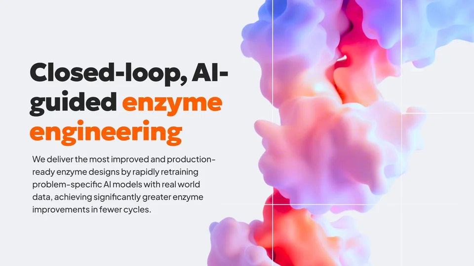
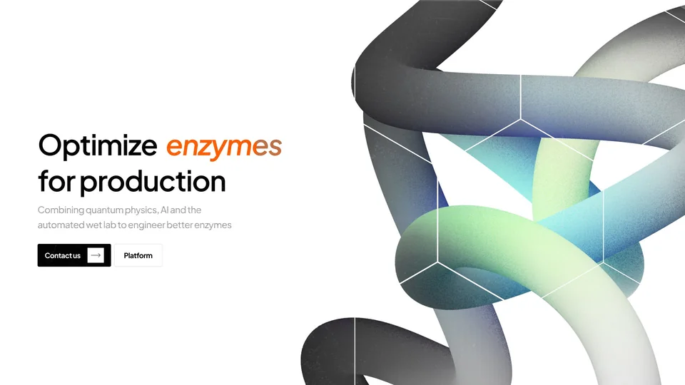
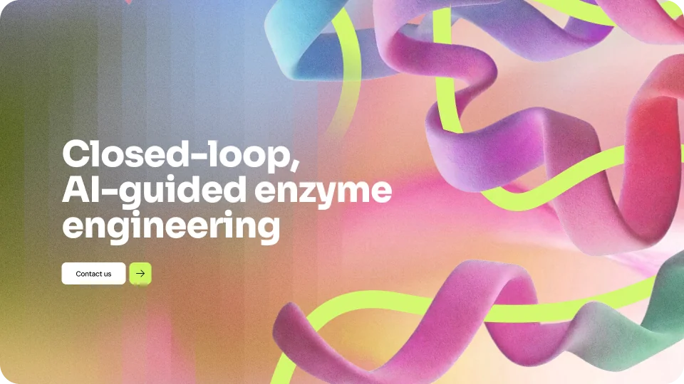
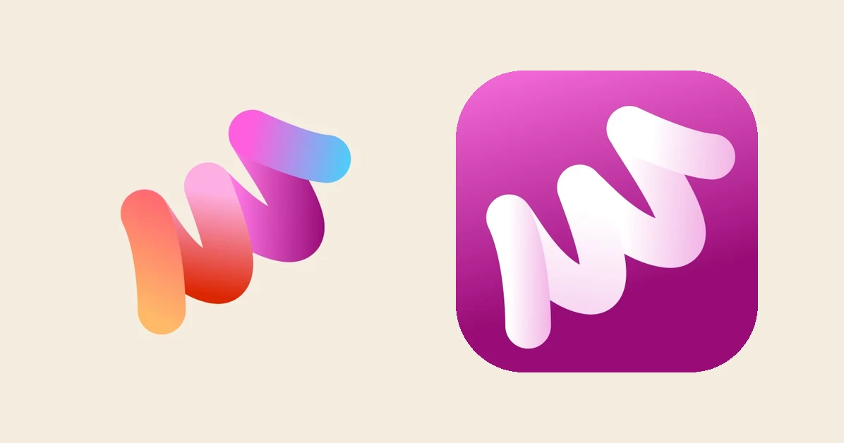
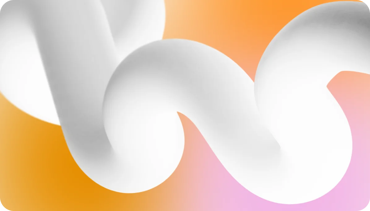
Honestly, jumping straight into enzymes would have been quicker, but those directions gave the brand its backbone, and every round after them moved closer to the science. We tried 3D proteins, then soft blobs and meshes, then a single tube we kept calling the noodle, until the client asked us to spiral it and the whole idea clicked. A very small thing with a whole world inside it was exactly what they had described at the kickoff, and now it had a shape.
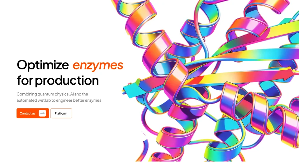
The identityA clear way into complex technology.
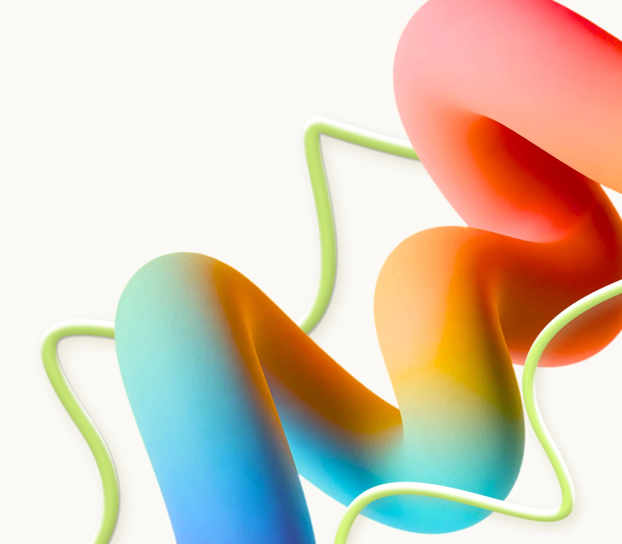
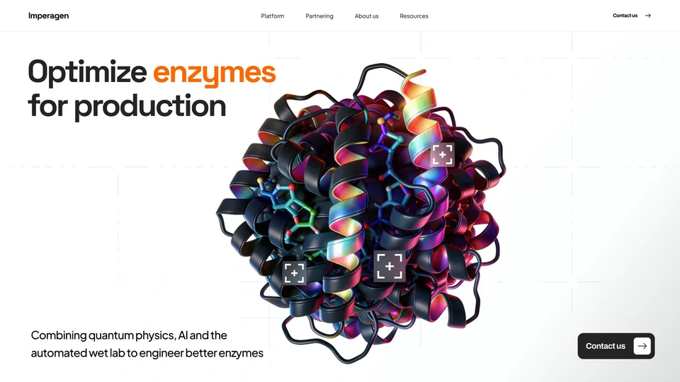
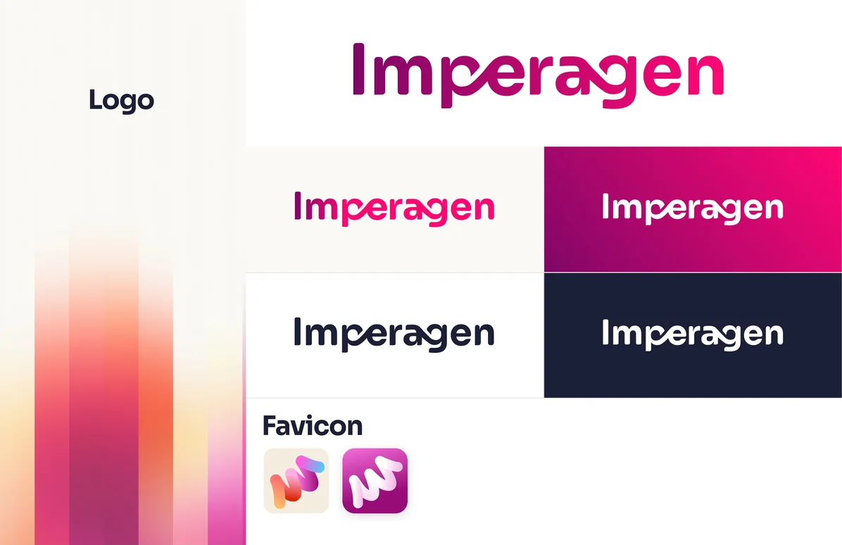
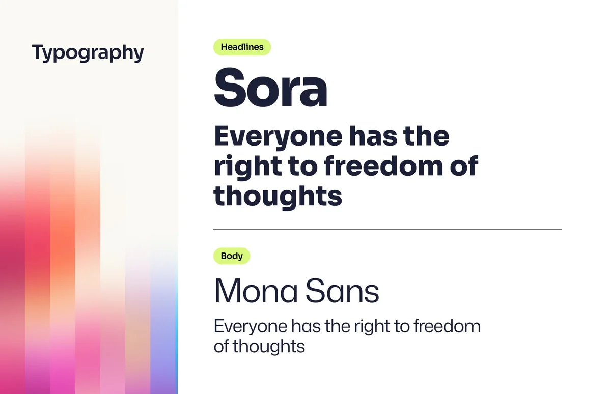
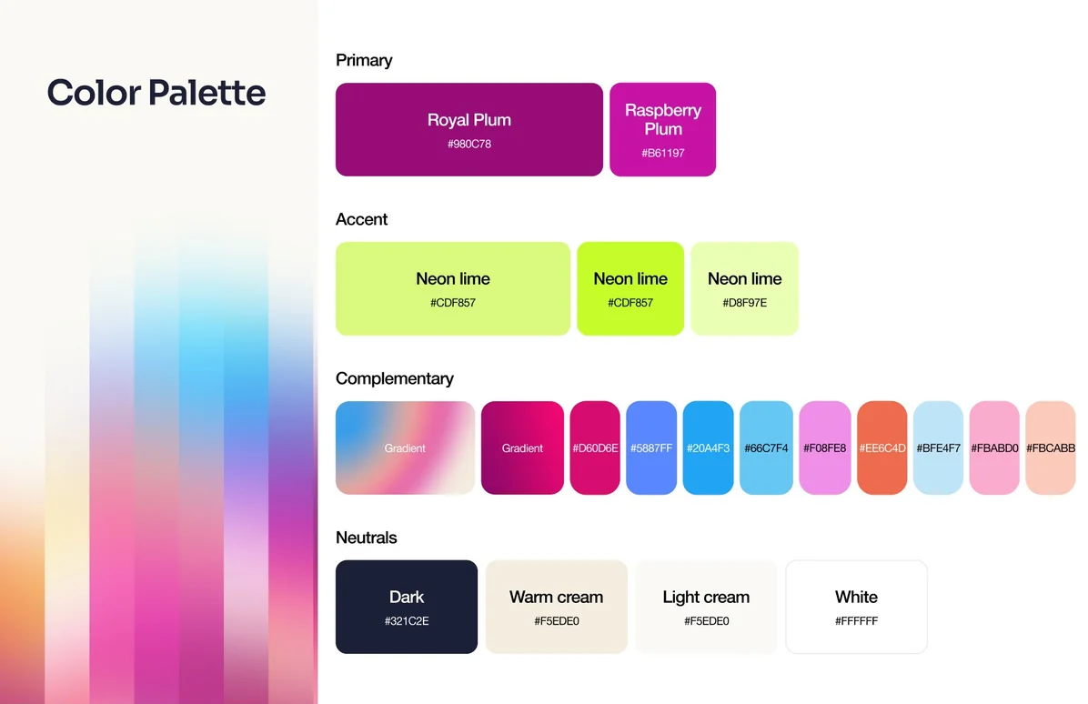
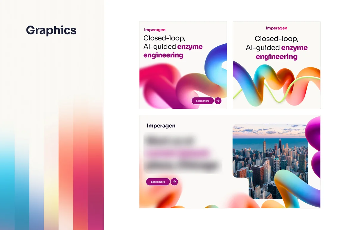
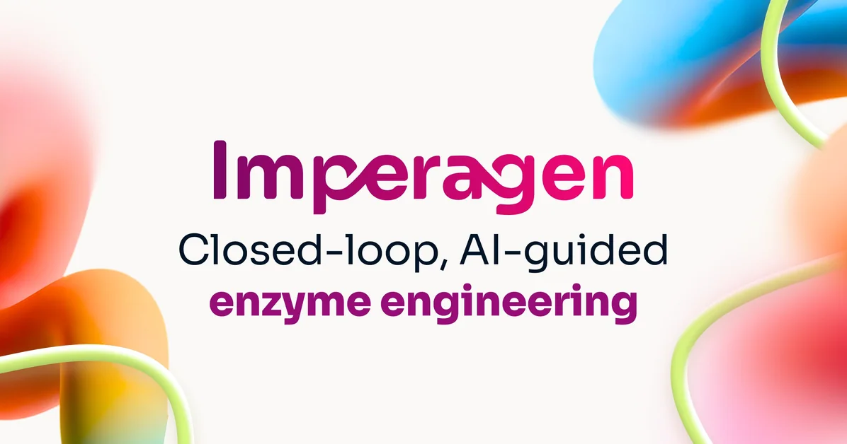
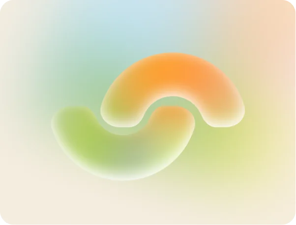
The final identity is built around a textured spiral form you almost want to touch, with an intertwined wordmark where the letters merge into each other, inspired by the way enzymes themselves work. Sora and Mona Sans carry the type, and the palette goes punchy on purpose: plum, raspberry and neon lime with bright secondaries on a warm cream base. They wanted it colourful because, as they put it, Manchester is grey: grey skies, grey streets, with all its colour coming from what the city makes (we were happy to help with that).
The website, designed and built in LovableOne team from the first sketch to the live site
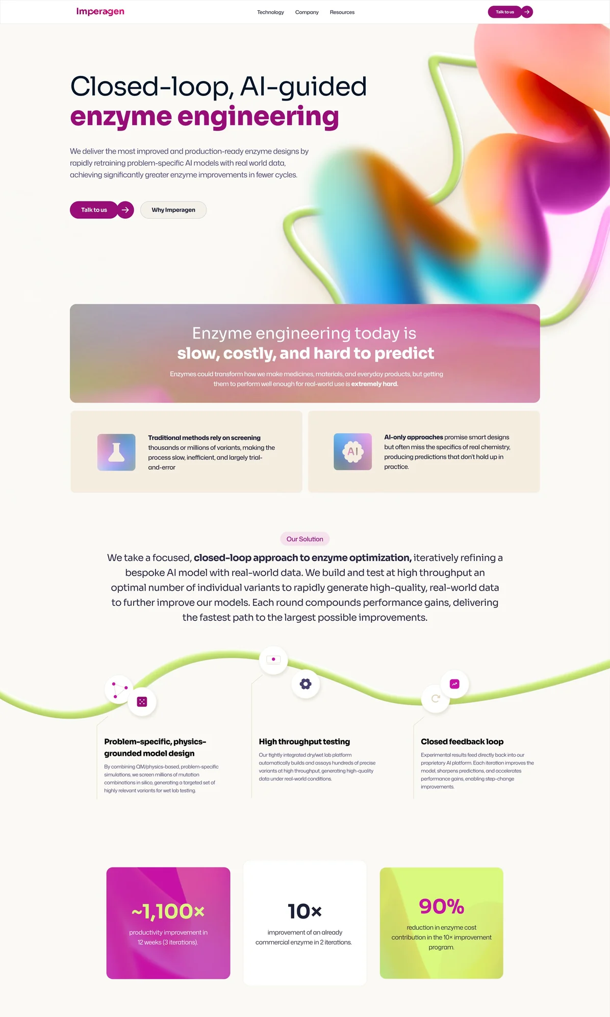
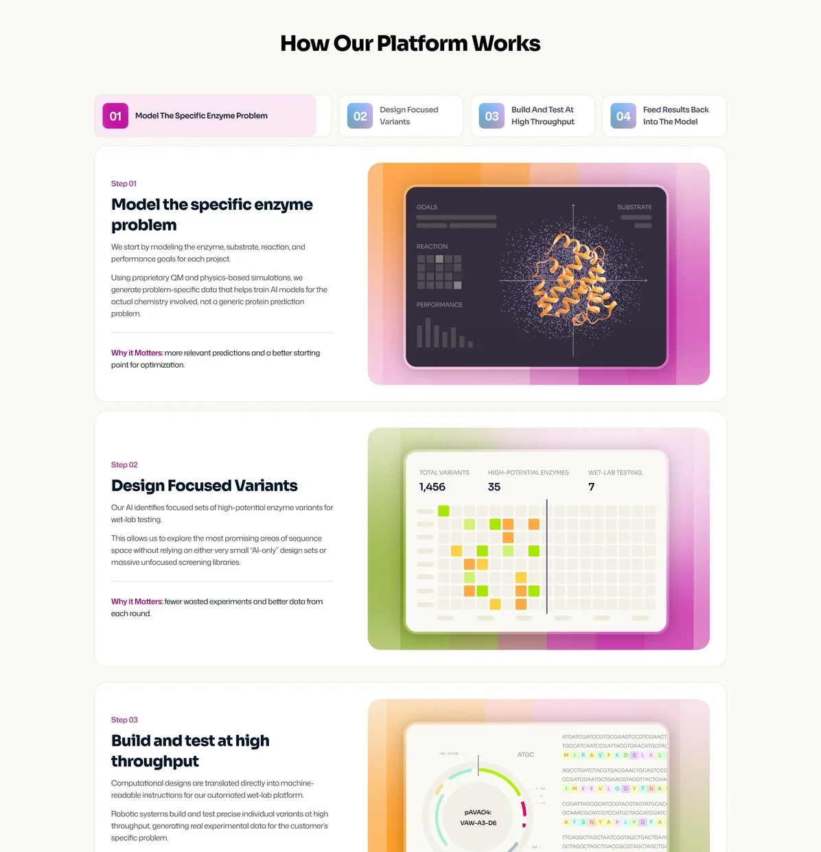
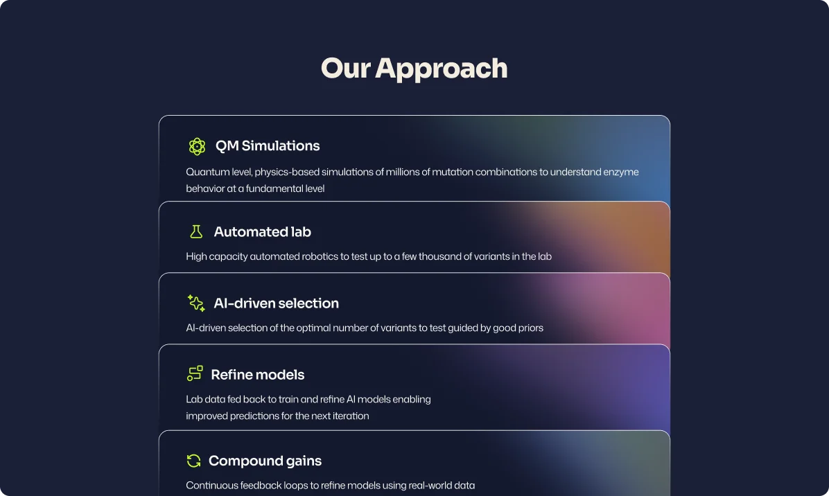
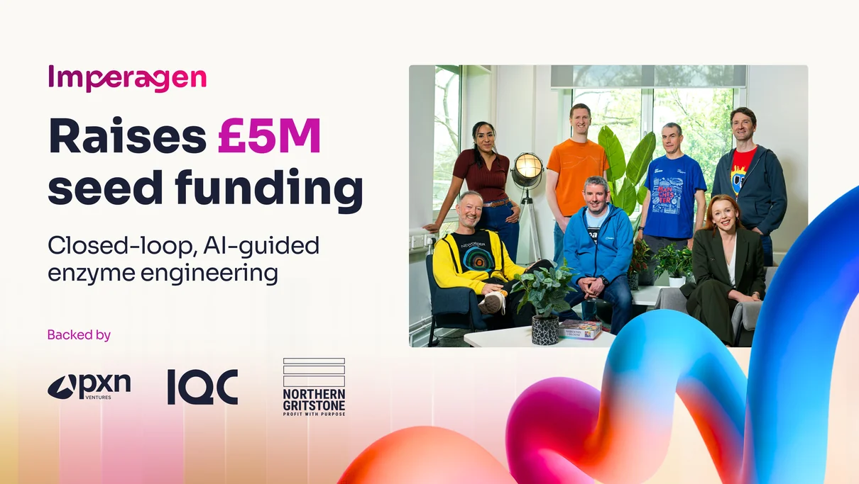
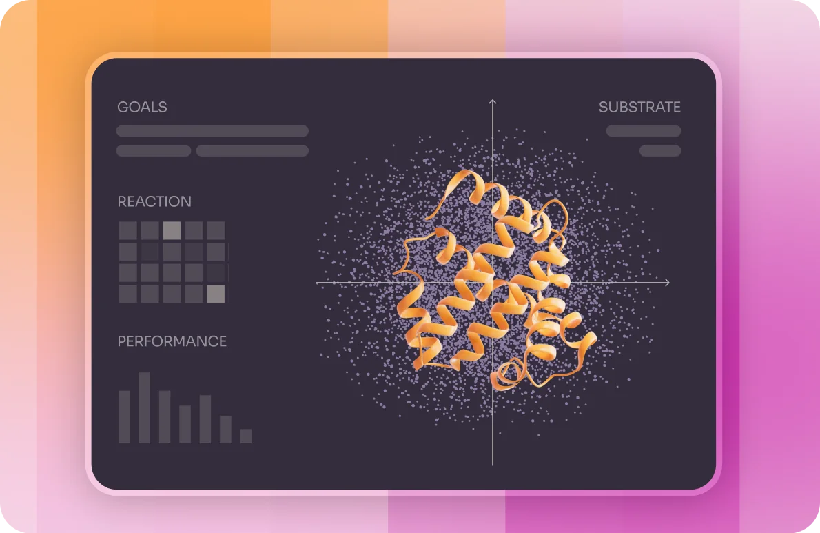
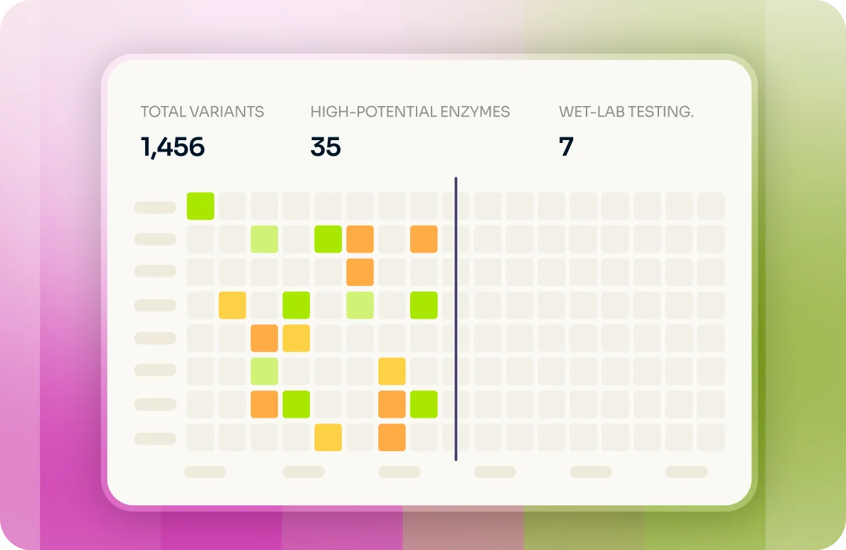
We designed and built the full site in Lovable, with a homepage, technology, about, careers, resources and contact pages, so the brand made it to the web without losing anything in a handoff between studios. The technology page does the hard work of explaining a closed loop of physics, AI and lab testing to investors, partners and future hires, and the spiral keeps the whole site feeling like one story.

We nailed this project
Don't just take our word for it!

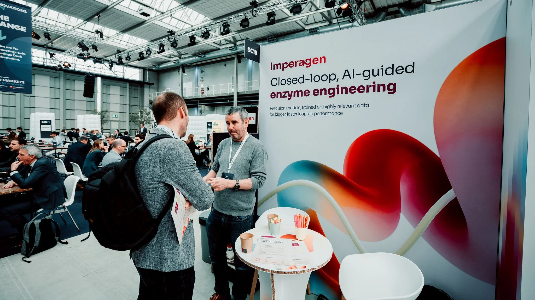
"After launching the new brand and website, we saw increased web traffic, user engagement, and leads. The brand is now extremely visible both online and offline. People recognize and remember us. They're engaged with us and approach us for discussions."

Why it worked
Research gave it roots, and the client gave it courage
Because we started with the people and the place, every concept had a reason to exist, and the client could follow the story from the cotton mills all the way to the enzyme. They asked for bold and gave us the nudge to spiral the noodle, and the result is a brand that looks nothing like the rest of biotech, which the Imperagen team tells us they love.
Just raised your round and need a brand as serious and as bold as your science?
Let's talk!