
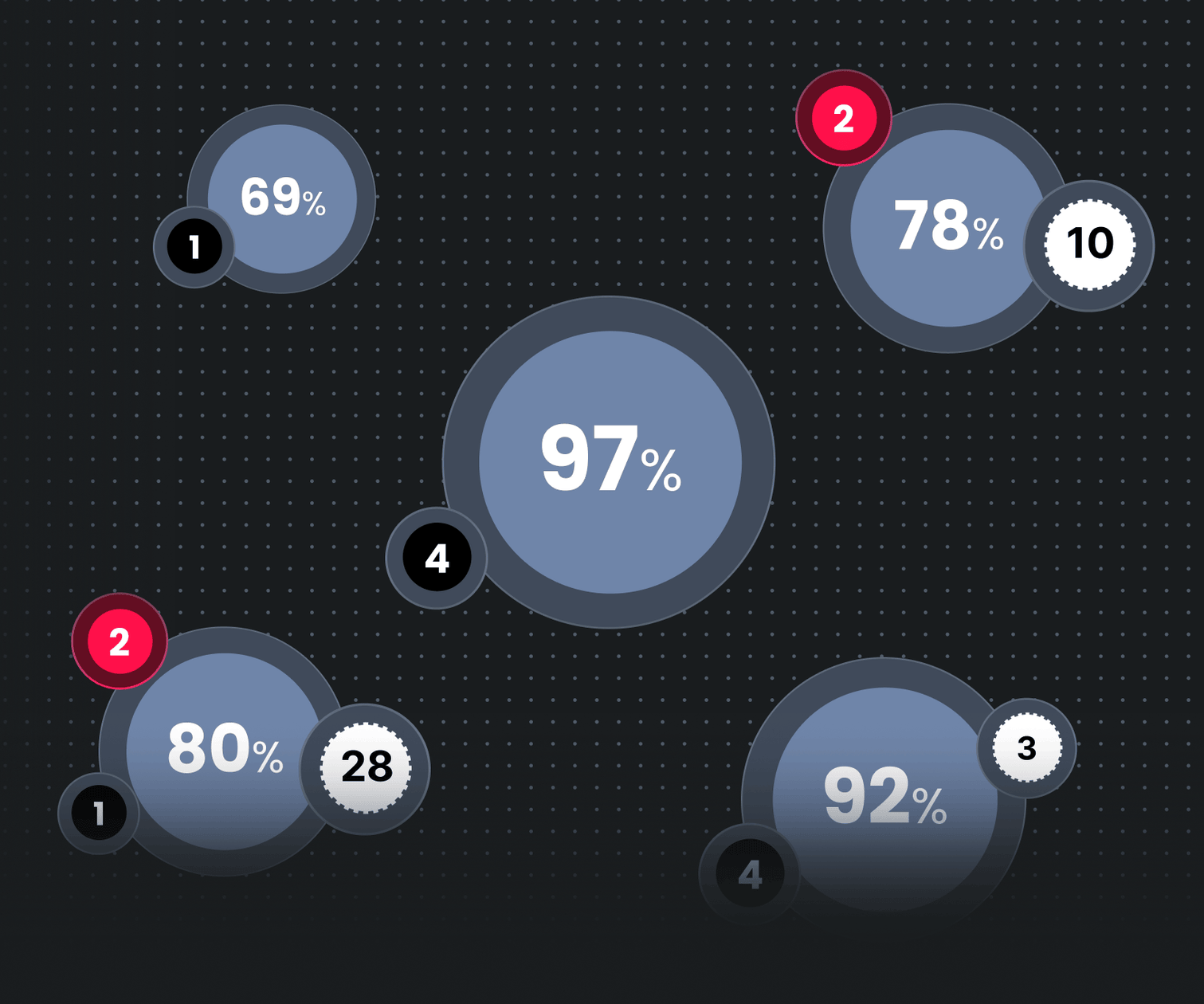

Firedome is a cybersecurity platform built for IoT managers: the people responsible for keeping fleets of connected devices safe. They needed to cut through the noise and act on what matters, not drown in dashboards and data overload. Firedome came to Mondeo ready to challenge the industry's default: the endless, unforgiving table.
Overview
For a cybersecurity platform drowning in data, the default was you guessed it a giant table. Rows on rows of raw, unreadable detail.
Most cybersecurity platforms love tables. Which makes sense when you’re dealing with logs, alerts, metadata, and incident reports, a grid of rows and columns feels like the safest bet.
But here’s the thing: no one actually likes using them.
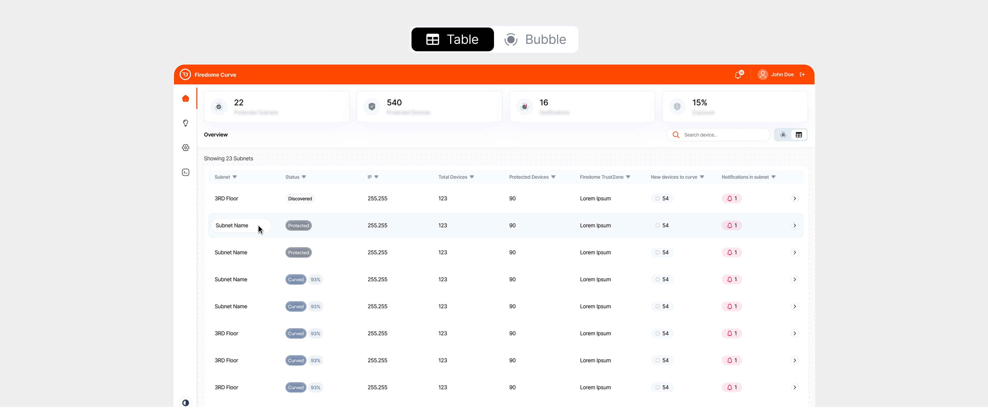
The UI for this cybersecurity client was a prime example. It displayed thousands of threat signals in a standard table view: dense, flat, and painful to navigate. Finding patterns meant scrolling, filtering, toggling columns, opening new windows… and still hoping you clicked the right row.
For analysts working under pressure, this wasn’t just annoying. It was inefficient. And in cybersecurity, inefficiency is a risk.
“”"Every cybersecurity tool looks the same: walls of tables that take forever to scan. We know our data tells a more interesting story. Help us show it differently."
How we brought it to life
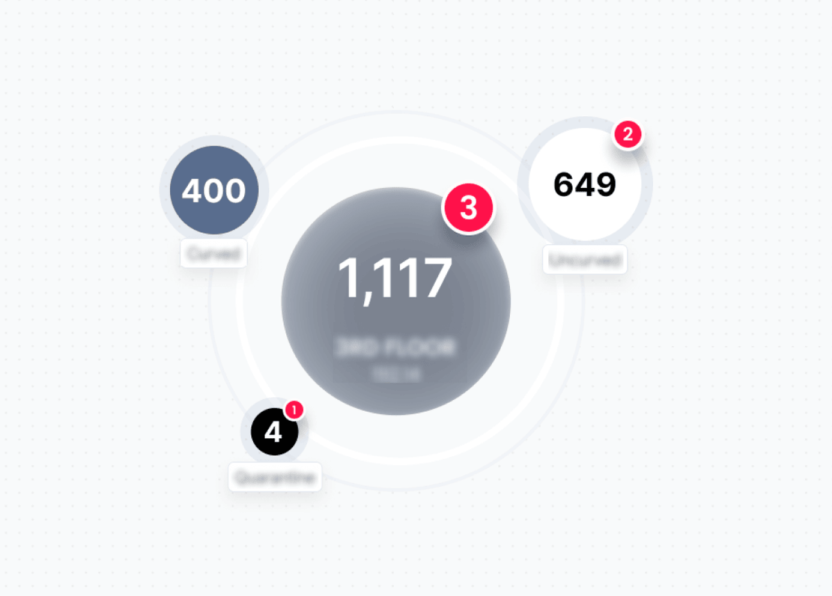
We redesigned Firedome's core interface around a bubble-based visualization model, a spatial, relationship-driven approach that lets analysts see clusters, anomalies, and connections at a glance instead of hunting through rows. The redesign preserved the platform's technical depth while dramatically reducing the time it takes to orient, prioritize, and act. Firedome walked away with a product interface that looks as advanced as it actually is.
Deliverables:
- Product Design
Product designFrom flat lists to spatial intelligence
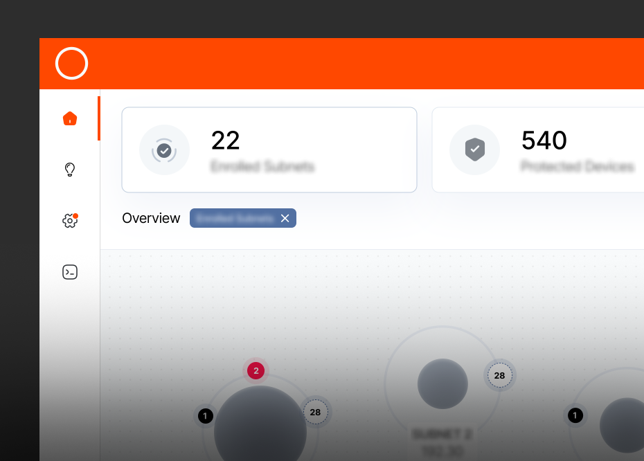
We replaced the platform's table-first architecture with a bubble view system that maps security data spatially, grouping related risks, surfacing weighted relationships, and letting users navigate by context rather than by column. The interface uses dark, high-contrast visual design with sharp orange signaling to direct attention exactly where it needs to go. It's a product that finally matches the sophistication of the analysts using it
Make it visual, without losing the detail
We were asked to redesign the UI for this platform’s core intelligence view:
- Dozens of data types
- Thousands of entries
- Relationships between threats, assets, and endpoints
- And a team of analysts who didn’t want style over substance
So we asked the obvious question:
Why not show relationships as relationships?
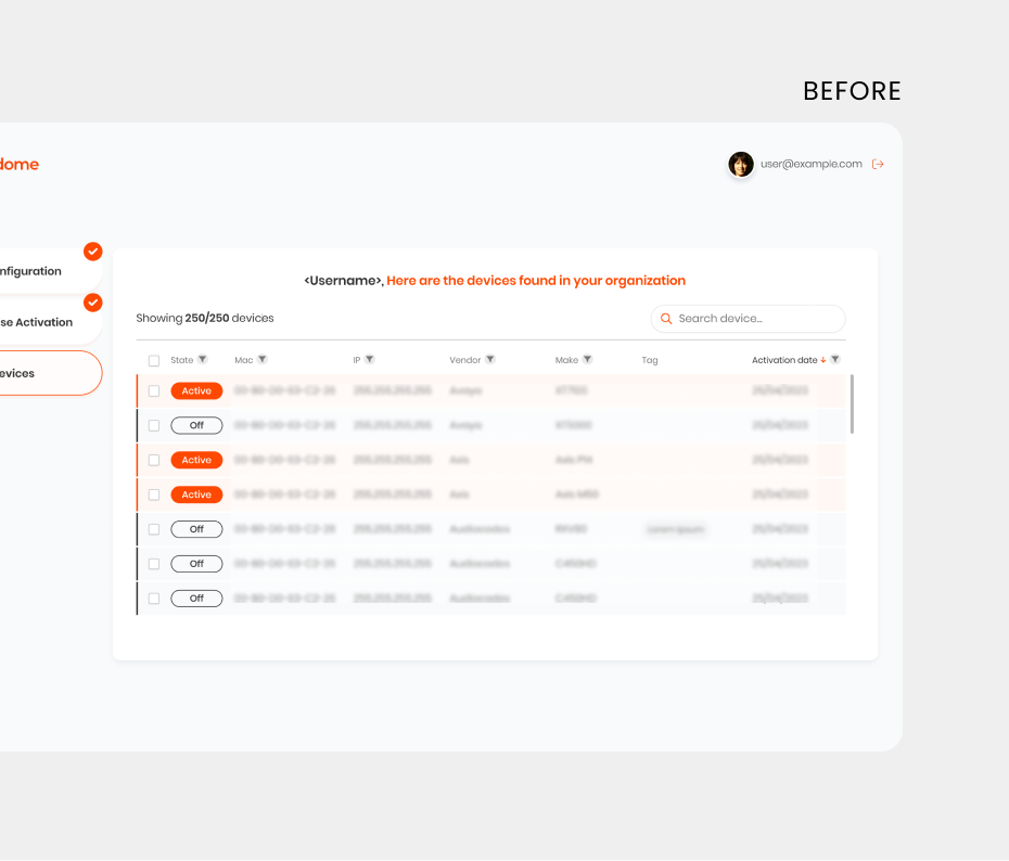
From flat lists to dynamic views
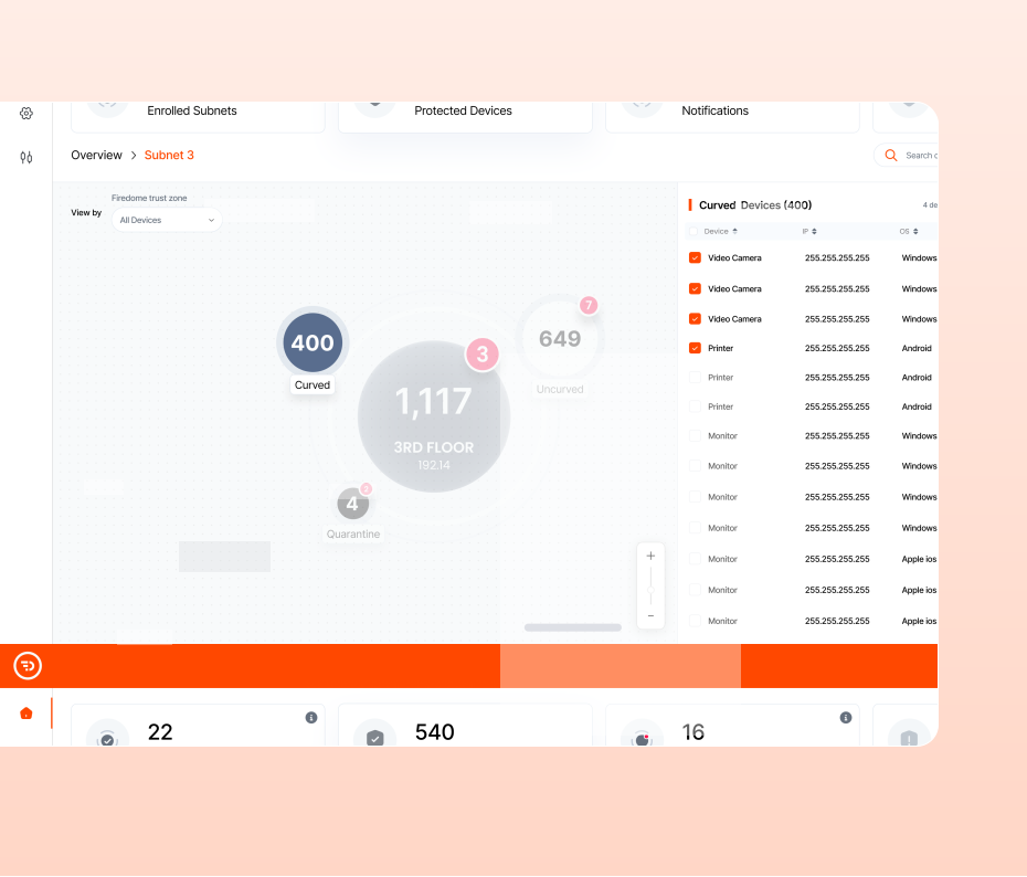
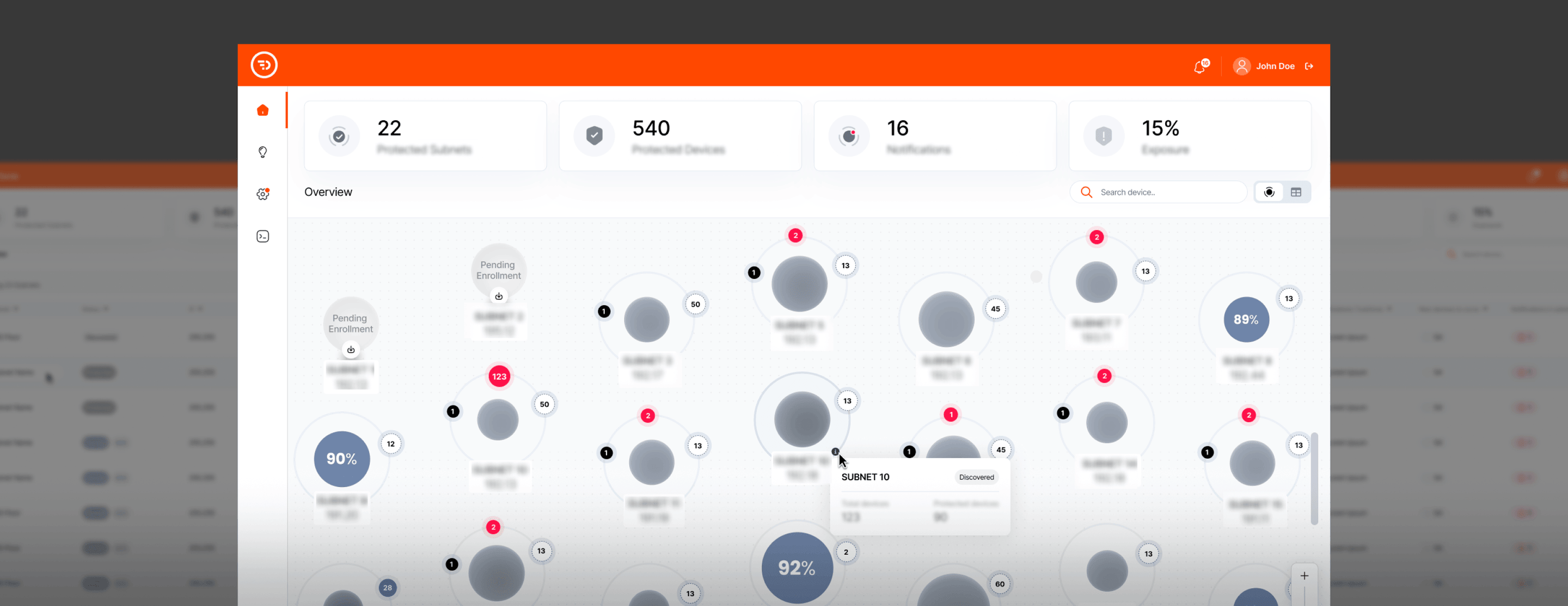
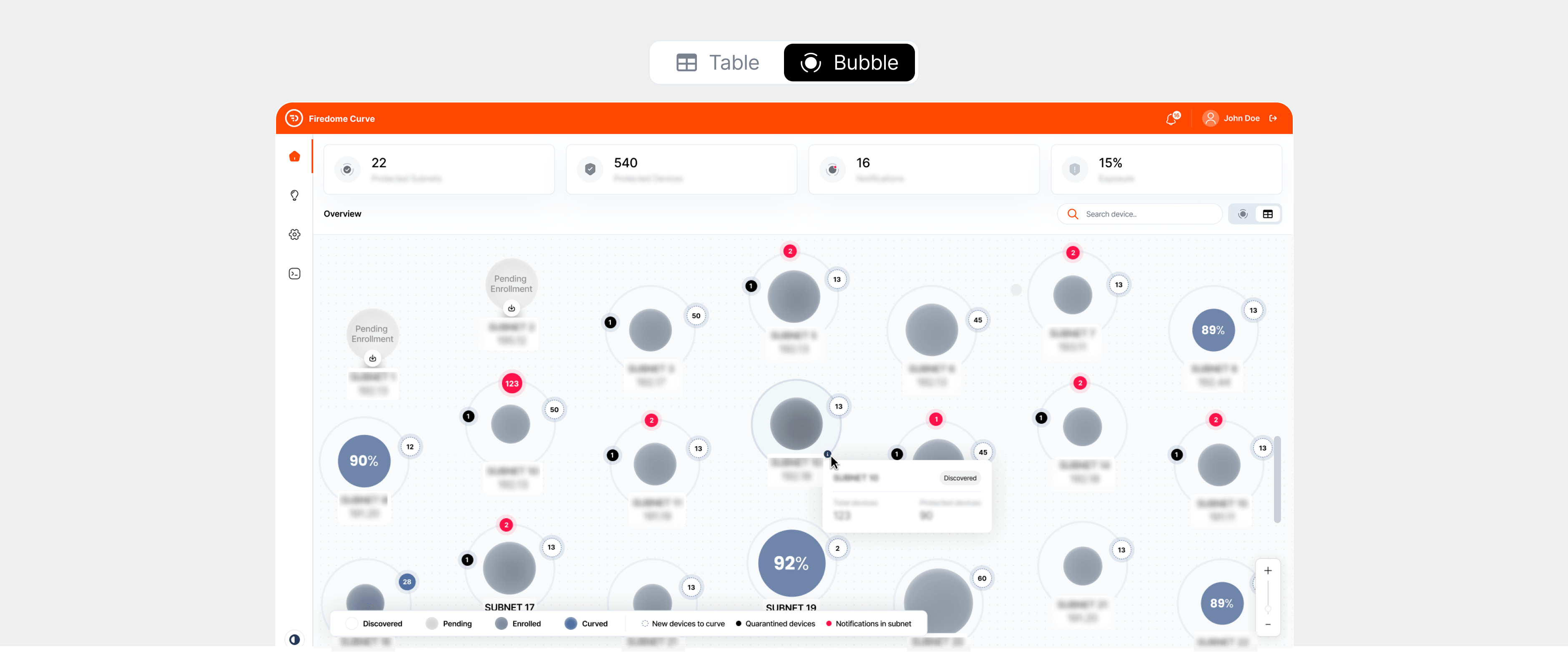
We replaced the overwhelming table with a bubble-based interface. Each bubble represented a threat or asset, size-weighted, and relationally mapped.
Zoom in, zoom out, instantly grasp context.
Same data. Radically better understanding.
Same data. Radically better understanding.
- Want to dive into the details? Zoom in.
- Need the big picture? Zoom out.
- Looking for a pattern? It’s right there.
No more guessing. No more flipping between tabs and hoping for a eureka moment.
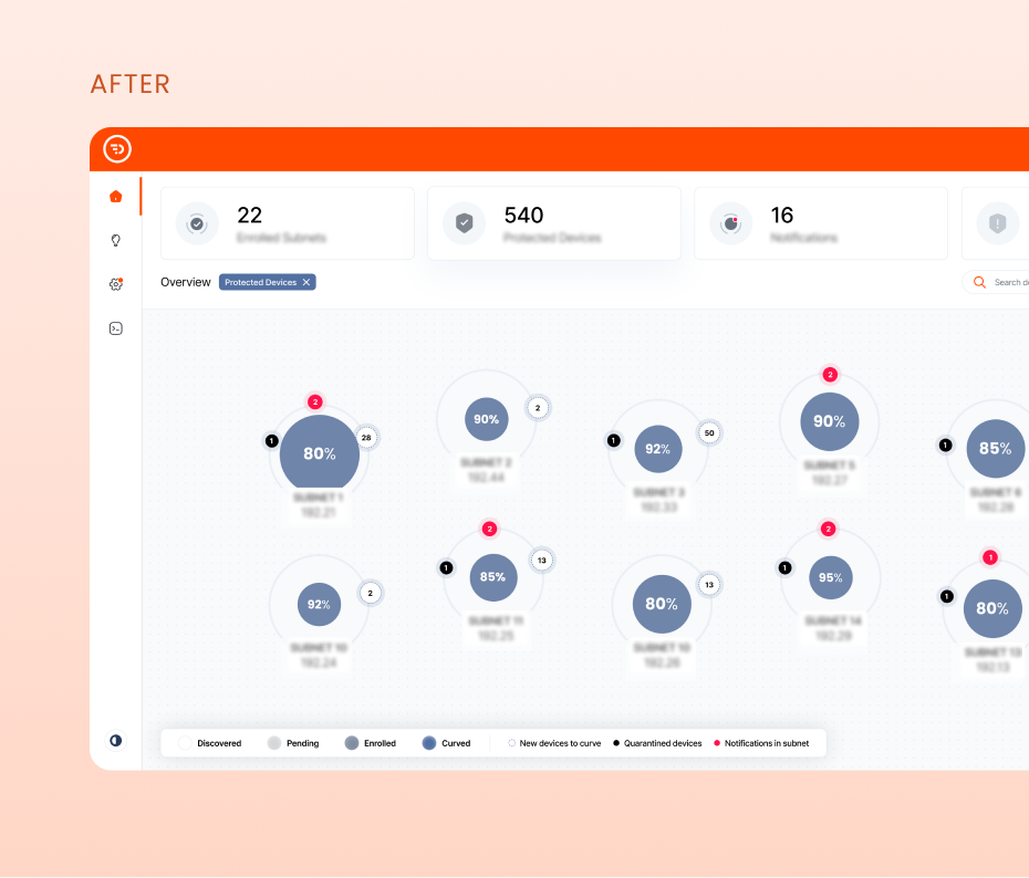
What we deliver
How the bubble view works:
Zoomable canvas with panning and drill-down
Proximity-based relationships to show what’s linked and why
Visual grouping for threat families, asset types, or severity levels
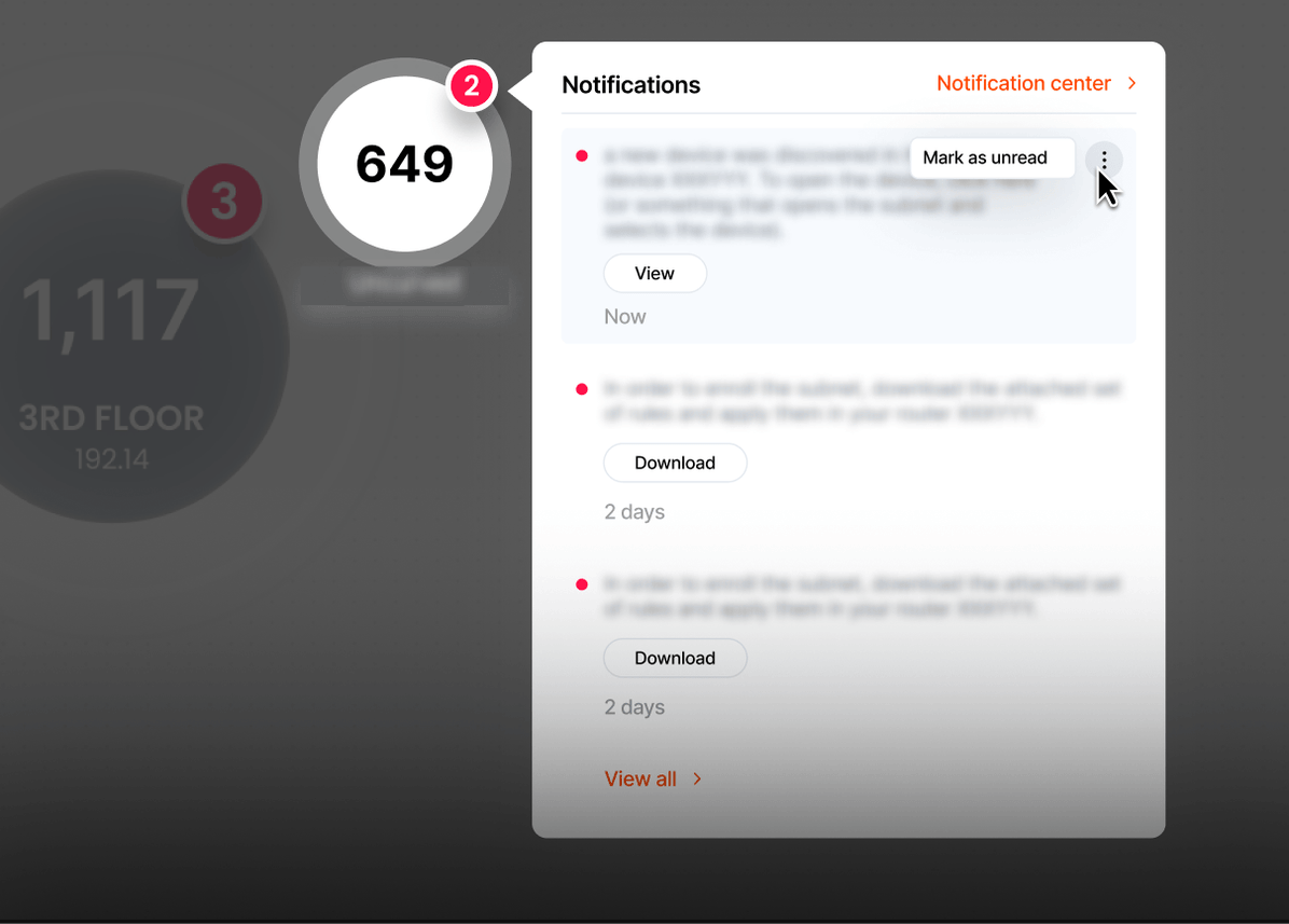
On-hover previews and click-to-expand metadata
We didn’t just design for aesthetics. We designed for speed, clarity, and insight.
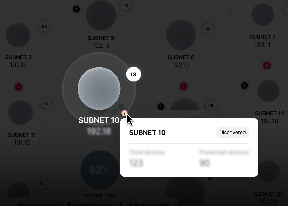
What we changed:
- Analysts spotted threat clusters instantly
- The interface actually explained itself, no training manual needed
- Plus, let’s be honest: it looked good. And in a field full of clunky dashboards and Excel clones, looking good is a competitive advantage.
Why everyone uses tables (and why they shouldn’t)
Tables are for databases, not for people.
Sure, tables are how databases are built. Structured. Queryable. Machine-friendly.
But once you go beyond a handful of rows and columns, the human eye taps outWhat starts as “organized data” quickly becomes a flat sea of sameness, impossible to scan, hard to prioritize, and downright hostile when decisions need to be made fast.
We’re not designing for SQL queries. We’re designing for humans trying to make sense of complexity under pressure.
And yet tables are the default because they’re safe. Familiar. Easy to code.
But default doesn’t mean effective.
When you’re dealing with complex systems, interdependencies, and urgency, tables flatten the data and bury the story. We design interfaces that pull that story to the surface.
Why it worked
The insight was simple but bold: tables are for spreadsheets, not for threat response. By reimagining how Firedome's data is spatially organized and visually weighted, we gave security teams a tool that works the way they actually think: scanning broadly, drilling into anomalies, making fast calls. The bubble view isn't just a design choice; it's a different philosophy for how security interfaces should behave.