


Epilog is a digital legacy platform built around one quietly powerful truth: love doesn't end with goodbye. Their platform helps people preserve personal messages, memories, vital documents, and final wishes, securely stored and unlocked for loved ones when the time comes. Epilog doesn't just organize end-of-life logistics; it companions people through one of life's most human experiences.
Overview
The challenge
End-of-life platforms have a branding problem: they either feel clinical and cold, or overly sentimental in ways that make people avoid the conversation entirely. Epilog needed a brand that could hold the emotional weight of their mission without tipping into either extreme. Their identity had to feel warm enough to welcome grief, authoritative enough to inspire trust, and beautiful enough to make people actually want to engage.
“"What we're building is deeply human, but nothing in our brand reflects that yet. We need something that feels like a lighthouse: grounding, calm, and quietly guiding people through the hardest moments."”
How we brought it to life
We built Epilog's identity around a visual language of stillness and depth: a muted, atmospheric palette drawn from twilight skies, misty coastlines, and quiet forests. The logo is clean and composed, carrying gravity without heaviness. We carried that tone through a full website experience, a custom illustration system, and a brochure suite — every piece designed to make a difficult conversation feel like a meaningful one.
Deliverables:
- Branding Concept & Logo Design
- Brand Guide & Visual Identity
- Website Design UX & UI
- Marketing Assets
Check out the stunning assets we've created!
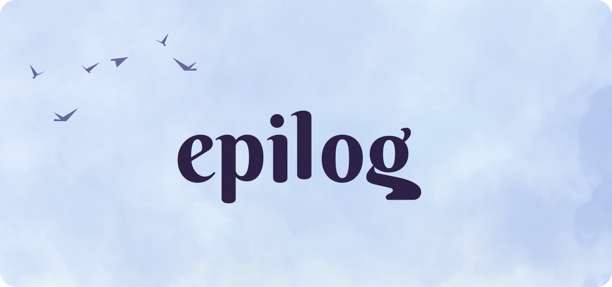
Epilog websiteBranding concept & logo designA mark that means peace
The Epilog mark needed to carry a rare combination: intimacy and authority, softness and permanence. We designed a wordmark rooted in elegant, unhurried typography, dignified without being distant. A brand people feel safe handing the hardest parts of their story to.
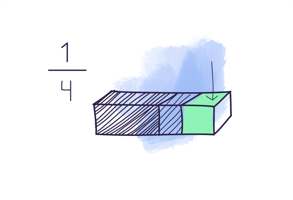
Epilog's visual system needed to hold up across a mobile app, a marketing site, and printed materials, all without losing its emotional register. We built a brand guide around a cohesive palette of muted purples and atmospheric tones that keep every touchpoint feeling considered, and deeply human.






Website designWhere clarity clicks
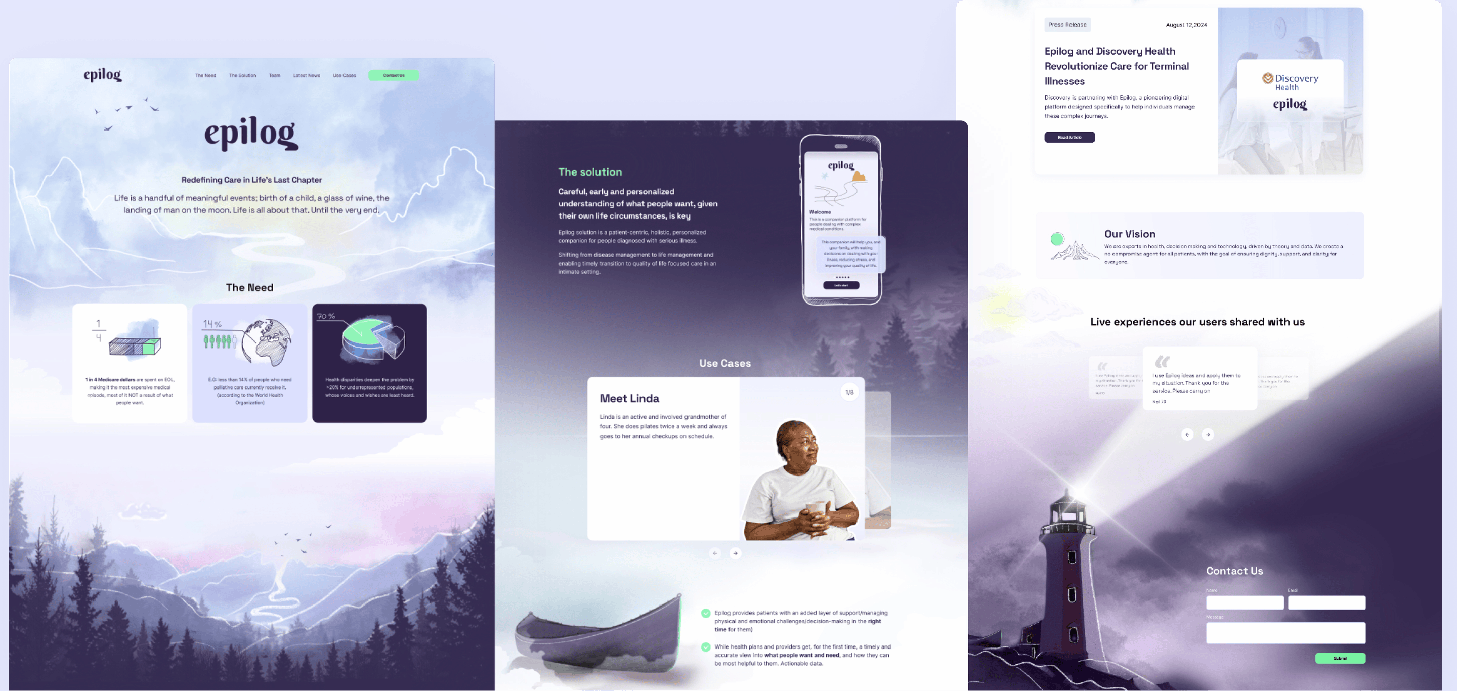
Epilog's website had one job: make an uncomfortable subject feel approachable. We designed a site that leads with warmth - atmospheric imagery, unhurried layouts, and a visual hierarchy that guides users gently through what Epilog offers and why it matters. The UI kit grounds the experience in structure, so the platform scales cleanly as the product grows without losing its voice.
Marketing assetsBuilt for the hardest conversations
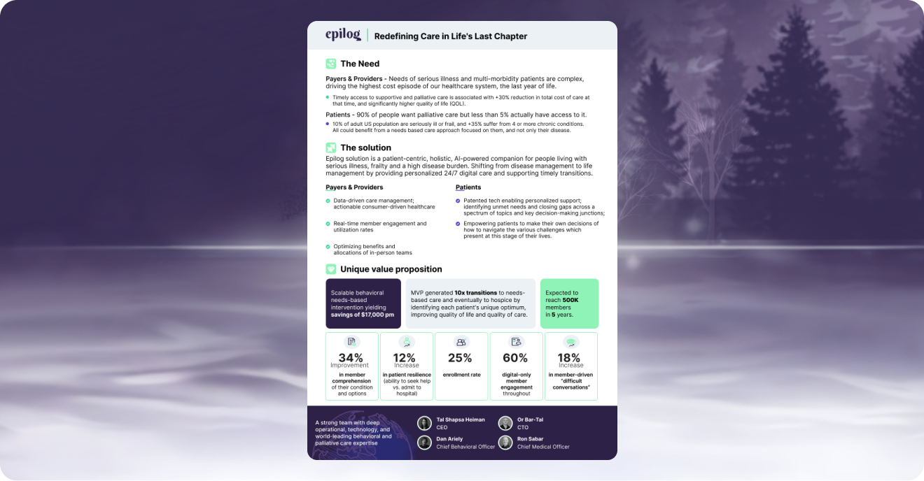
Epilog's brochures and one-pagers had to do something most marketing materials never attempt: make people feel seen. We designed a suite of collateral that explains the platform's features without reducing them to bullet points, using clean layouts, considered imagery, and copy-friendly structure that leaves room for the message to breathe.
Why it worked
Epilog's brand works because it doesn't look away. By building a visual identity rooted in atmospheric depth rather than avoidance, we gave them a brand that mirrors what their platform actually does - holding space for something profound, and making it feel safe to begin. Every design decision was made in service of one feeling: you're in the right place.
Building something that deserves to be felt, not just seen?