
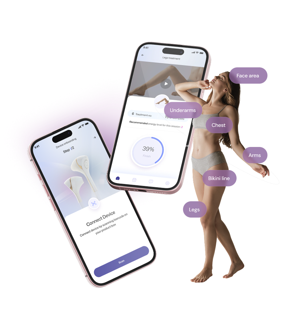

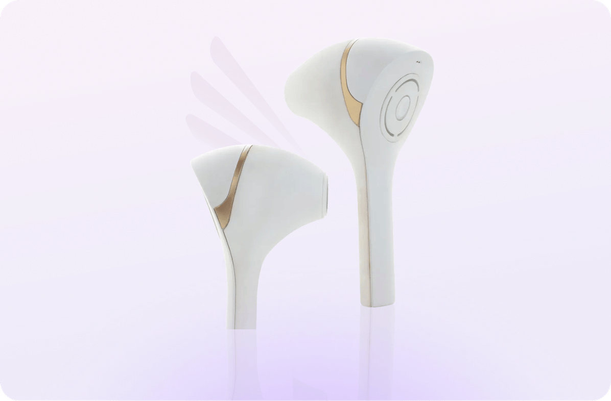
Epilaser, by Epilady, is the world's first smart, professional-grade at-home laser hair removal device, and the first of its kind to earn FDA clearance. Built with a Smart Vision System that uses AI-powered image processing to detect and hyper-target individual hair follicles, Epilaser delivers permanent results in 90 days across all skin tones. It's clinical technology, designed for your bathroom shelf.
Overview
The challenge
Epilaser had built something genuinely groundbreaking: a $13M investment, four diode lasers, medical-grade intelligence, and results backed by clinical studies. But a device this sophisticated needs an app experience to match. Users needed to be guided through a treatment protocol that's precise, personalized, and ongoing, without ever feeling like they were operating medical equipment. The app had to bridge the gap between clinical and comfortable.
“”"We've built the most intelligent at-home laser device in the world, but the app is where the user actually lives. It needs to feel as smart as the device, and as easy as any beauty routine."
How we brought it to life
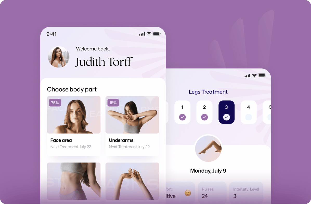
We designed Epilaser's companion app from the ground up, mapping out the full user journey from onboarding and skin tone detection through treatment scheduling and progress tracking. Every screen was built to make a complex, multi-session protocol feel effortless. A soft, clean visual language, rooted in the brand's lavender palette and clinical whitespace, gives the app a beauty-forward feel that earns the user's trust before the first pulse.
User flowEvery step, thought through
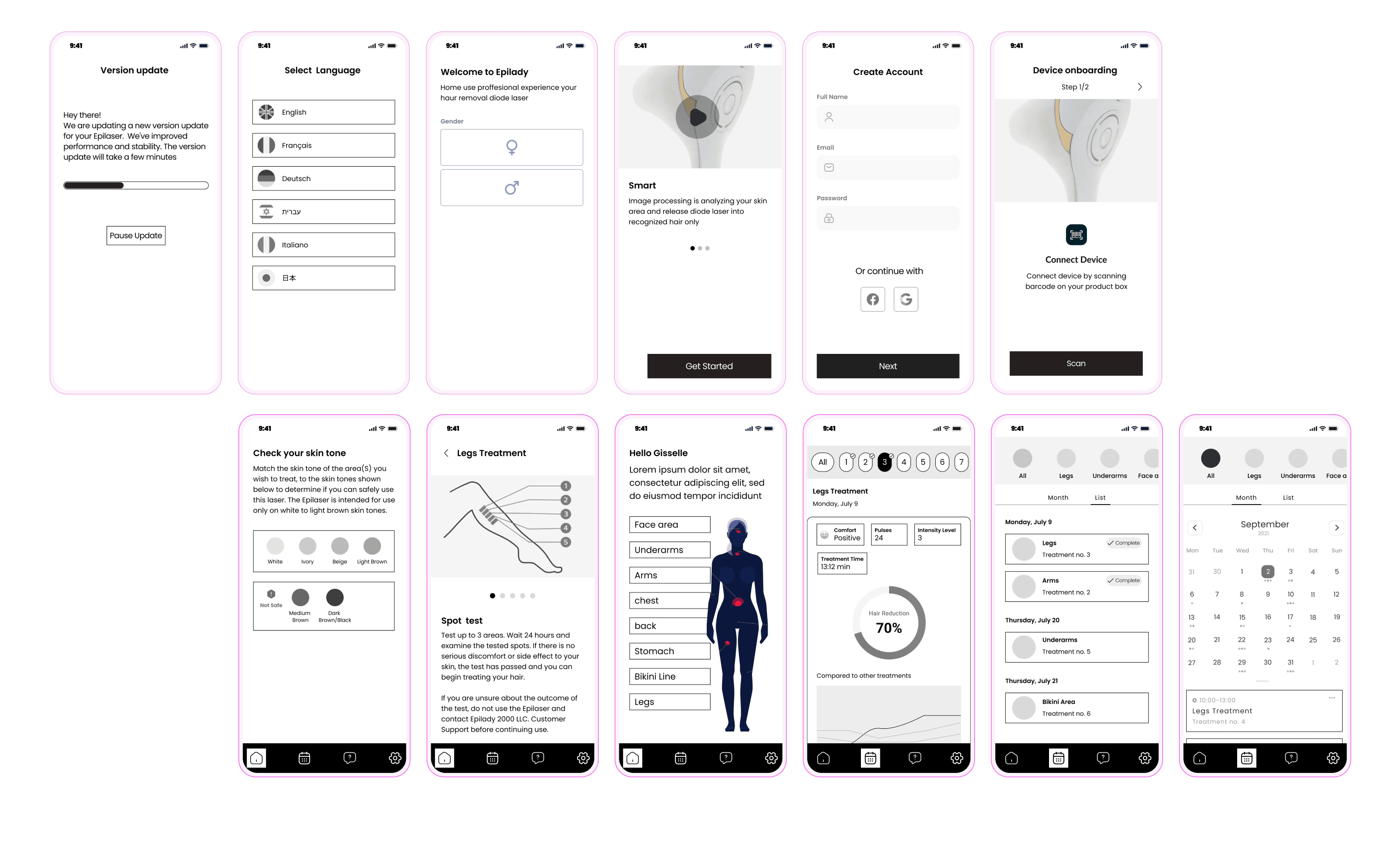
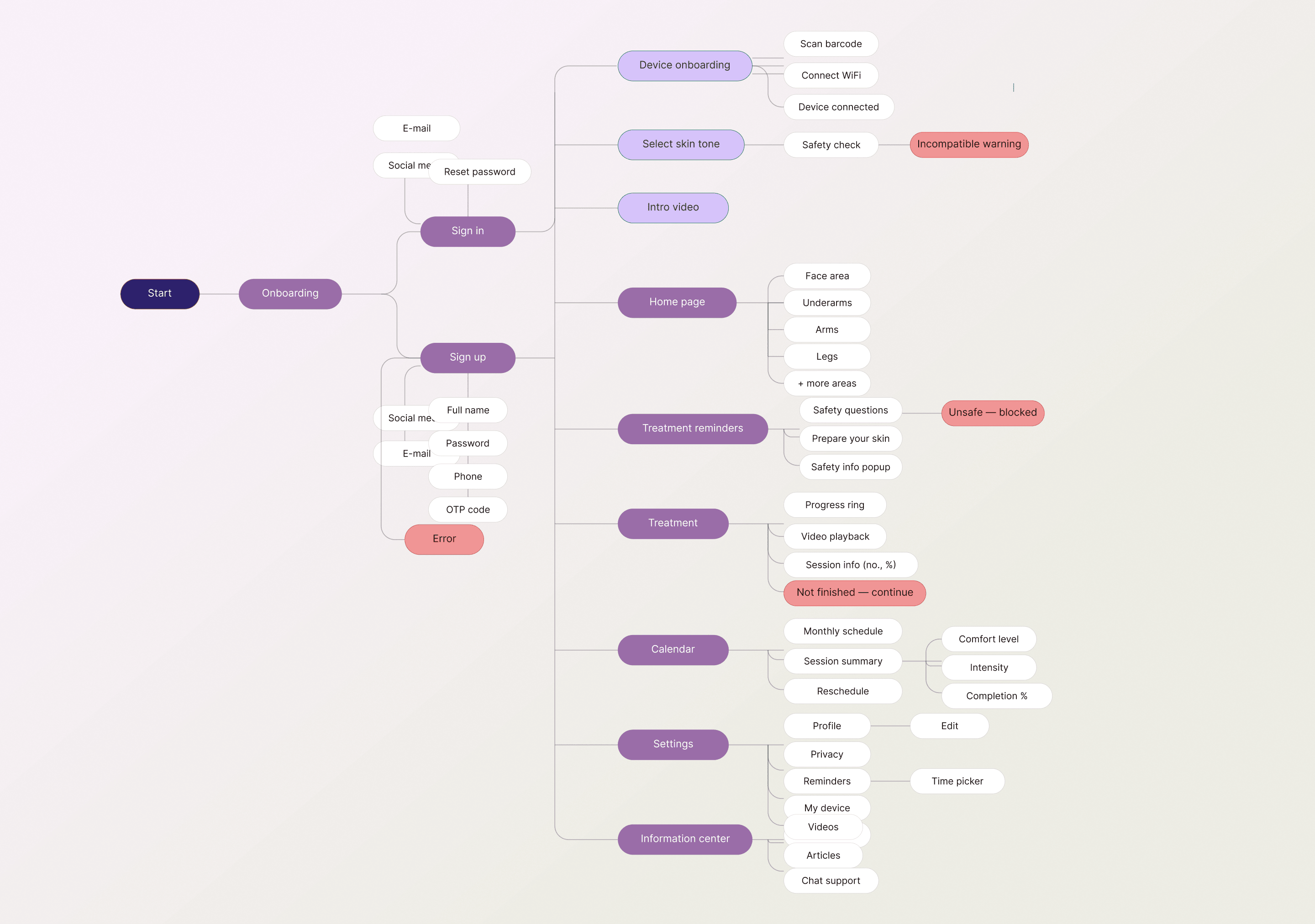
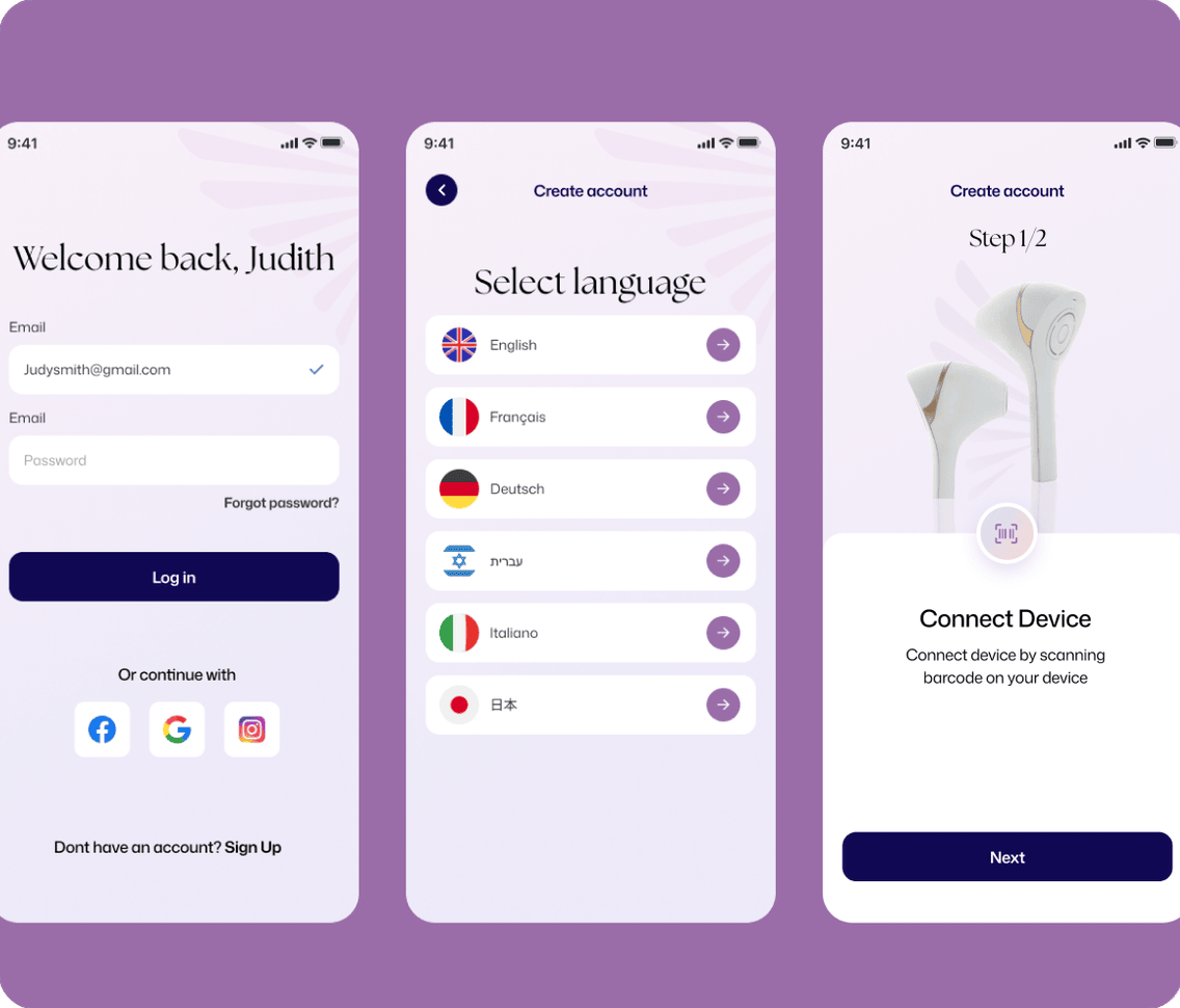
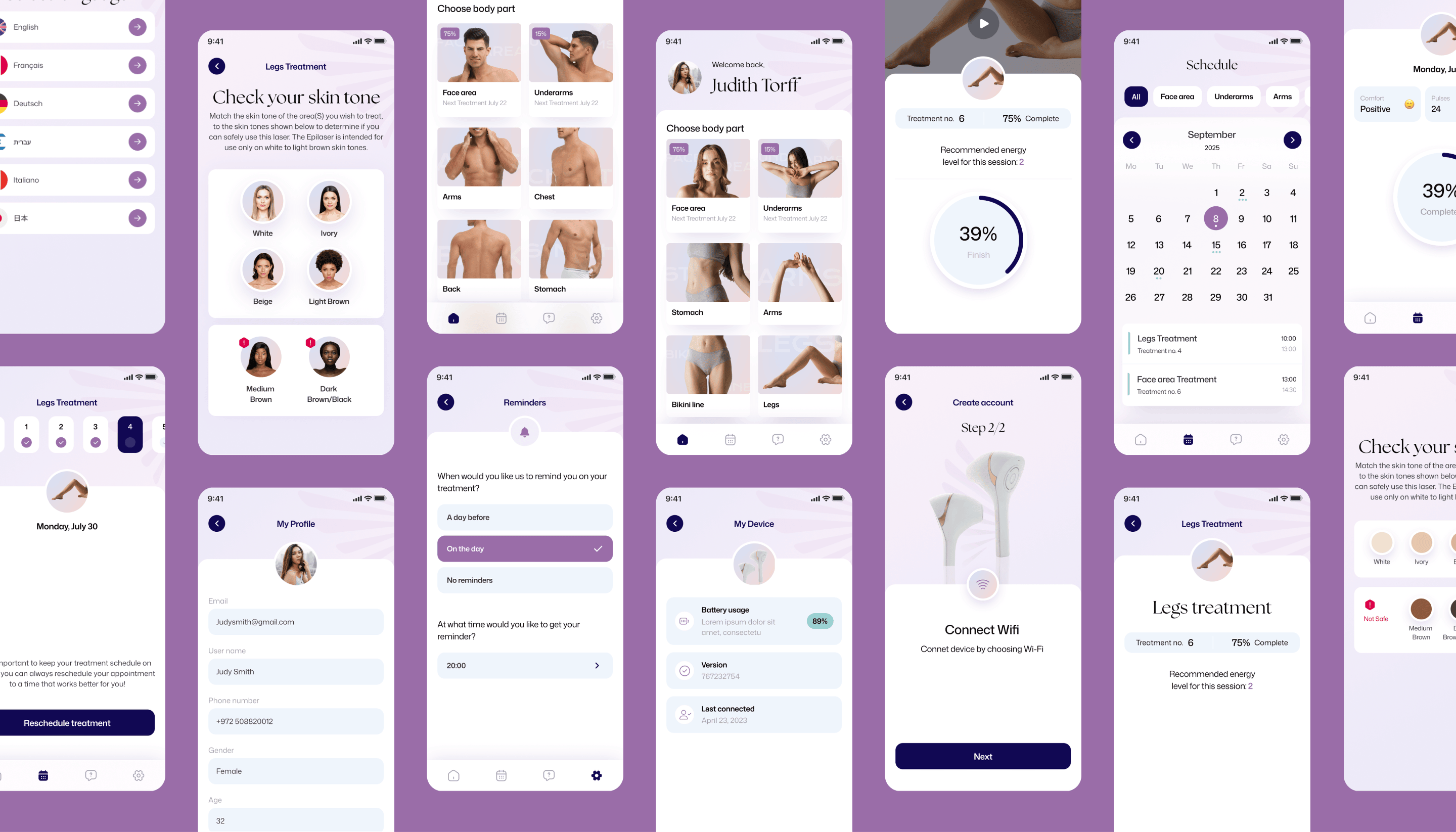
We mapped the full end-to-end journey, from unboxing to long-term treatment tracking, before a single screen was designed. The flow handles language selection, gender personalization, account creation, and device pairing via barcode scan, then guides users through a skin tone safety check and spot test before their first session. Treatment reminders, area selection across seven body zones, real-time session tracking, and a monthly progress calendar all live within a single, unbroken journey. Nothing is left to chance, because when you're dealing with a laser device, every edge case needs a designed answer.
UI guide style Soft enough to trust, clear enough to follow
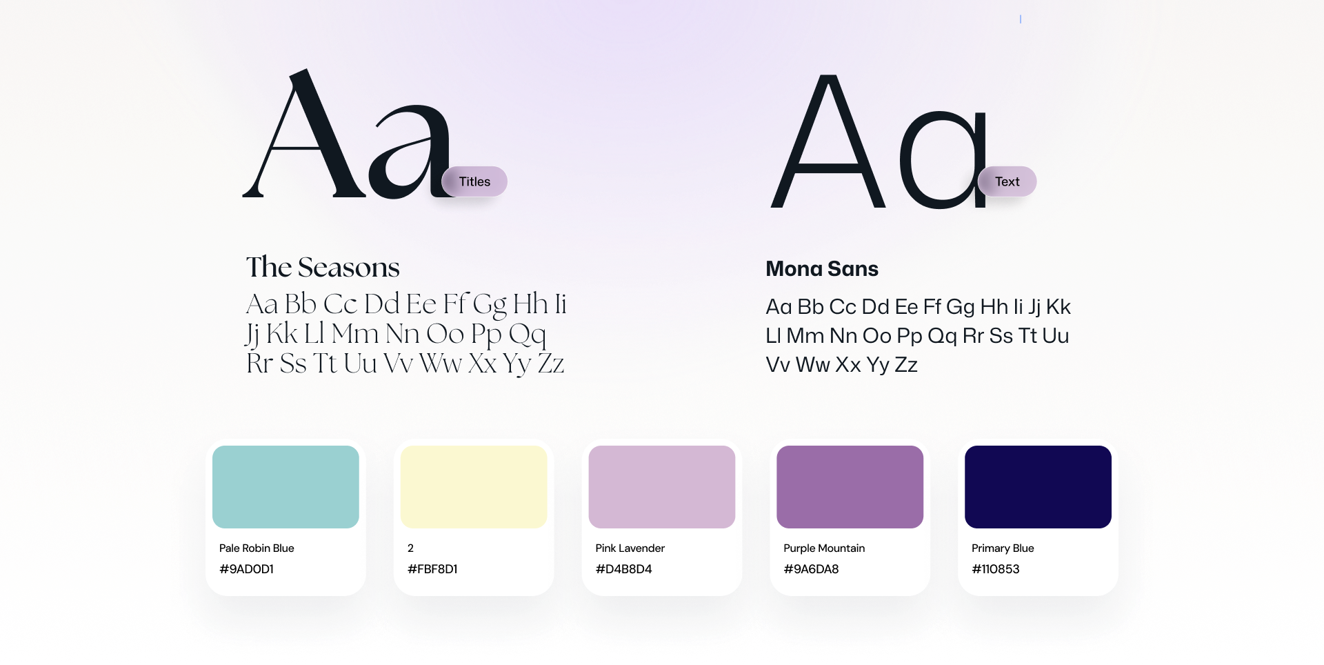
We built Epilady's visual language around the person holding the device, designing a system that feels reassuring, premium, and distinctly feminine without ever being frivolous. The Seasons brings editorial warmth to headlines, while Mona Sans keeps body text clean and clinically legible. The palette (soft Pale Robin Blue, Pink Lavender, Purple Mountain, and a grounding Primary Blue) creates an atmosphere that sits closer to a luxury skincare brand than a tech app. Every colour, type choice, and gradient was chosen to make users feel like they're in expert hands.
Product designClinical precision, effortless feel
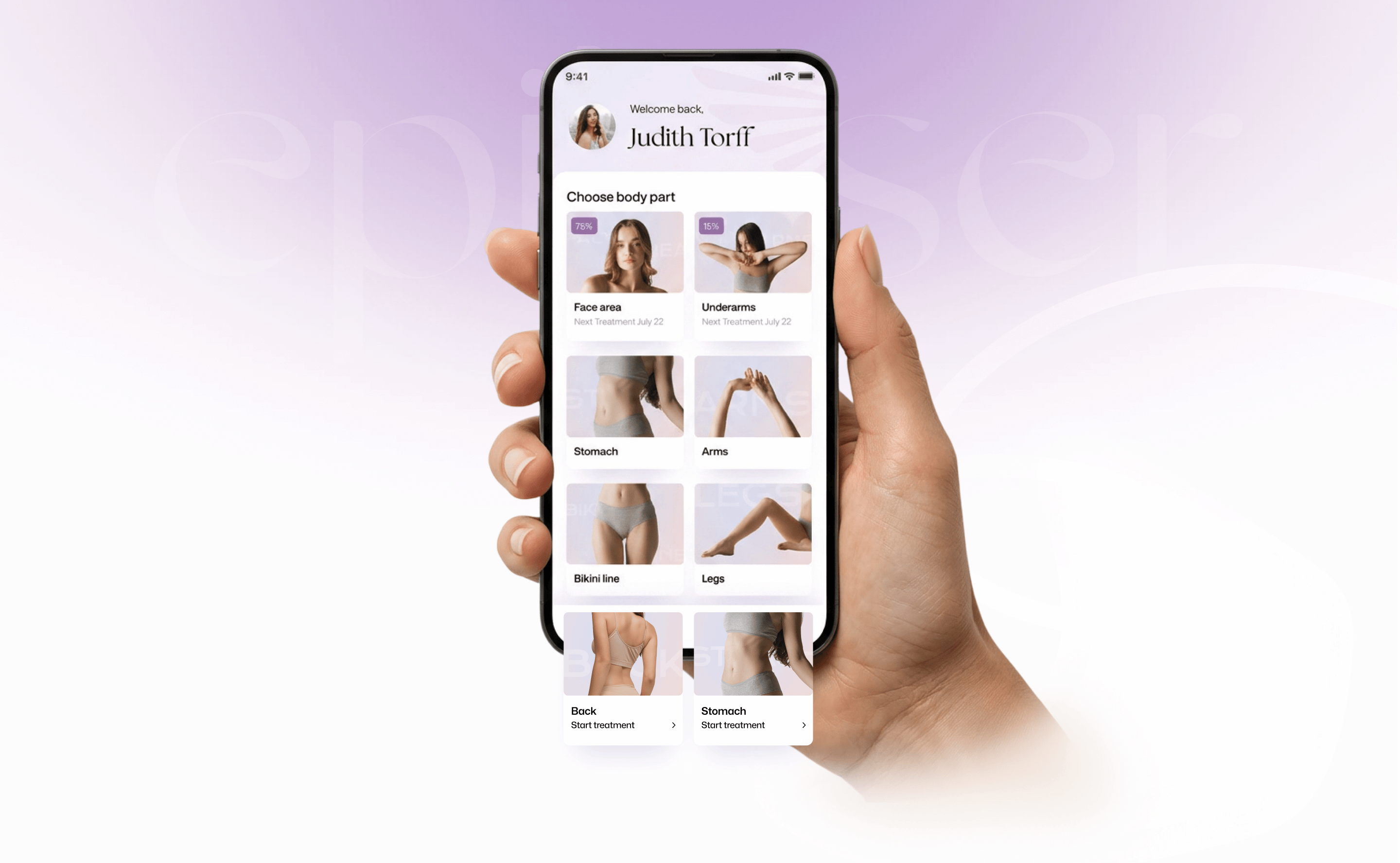
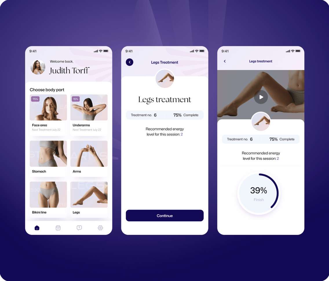
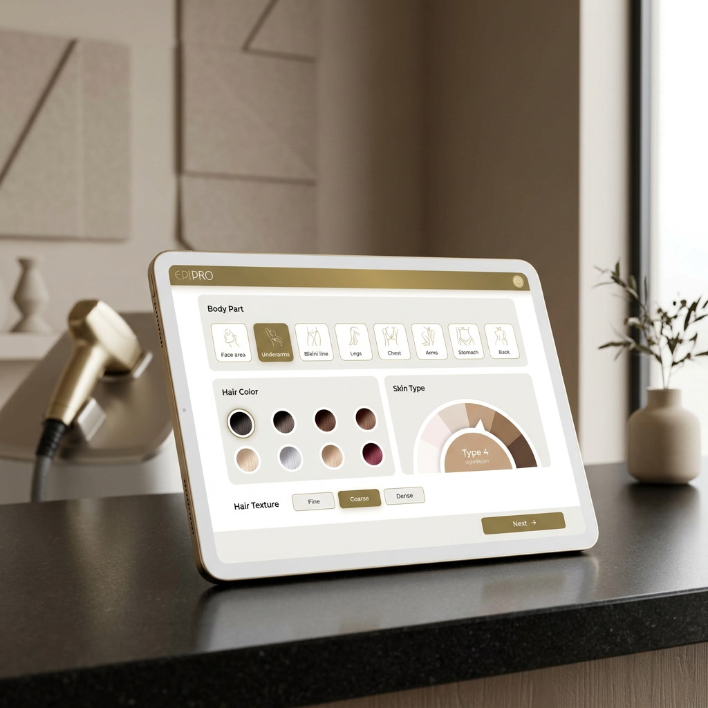
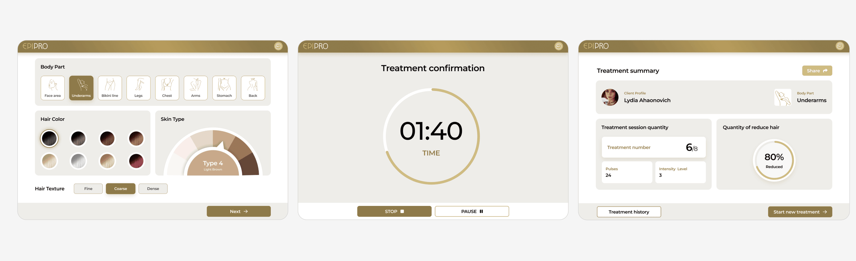
Designing for a medical-grade device meant solving two problems at once: conveying the intelligence of the technology while making the experience feel approachable for everyday use. We built a full UX architecture (wireframes, UI system, onboarding flows, treatment tracking, and EpiPRO screens) that guides users through each session with clarity and calm. The UI kit gives the engineering team a scalable component library built to grow with the product. Whether a user is starting their first session or tracking 90 days of progress, the app feels like it was made for them.
Onboarding
First time treatment

Treatment schedule
EpiPRO screens

Why it worked
By combining bold design, clear messaging, and a full suite of digital + physical assets, we gave the brand a presence that matches its product: fast, precise, and human at the core.