
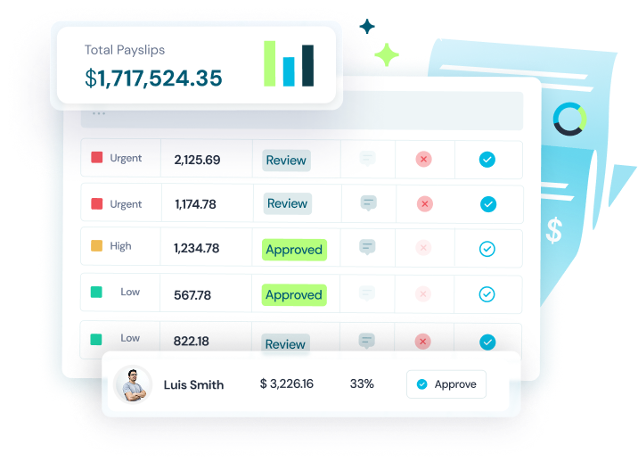

Celery is an AI-powered financial monitoring platform built to catch what spreadsheets and manual oversight never will. Their software automatically detects errors and anomalies in payroll and revenue data before they drain a company's bottom line, reducing oversight time by up to 91%. With zero complex integrations and enterprise-grade security, Celery is built for organizations where financial accuracy isn't optional.
Overview
The challenge
Celery came to Mondeo with a product that already worked. It just didn't look like it. Their brand had no cohesive visual identity, no system to carry it across touchpoints, and a product interface that hadn't caught up with the sophistication of the AI behind it. In an enterprise space where trust is everything, looking unpolished is a competitive disadvantage. They needed a full design foundation: brand, product, and web, built to move together.
“”"We know our product works. But walking into an enterprise sales call with what we have right now? It doesn't do us justice. We need a brand and product experience that matches what's actually under the hood."
How we brought it to life
We built Celery's visual world from the ground up, starting with a brand identity and guide that gave every design decision a clear foundation, then extending that into a full design system that kept the product interface consistent at scale. The website was designed to convert skeptical enterprise buyers into confident ones, and the marketing materials gave the sales team assets they could actually be proud of. Everything connects. Everything scales.
Deliverables:
- Visual Identity
- Product Design
- Website Design UX & UI
- Marketing Assets
Check out the stunning assets we've created!
Celery websiteVisual identity The system behind the brand
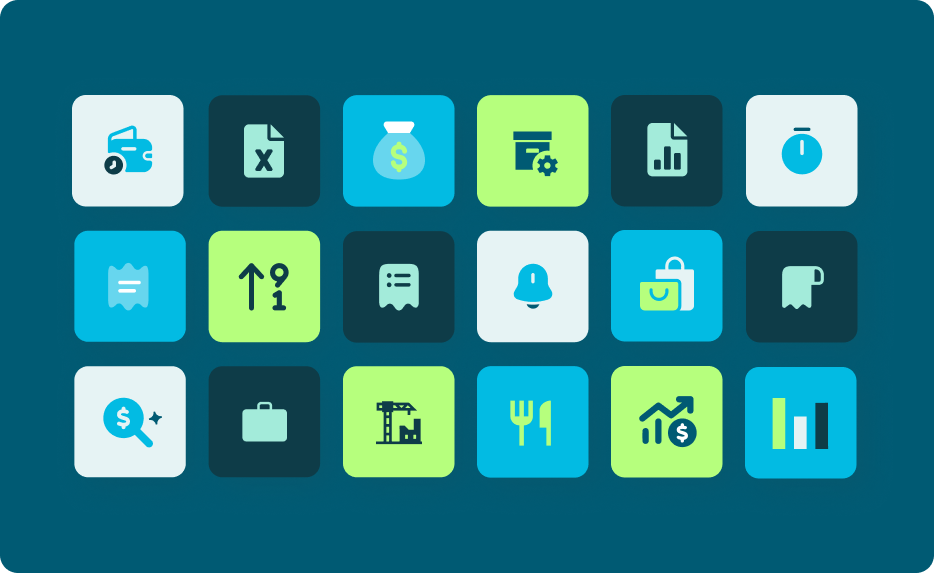
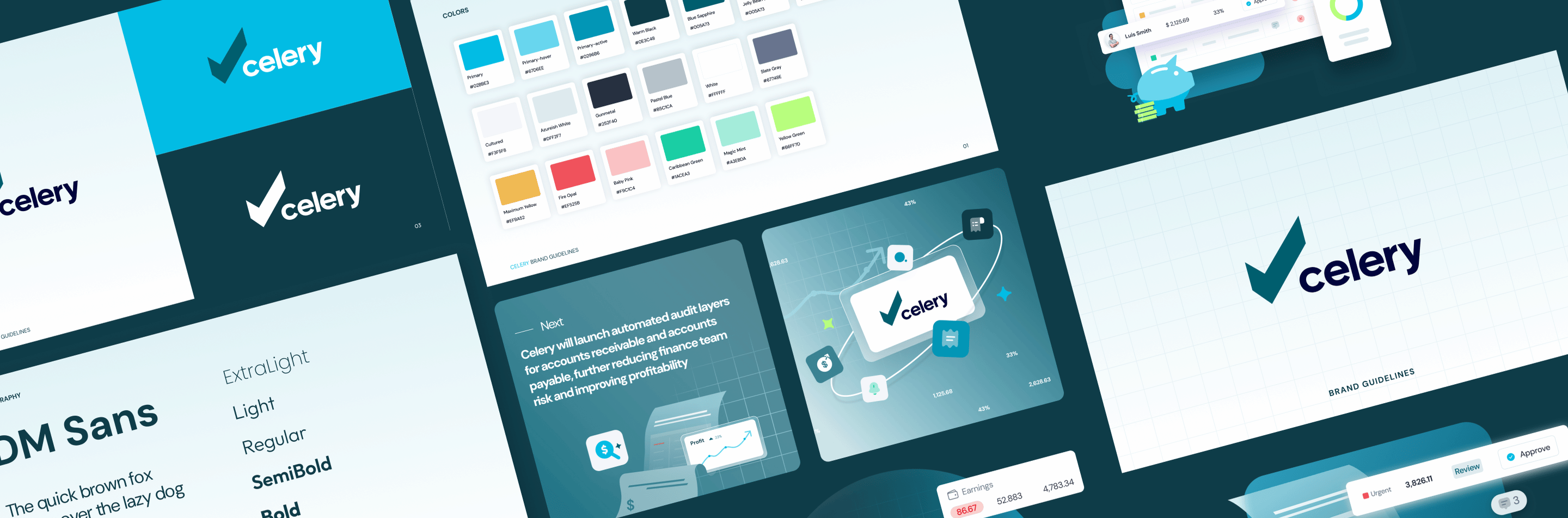
With no logo to redesign, we focused on building the visual language that would carry Celery everywhere else: color, typography, iconography, illustration style, and usage rules that work at every scale. The result is a brand system that feels clean, credible, and distinctly Celery: approachable enough for a first impression, rigorous enough for an enterprise buyer.
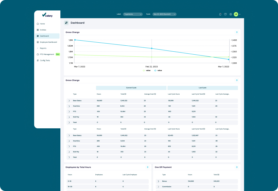
Product designComplexity, elegantly hidden
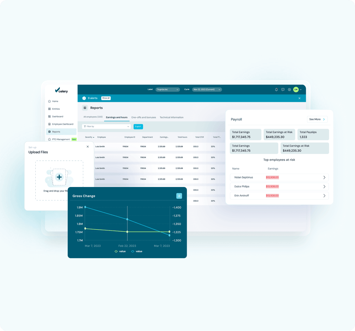
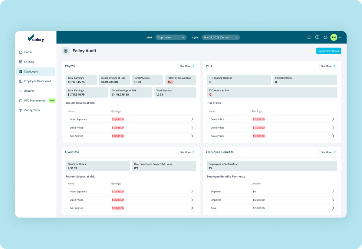
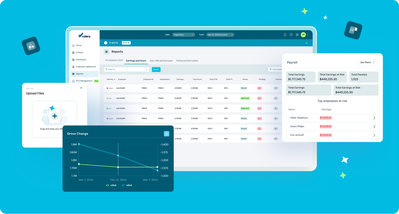
Celery's AI catches thousands of payroll and revenue errors across massive datasets, but users should never feel that weight. We redesigned the product experience and built a comprehensive design system around a single promise: financial intelligence that feels simple to use. Every screen was structured to surface anomalies clearly, guide users to action fast, and scale consistently as Celery's product grows.
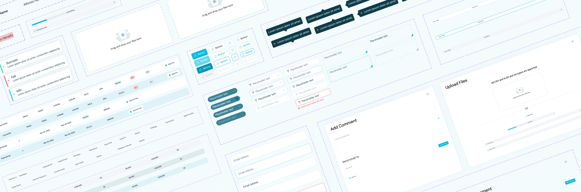
Building UI system One language, every screen
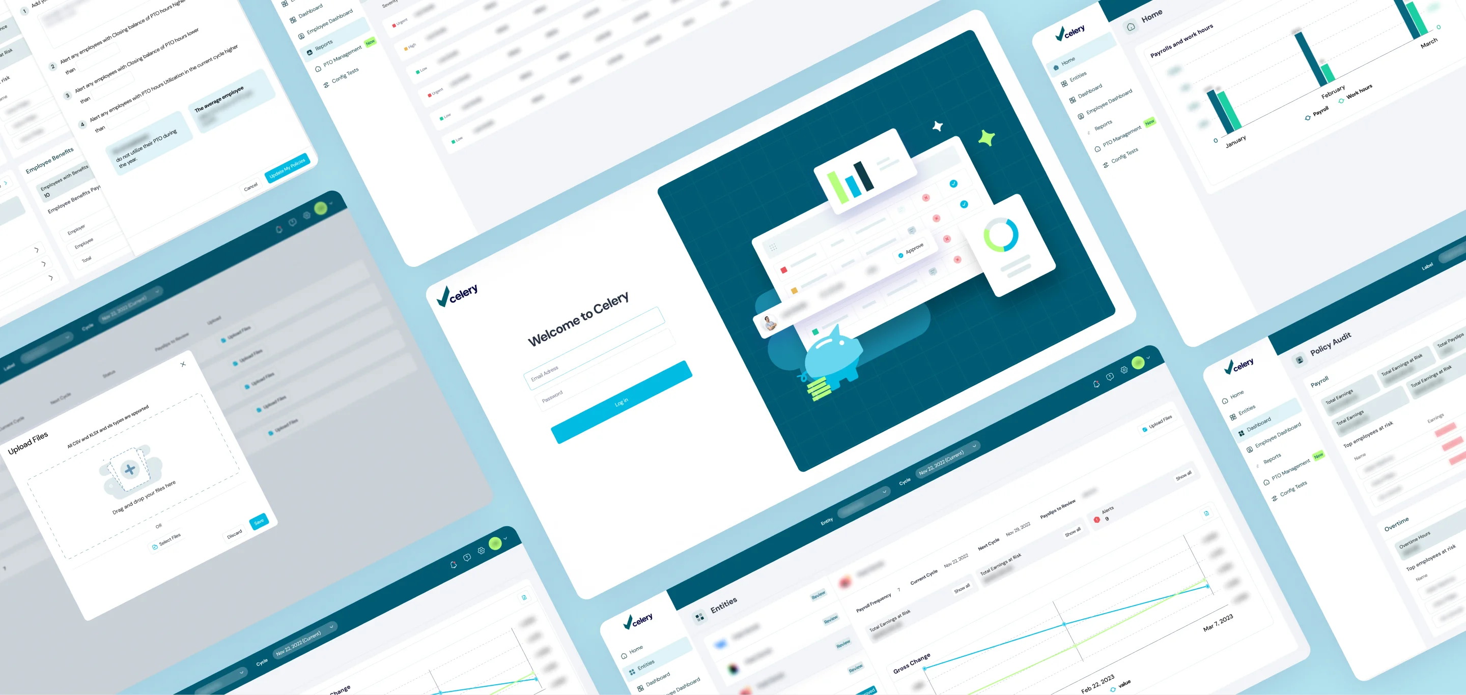
We built Celery a complete design system: a living library of components that gives every future screen a consistent, well-considered starting point. Buttons, form states, data tables, alerts, modals, upload flows, tooltips: every element was designed with the product's real use cases in mind and documented to work across the full range of interactions Celery's users encounter. It's not just a component kit; it's the foundation that makes Celery's product scalable without ever losing visual cohesion.
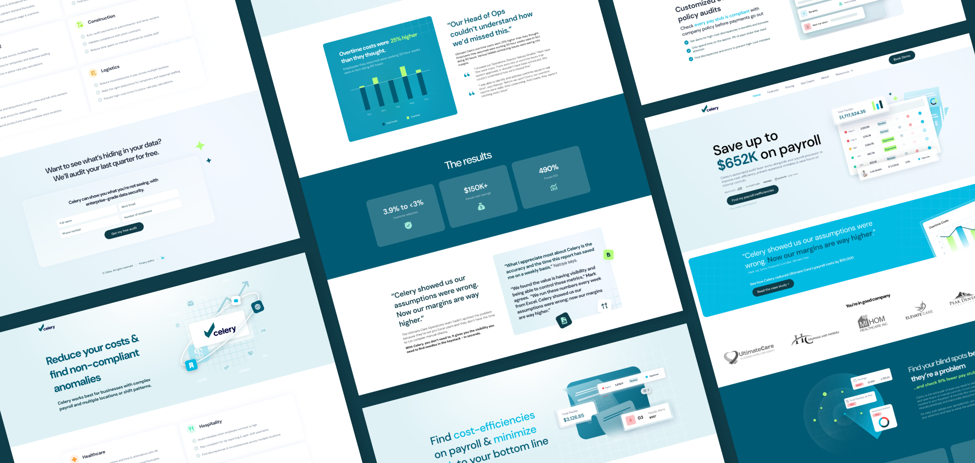
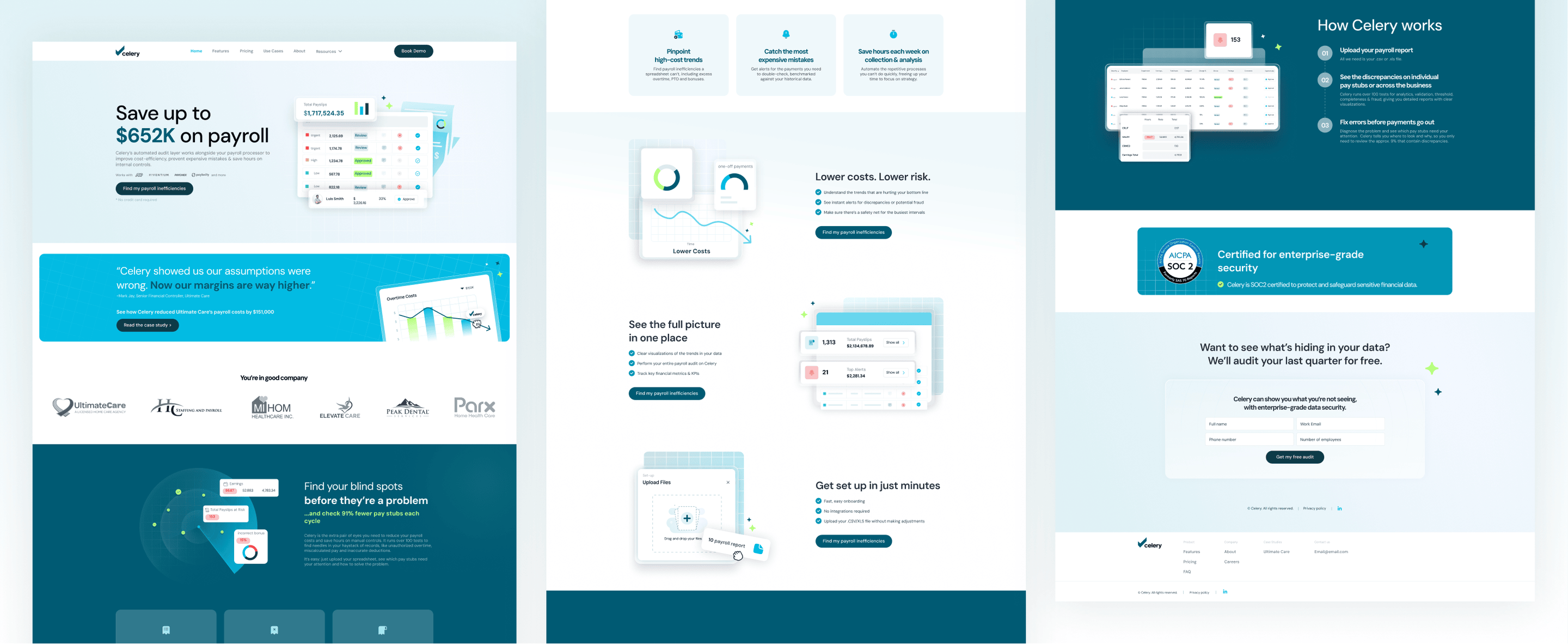
Website design Hard to build, easy to trust
Enterprise buyers don't convert on features alone. They convert on confidence. We designed Celery's website to build that confidence fast, translating a technically nuanced product into a clear, compelling story. Clean layouts, sharp messaging hierarchy, and a visual flow that walks visitors from problem to proof, without losing them in the details.
Marketing assetsReady to deploy, hard to ignore
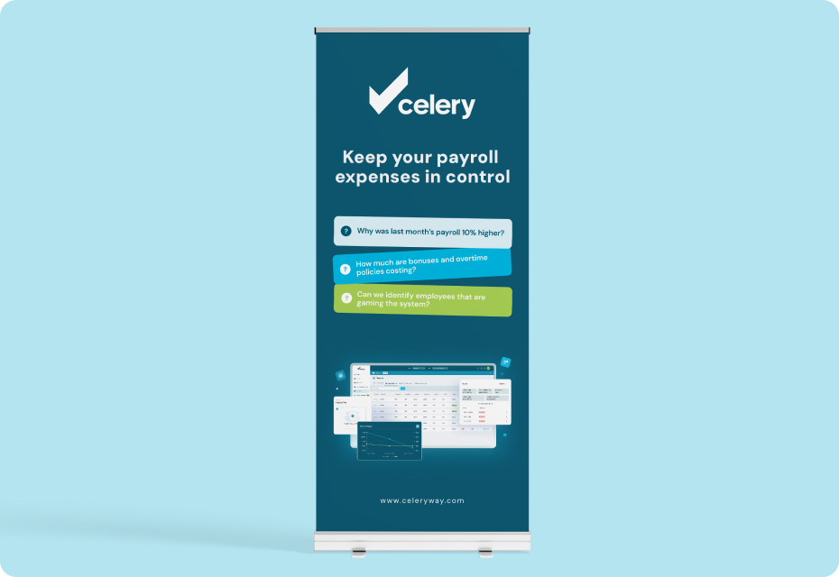
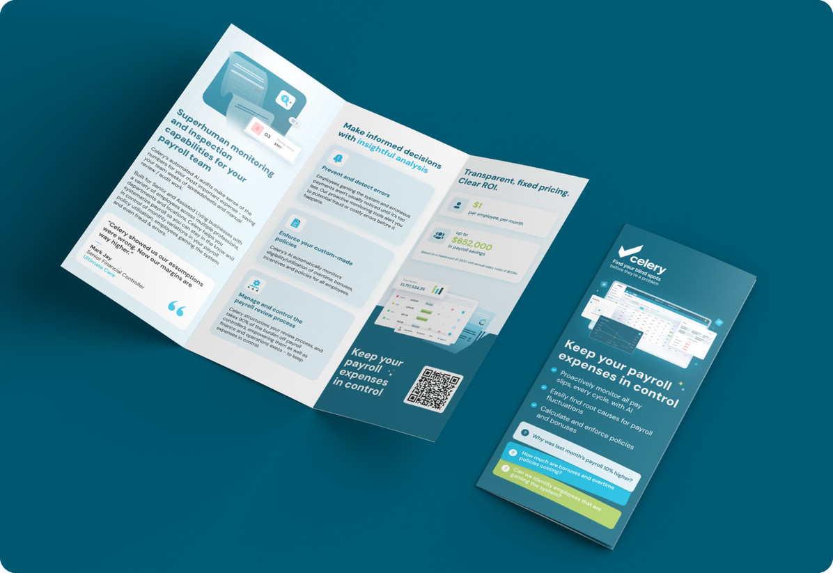
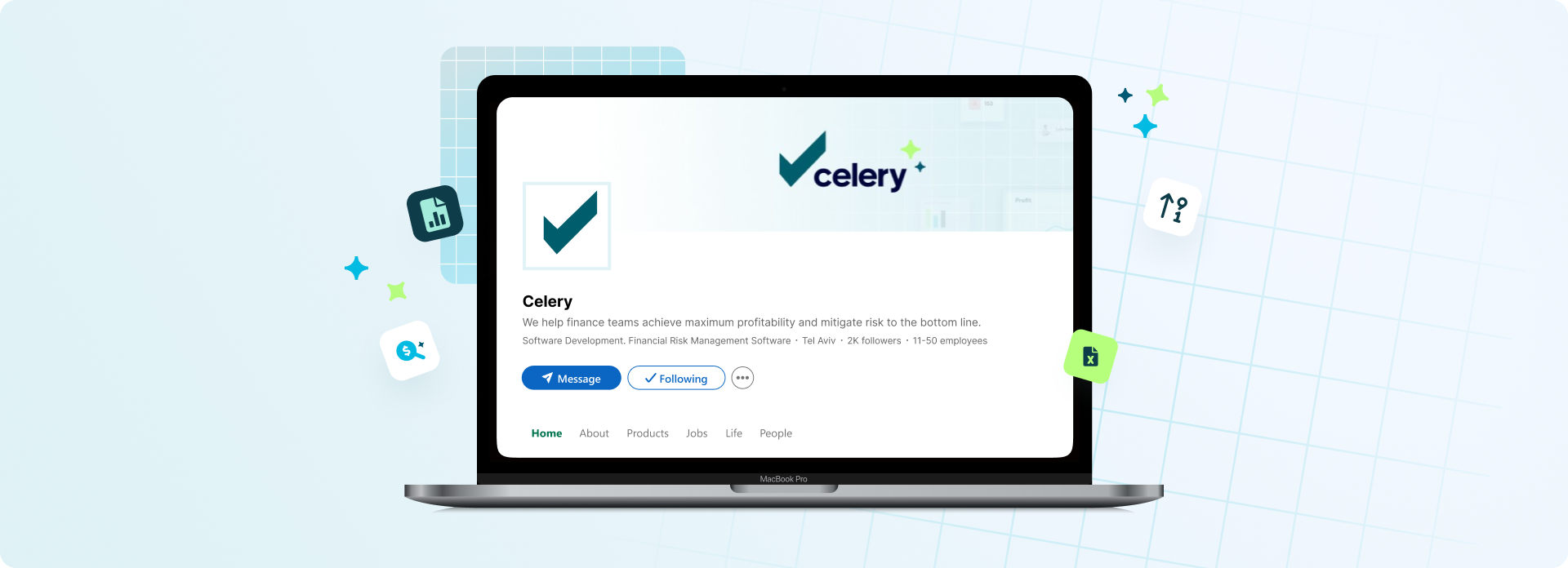
We built a suite of marketing materials that gives Celery's sales team everything they need to show up and stand out, from one-pagers to campaign visuals, all built on the brand system so everything stays consistent. In a category where trust is built touchpoint by touchpoint, every asset earns its place.
Illustrations & graphicsComplexity made beautiful
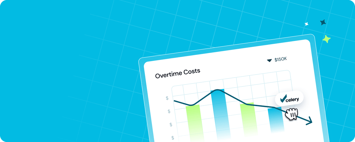
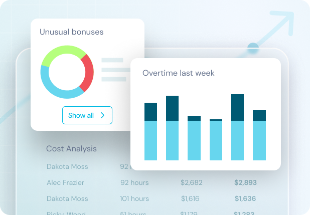
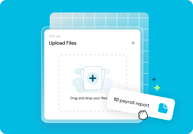
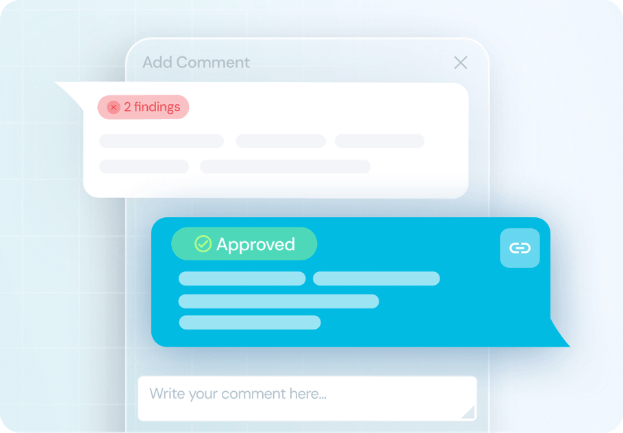
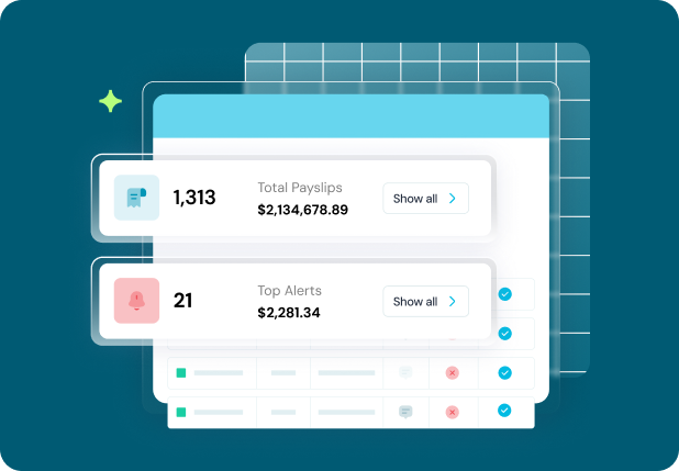
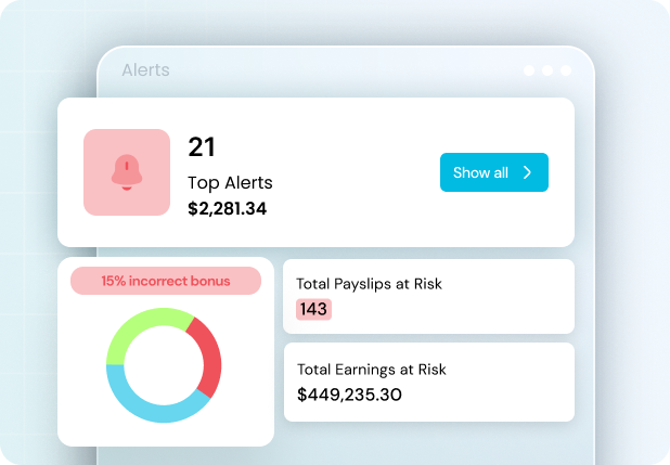
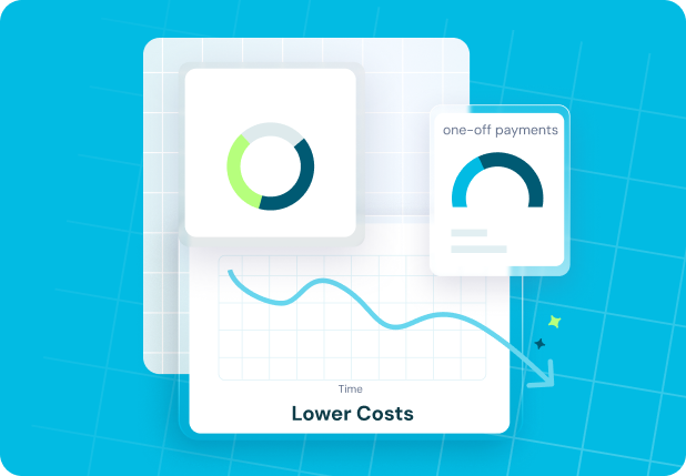
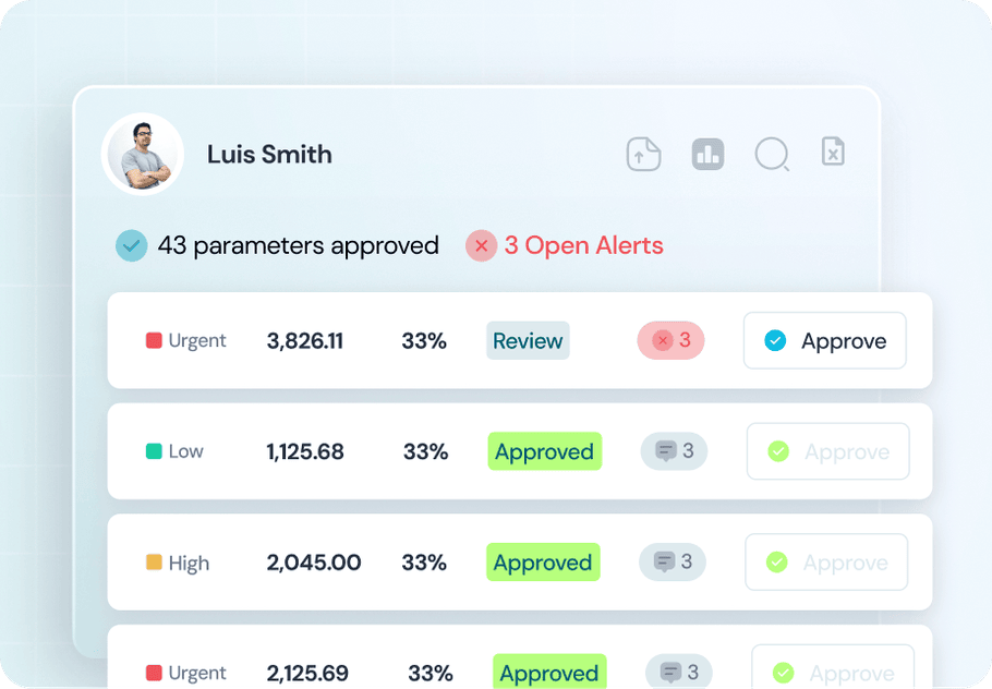
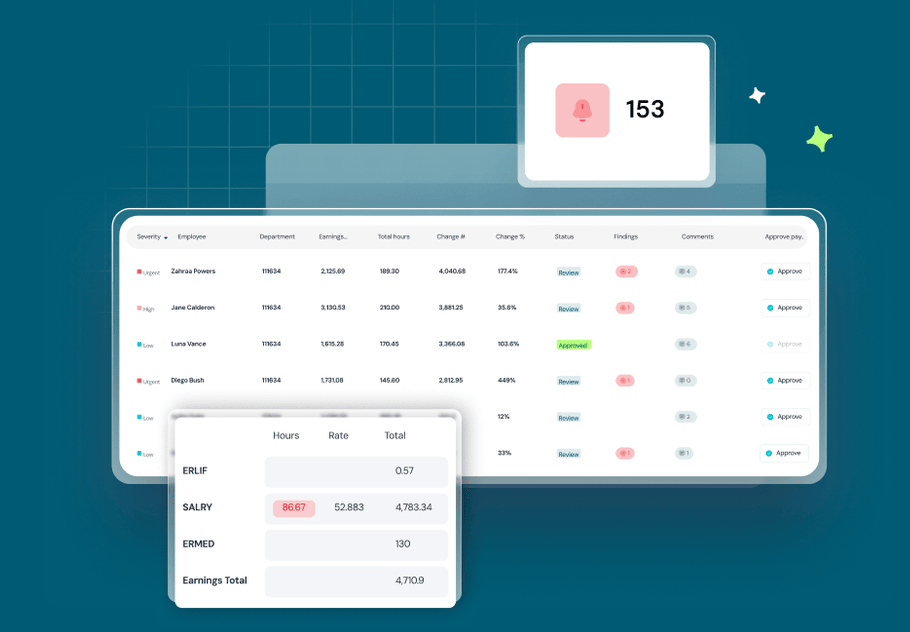
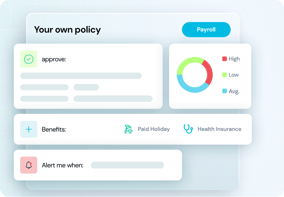
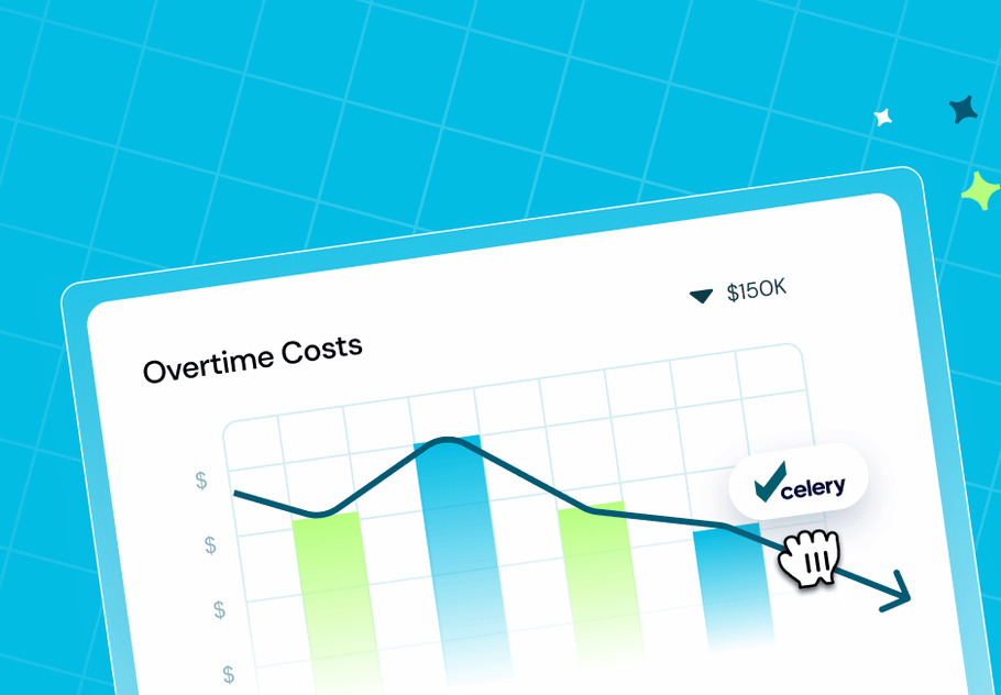
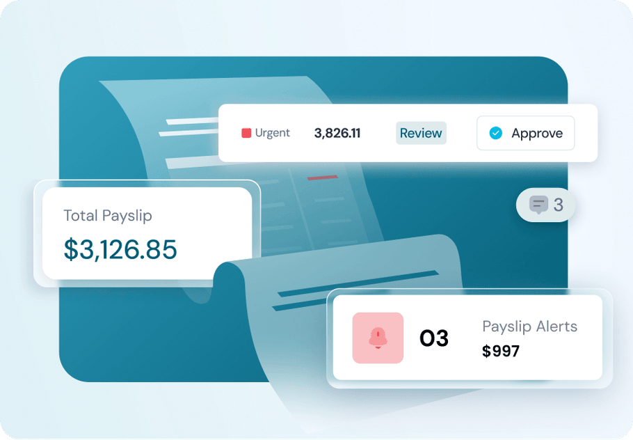
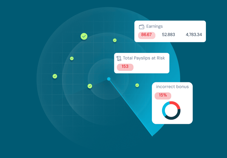
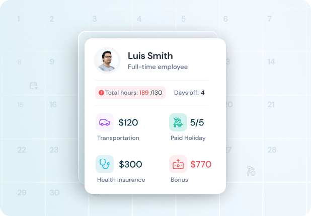
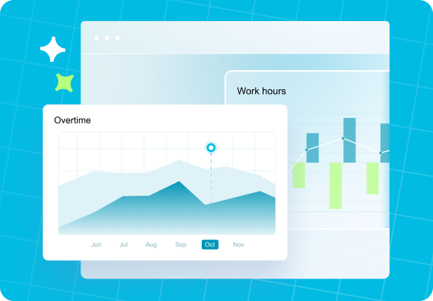
Payroll errors and revenue anomalies aren't the most visual concepts, so we built a custom illustration language that makes them tangible. Each graphic translates a specific product moment into something immediately understandable: an overtime spike, a flagged payslip, a one-click approval. The style is clean and dimensional, built to work across the website, marketing materials, and product, giving Celery a visual voice that's as clear as the insights it delivers.
Why it worked
Celery's strength was always the product. We just made sure the brand, the interface, and the website were finally strong enough to prove it. By building every layer as part of one connected system, Celery now shows up with the same credibility in a sales deck, a product demo, and a Google ad. That consistency is what turns a great product into a brand that enterprise buyers trust.
Building a fintech product that needs to earn enterprise trust?