
akeyless
Zero-trust security. Zero compromise on design.
Branding Concept|Website Design|Pitch Deck Designs & Templates|Motion & Animation|Illustrations & Graphics|Marketing Assets
Visit website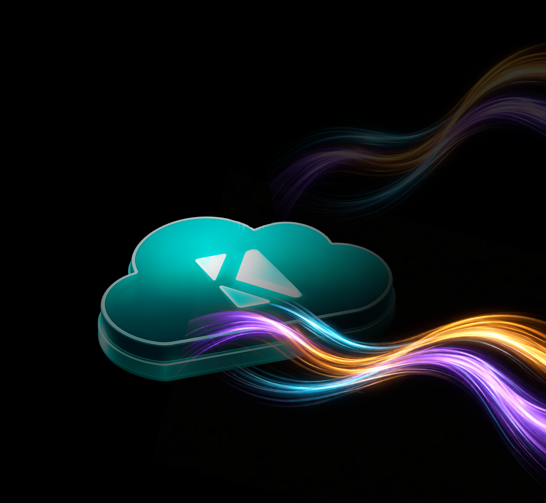

Akeyless is an enterprise identity security platform for AI agents, machines, and humans. It secures over 100 billion identity interactions across some of the world's most complex cloud environments. With more than $80M raised and clients like Deutsche Bank, Wix, and Thales, it's rethinking how organizations manage secrets, certificates, and access. Its patented Distributed Fragments Cryptography™ brings post-quantum protection to the core of the platform. Ambitious technology. It needed a brand to match.
Overview
A brand that had outgrown the light.
Akeyless came to us with an existing identity, but it wasn't telling the right story. A light-themed brand felt at odds with a platform built to protect the world's most sensitive infrastructure. They needed a full rebrand: darker, bolder, and built around a visual concept that could carry the weight of what they actually do. The old look said software. They needed something that said fortress.
“"We love what we've built, but the brand doesn't feel like us anymore. We want dark, we want glow, we want something that actually feels like enterprise security."”
How we brought it to life
Enter the Matrix.
We built the Akeyless rebrand around a single, powerful concept: the matrix. Not as a reference - as a metaphor. In mathematics, a matrix is a structured grid of values: ordered, interconnected, precise. For Akeyless, it became the visual language for what their platform actually does: imposing invisible structure on the chaos of machine identities, secrets, and access points sprawling across an enterprise. The matrix shapes you see across every surface aren't decoration. They're a representation of Akeyless itself: the hidden architecture of trust that holds everything together. We executed this across a full dark-theme rebrand: website, decks, explainer video, custom graphics, and dozens of client-facing papers, all built from one cohesive visual system.
Check out the stunning assets we've created!
Akeyless websiteBranding conceptFrom light to dark. From software to fortress.
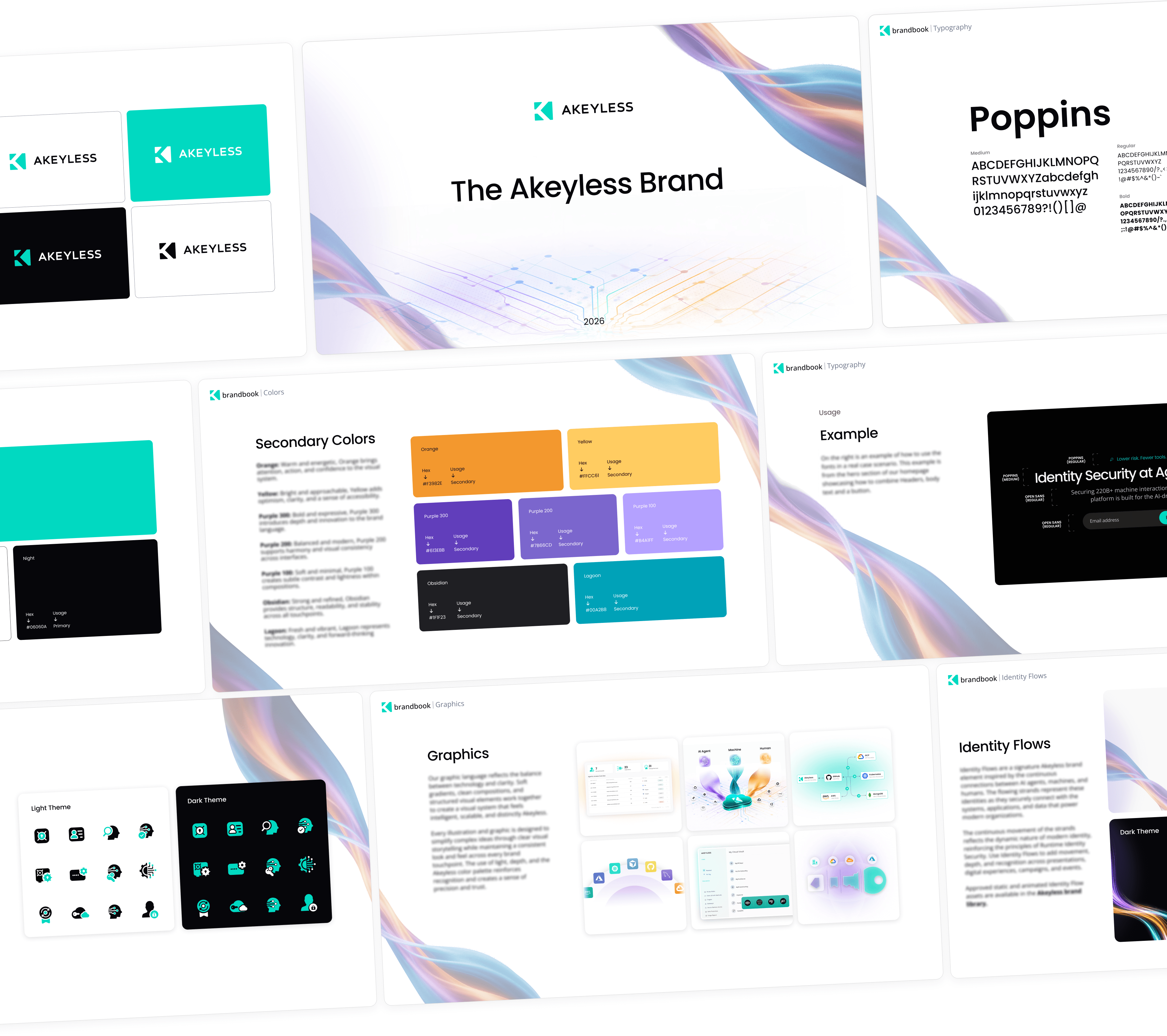
The rebrand started with a direction: tear up the light theme and build something that commands authority. We designed a dark visual identity with signature glow effects and a matrix-inspired graphic language - geometric grids and interconnected structures that visually echo the platform's architecture. The result is a brand that feels as advanced as the cryptography powering it.
Website designA dark world, precisely built.
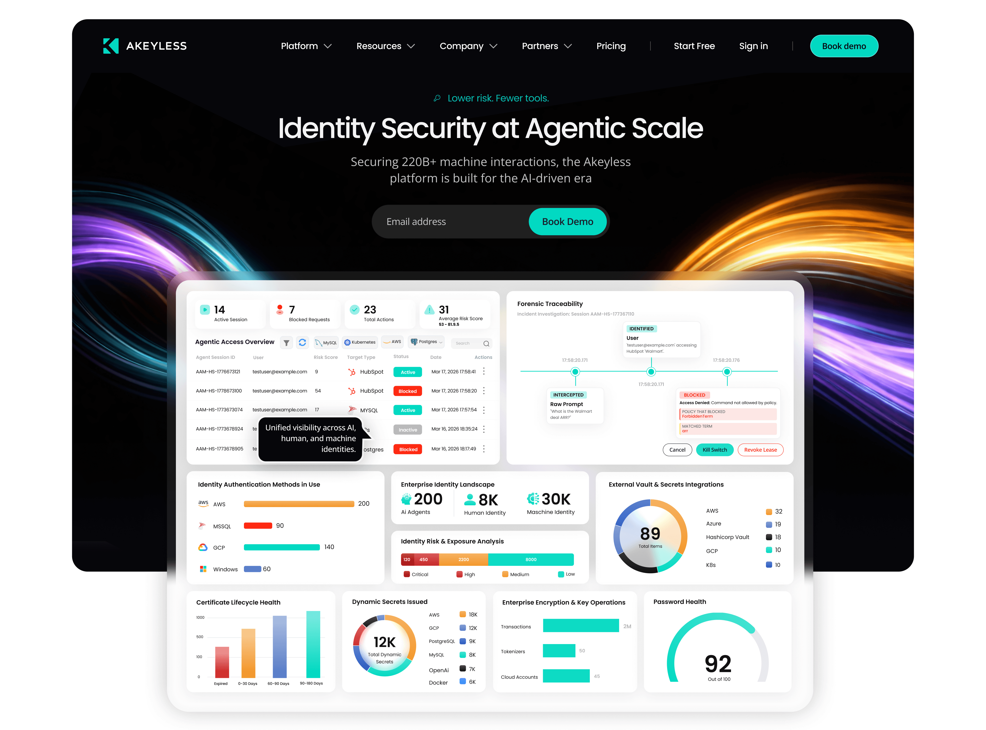
We redesigned the Akeyless site in full dark mode, with a custom illustration and icon set built only for them. It feels like it belongs inside the infrastructure it protects.
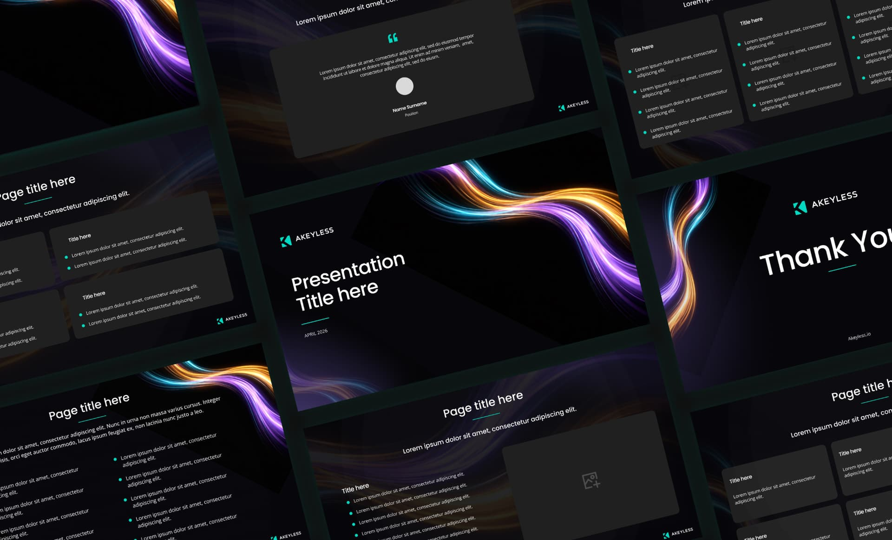
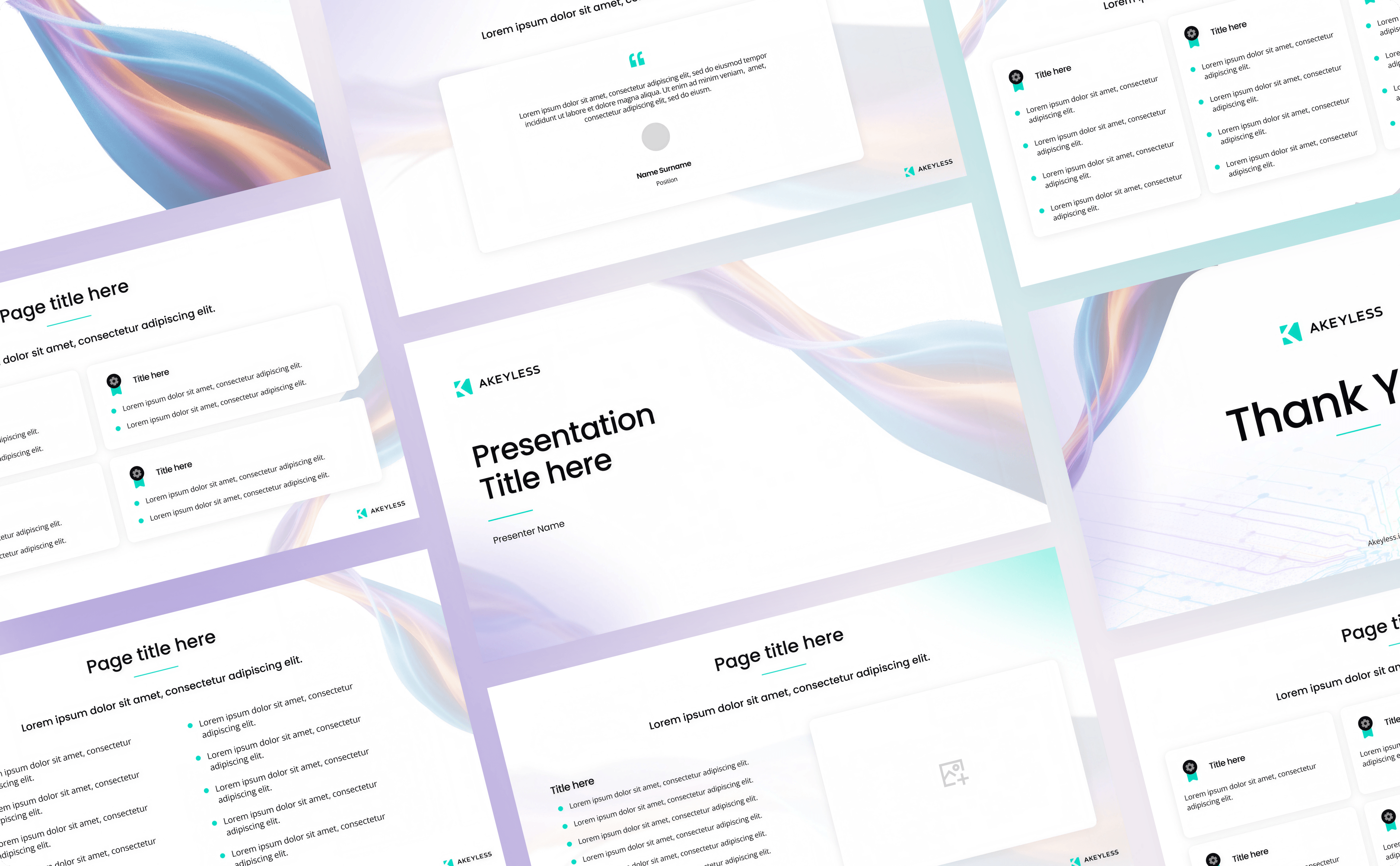
Pitch deck designs & templatesDozens of decks. One unmistakable look.
We established a deck style that matches the rebrand: dark backgrounds, subtle matrix shapes woven through layouts, and clean data presentation that lets the numbers speak. From there, we designed dozens of decks for Akeyless: investor presentations, sales decks, technical deep-dives, and event presentations. Every one built on the same system, every one unmistakably Akeyless.
Motion & animationThe invisible, made visible.
The Akeyless brand in motion: a two-minute explainer built entirely on the rebrand system.
Flowing geometry, glowing connections, and precise motion work together to translate a technically dense platform into something immediately compelling for both security buyers and executive audiences.
Flowing geometry, glowing connections, and precise motion work together to translate a technically dense platform into something immediately compelling for both security buyers and executive audiences.
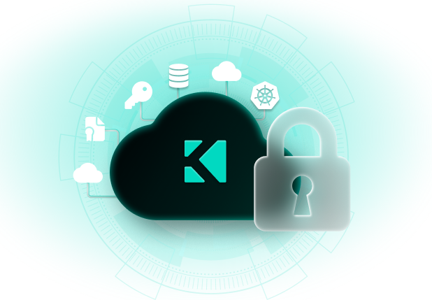
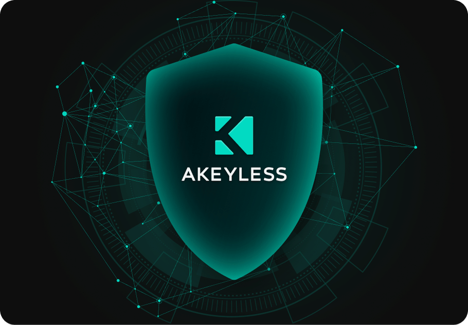
Illustrations & graphicsDozens of assets. One visual world.
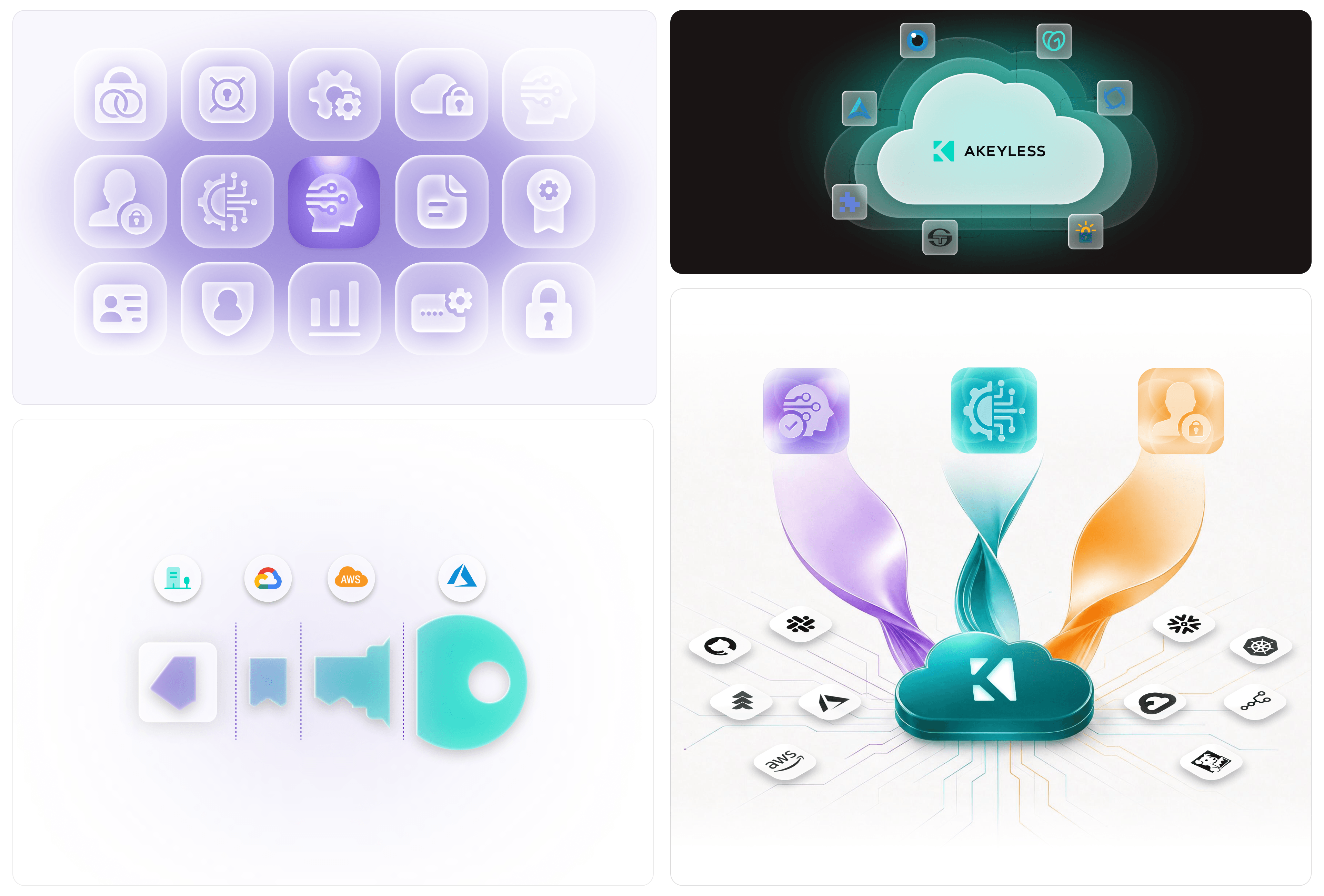
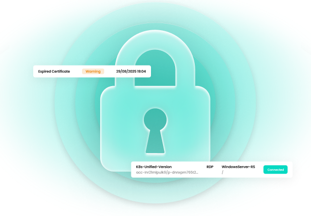
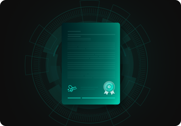
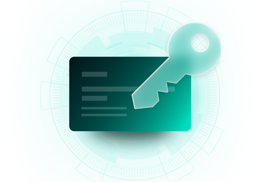
Icons, editorial illustrations, and conceptual visuals, all built in the matrix design language. Each one carries the same idea: Akeyless is the structured layer of control beneath the chaos. The set runs across the website, decks, papers, and social.
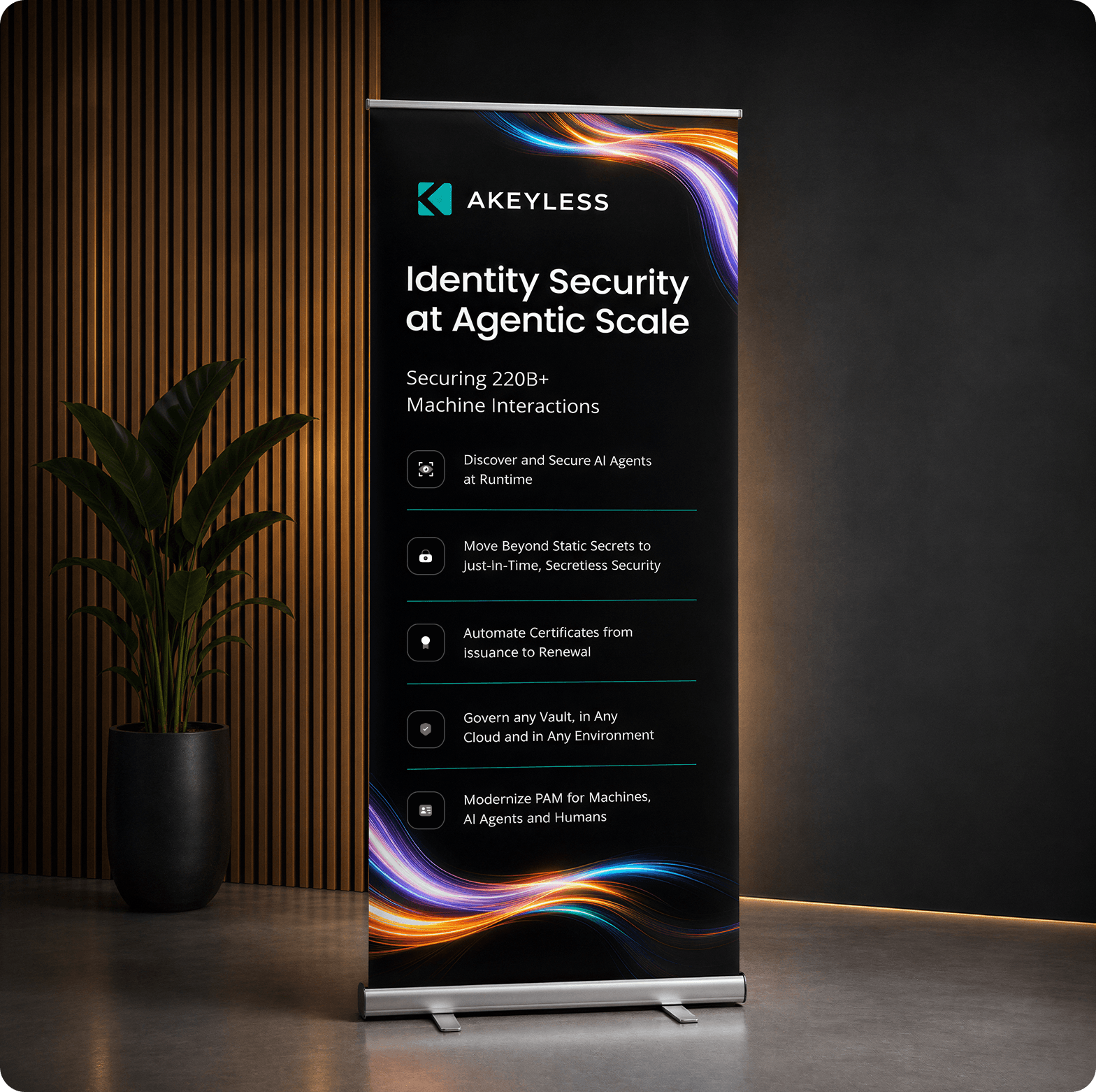
Booths and rollupsThe brand, scaled up to human size.
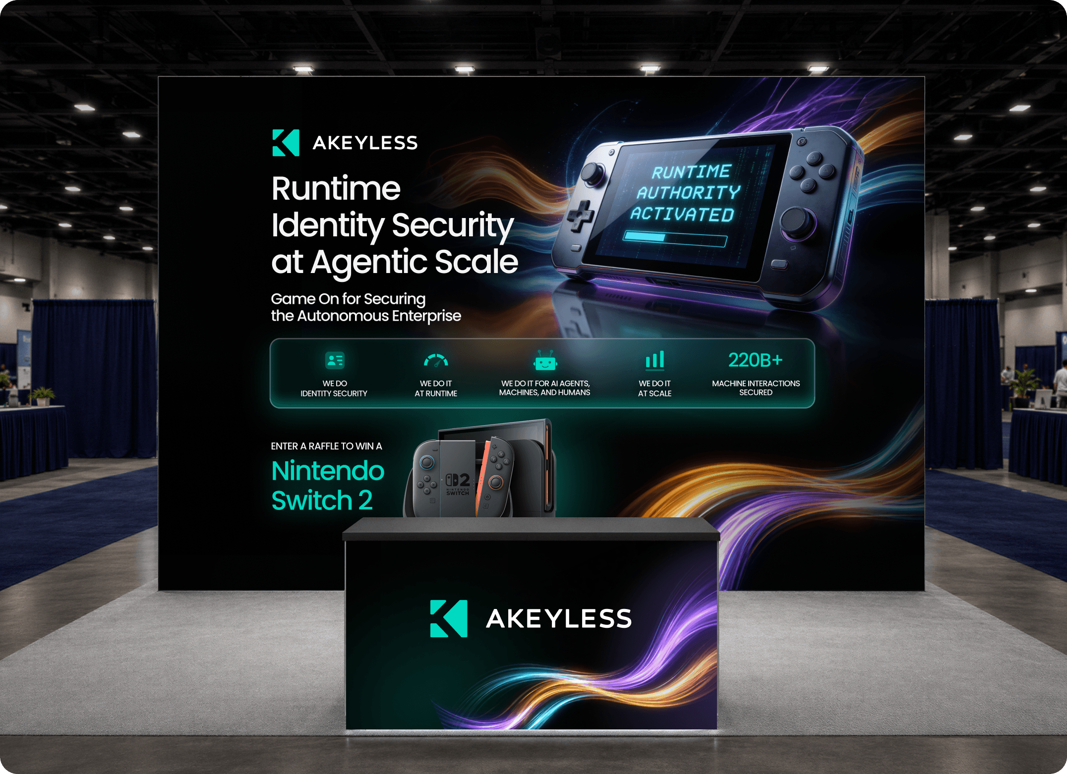
Event booths and rollups built on the same dark, glowing system, designed to hold their own on a crowded conference floor.
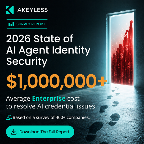
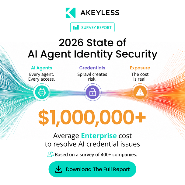
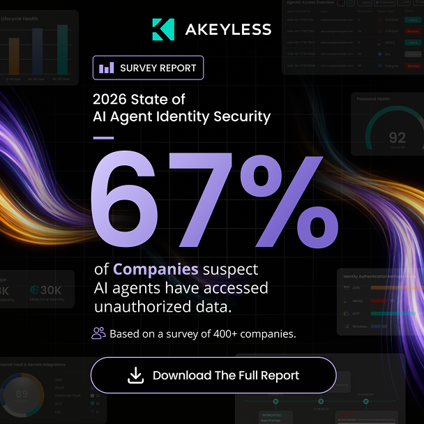
Marketing adsData-led. Dark. The numbers stop the scroll.
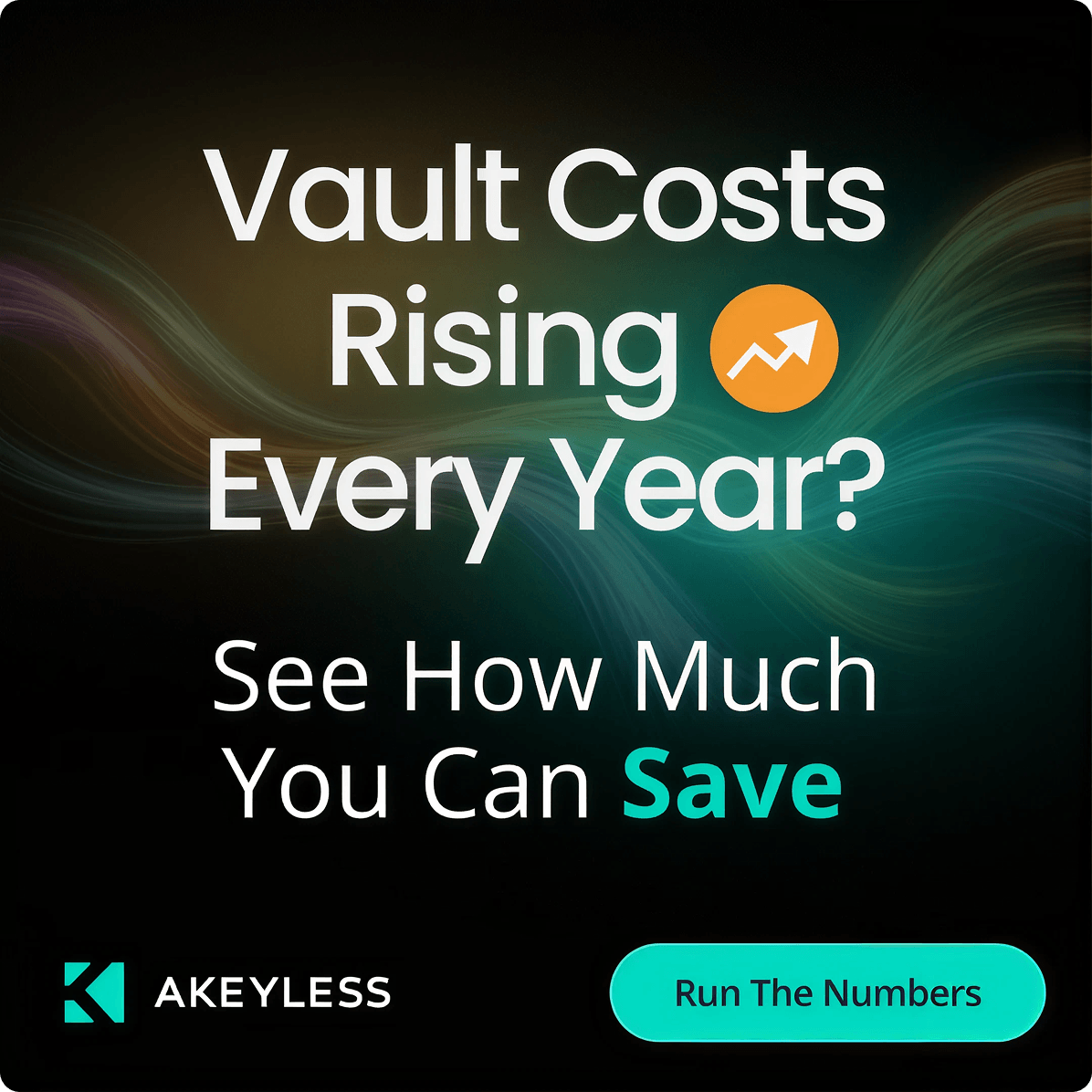
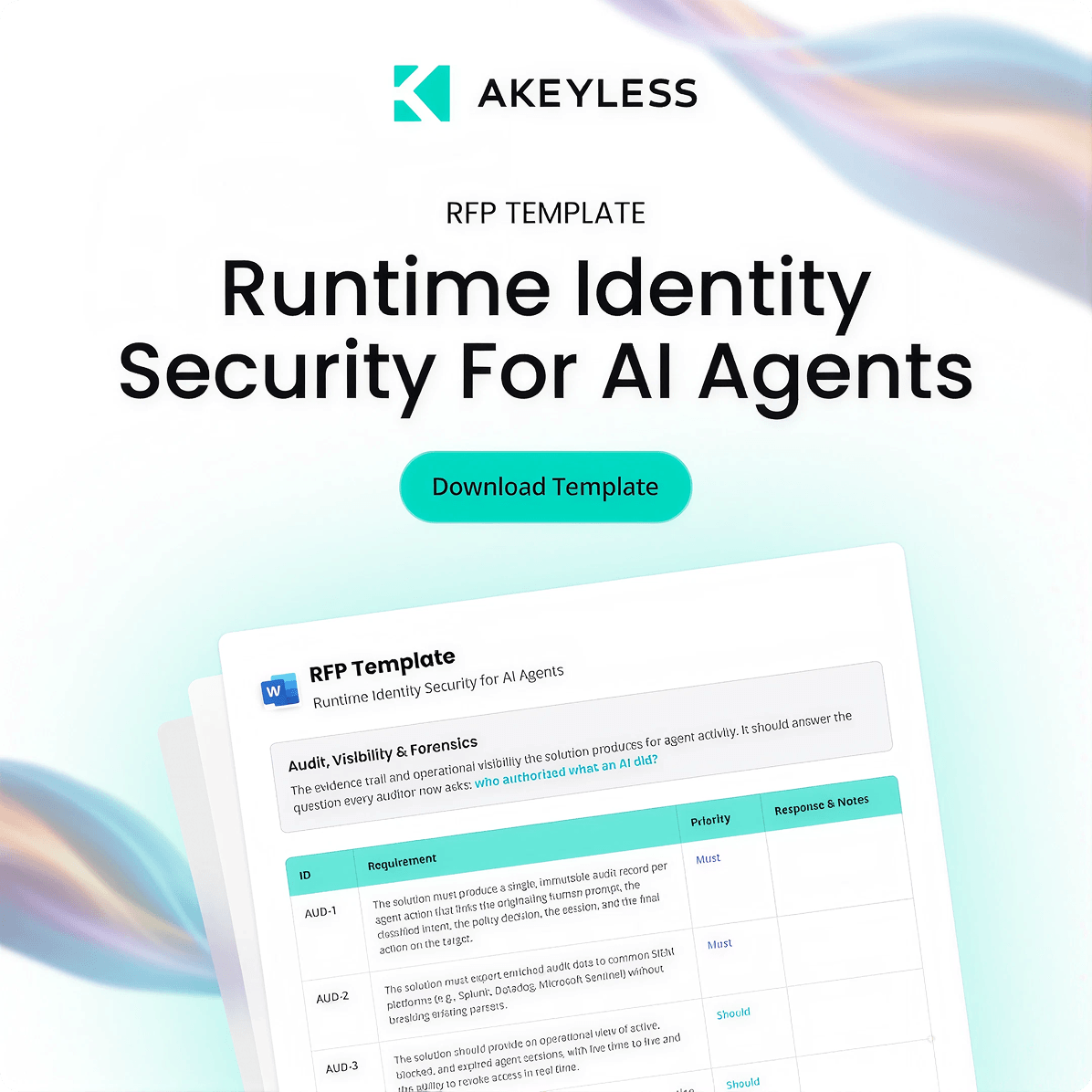
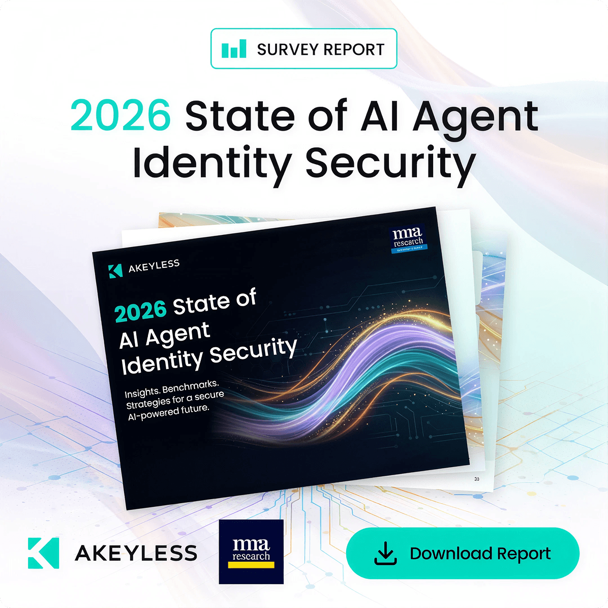
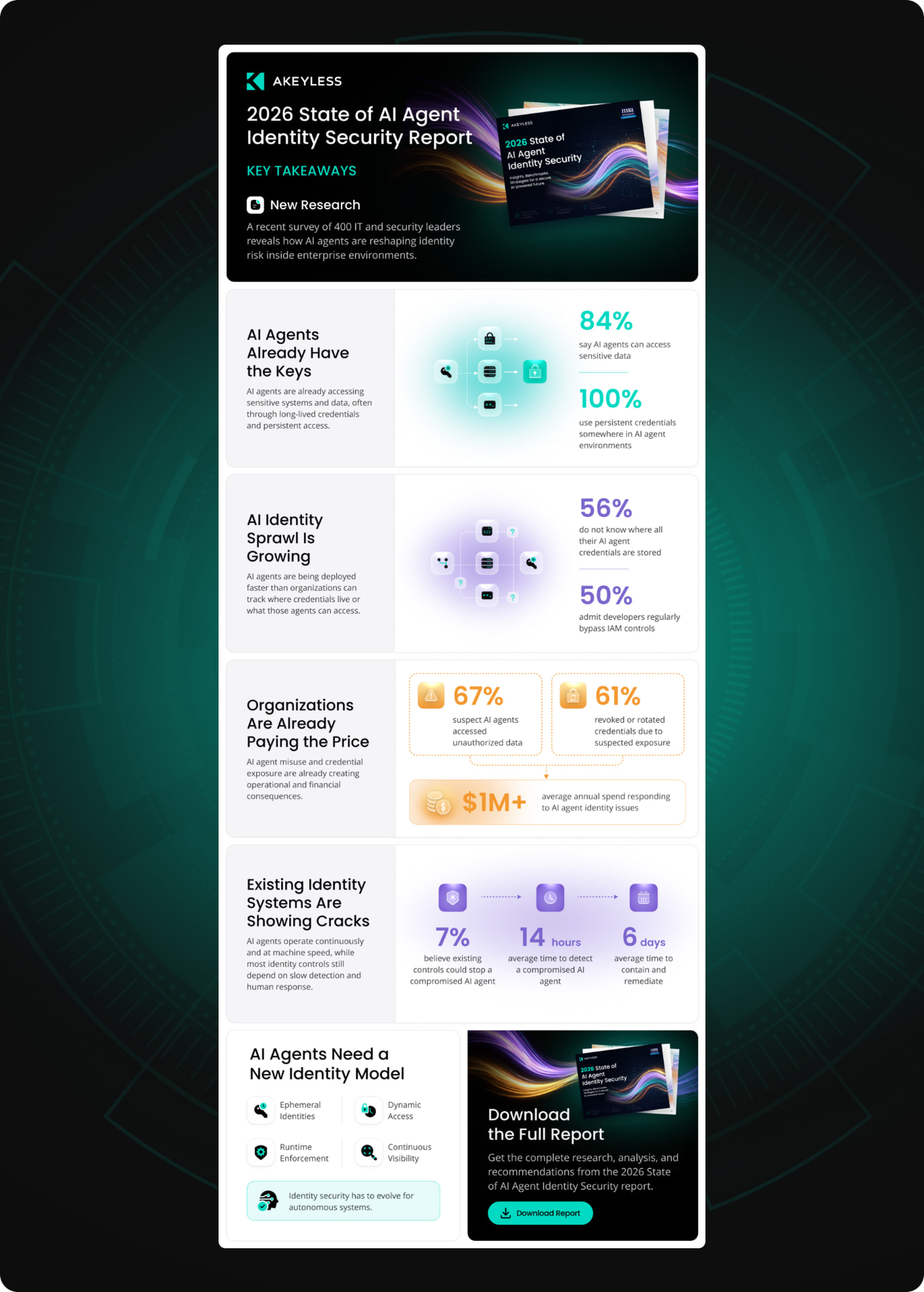
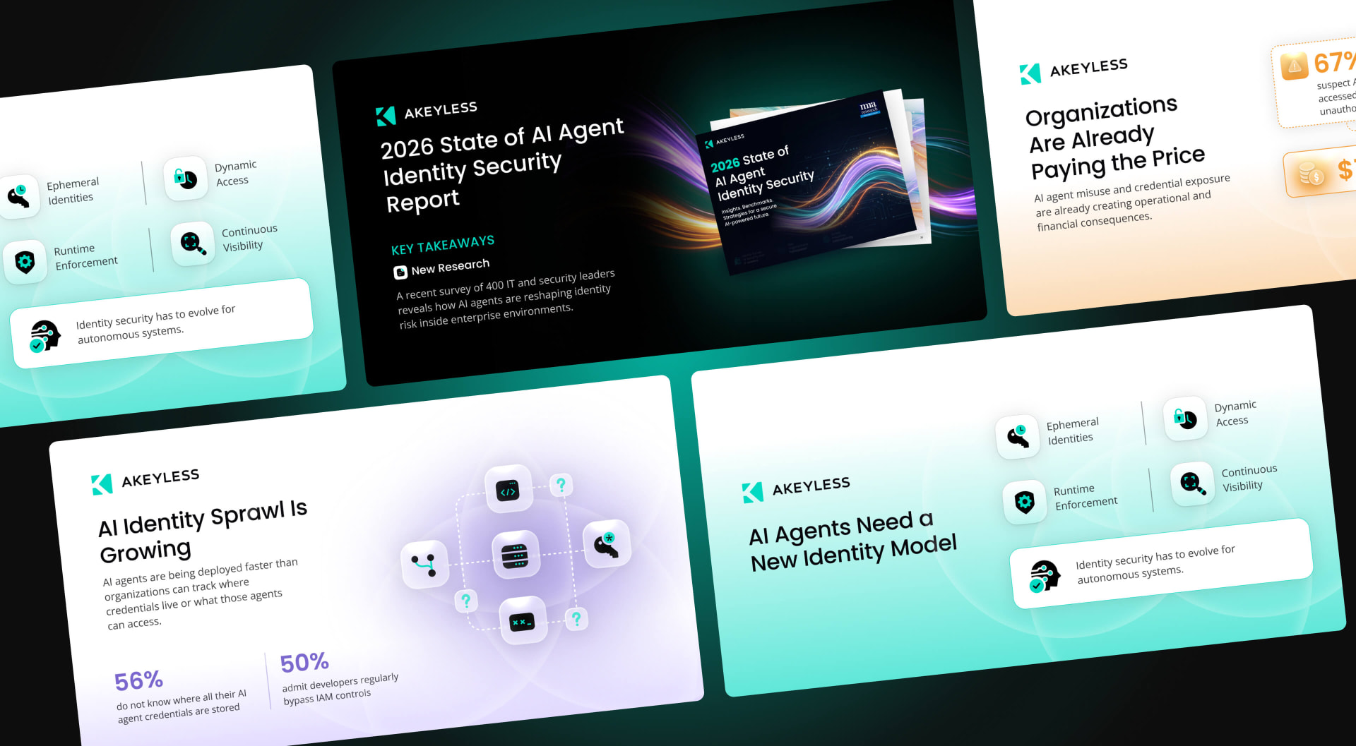
A suite of performance ad creatives that lead with the numbers security teams actually care about: million-dollar credential breach costs, unauthorized access rates, vault cost comparisons. Bold hierarchy in the Akeyless dark theme makes the data land before a single word is read. From survey-report promos to ROI calculators and competitive comparison ads, each one is built to stop an enterprise buyer mid-feed and read like a category leader.
Marketing assets
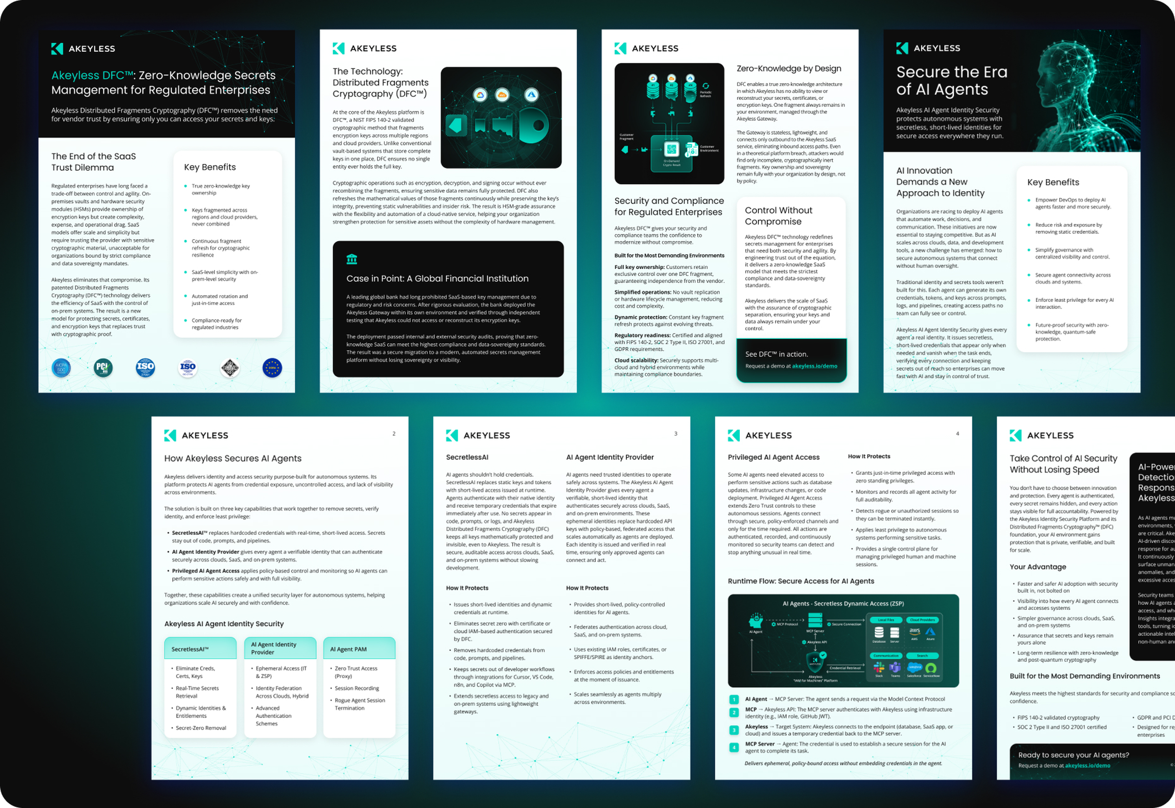
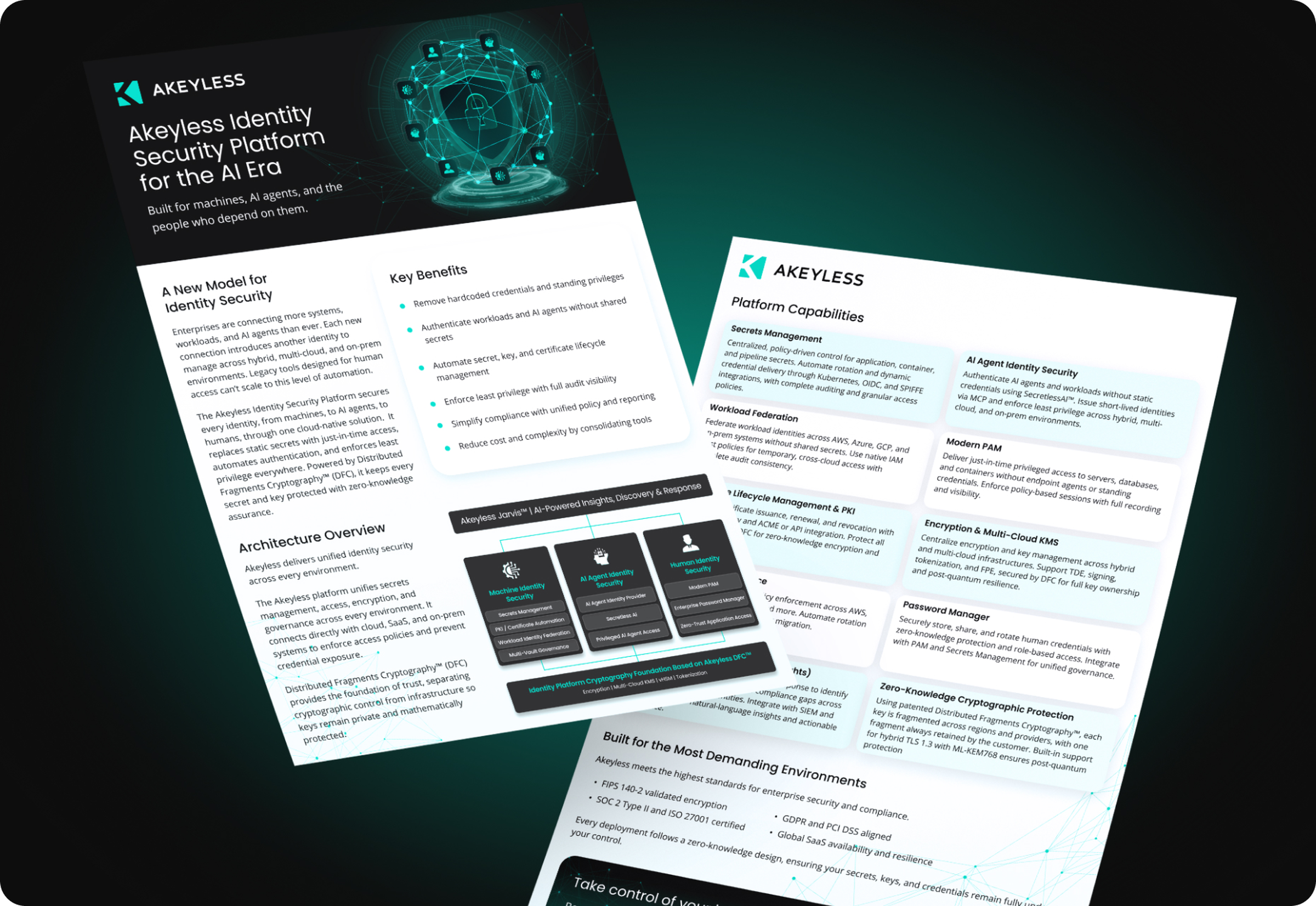
Product overviews, technical papers, one-pagers, and solution briefs. Dozens of client-facing documents, carried into print and PDF on the same matrix system. Dark layouts and precise typography make each one feel like part of the platform, not marketing about it.
Why it worked
Structure imposed on chaos. By design.
The matrix concept worked because it wasn't cosmetic. It was true. Akeyless really is the hidden architecture of enterprise security: the ordered grid beneath the complexity. We built the entire rebrand around that one idea and held it across every surface, so the brand finally feels as structured and dependable as the platform it represents.
Protecting the most sensitive infrastructure in the world? Your brand should look like it.