
Your startup’s website is costing you customers: The 5 design red flags you can’t ignore

We’re not just talking about ugly colors or outdated fonts. Design flaws go deeper: poor UX, confusing navigation, slow load times, and clunky layouts that frustrate users before they even get to your product.
Not sure if your site is guilty? Run through this Founder’s Website Gut Check:
- Do visitors instantly understand what your product does?
- Can someone navigate your site without getting lost?
- Is your call-to-action clear and enticing?
- Does your site load faster than your morning coffee order?
- Is the mobile experience actually usable?
If you hesitated on any of these, keep reading: these five red flags could be costing you real customers.
1. Your website feels like a maze (and not in a fun way)
The problem
Users land on your homepage and… have no idea where to go next. Maybe your navigation is cluttered, your CTAs are buried, or your product page is hidden under three layers of dropdown menus.
A confusing website is a dead-end for potential customers. If they can’t find what they need within seconds, they’re gone.
Real-life example
Slack’s early website was designed by MetaLab. What made it work? It was stupidly simple: a clean hero section, a clear message, and a single CTA to sign up. No fluff. No over-explaining. Just action.
The fix
→ Make navigation stupidly simple. If a 10-year-old can’t figure it out, it’s too complicated.
→ Use one primary CTA per page. Visitors should never wonder, What do I do next?
→ Follow familiar UX patterns: there’s a reason great websites follow similar layouts.
Self-test
Ask someone unfamiliar with your business to complete a simple task (like signing up or finding pricing). If they struggle, your site needs a redesign.
2. Slow load times = lost customers
The problem
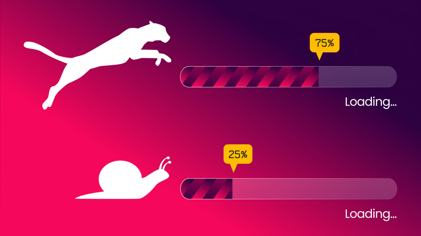
Your website takes so long to load that visitors leave before they even see it. Harsh truth: A 1-second delay in page load time drops conversions by 7%. A few extra seconds? Your bounce rate skyrockets.
Common culprits:
- Massive uncompressed images
- Bloated code
- Cheap, slow hosting
The fix
→ Compress images. PNGs & 4K hero videos? Your server hates you. Optimize them.
→ Minify your code. Nobody needs 14 tracking scripts running.
→ Use a fast hosting provider. If your site’s on a slow shared server, upgrade.
Self-test
Run your site through Google PageSpeed Insights. If your score is below 70, it’s time to optimize.
3. Your site looks… meh (or worse, untrustworthy)
The problem
People judge your business based on design, whether you like it or not.
If your site looks like it was designed in 2013, people will assume your business model is stuck there too.
Startup example
Notion’s website has always been minimalist but high-trust: crisp typography, soft colors, and a seamless UX that feels effortless. No flashy animations, just a product that looks like it works.
The fix:
→ Invest in professional design, or at least something that doesn’t scream “default template.”
→ Ditch stock-photo overload. A site full of generic handshake images screams boring SaaS template.
→ Use whitespace. Clutter is not a design aesthetic.
Self-test
Pull up your site next to a competitor’s. If theirs feels premium and yours feels DIY, you have a problem.
4. It’s not mobile-friendly (yes, that’s still a thing in 2025)
The problem
Your mobile site is a nightmare to use: text is unreadable, buttons are tiny, and navigation is broken.
Why this matters:
→ 60%+ of web traffic is mobile. If your site isn’t built for it, you’re bleeding users.
→ Google penalizes bad mobile experiences. If your rankings suck, this could be why.
The fix
→ Test your site on actual devices. Your desktop-friendly navbar might be a disaster on mobile.
→ Make buttons big enough for human thumbs.
→ Ensure text is readable without zooming.
Self-test
Open your website on your phone. Try signing up, clicking CTAs, and navigating. If anything is frustrating, fix it.
5. Your copy is confusing or boring
The problem
If users don’t immediately understand what your product does, they won’t stick around to figure it out.
Bad example:
“Our AI-powered synergy engine leverages machine learning to optimize efficiency.”
...What does this even mean?
Good example (Airtable):
“Looks like a spreadsheet. Acts like a database.”
Clear. Simple. Memorable.
The fix
→ Write like a human. No jargon, no buzzwords, just clarity.
→ Be specific. “Save time” is vague. “Cut scheduling time by 40%” is clear.
→ Make CTAs action-driven. “Get Started” is fine, but “Try It Free in 60 Seconds” is better.
Self-test
Read your homepage out loud. Does it explain your startup’s value in under 10 seconds? If not, rewrite.
The takeaway: Fix these, win more customers
If your website is guilty of these five design red flags, you’re losing customers. Guaranteed.
The good news? These problems are fixable.

A well-designed startup website doesn’t need to be flashy, expensive, or over-engineered. It just needs to be clear, fast, trustworthy, and easy to use.
Your website isn’t just a digital business card. It’s your startup’s best salesperson. Make sure it’s doing its job. Need a site that actually converts? Mondeo Studio builds startup websites that don’t just look good. They drive real results. Let’s talk.